Tag Archives: OBIEE 11g
Oracle Analytics: Everything you always wanted to know (But were afraid to ask)
The release of Oracle Analytics Server (OAS) on 31st January 2020 has left many OBIEE users wondering what it means for them. Common questions we were asked at Oracle OpenWorld Europe last week included:
- what’s the difference between OAS, OAC and OBIEE?
- where does DV fit into this?
- should I be migrating and if so, when; what are the benefits?
This blog post aims to answer all these questions!
First of all, let’s define each product in order to compare them.

Oracle Analytics Cloud (OAC)
Oracle’s strategic analytics platform, hosted in the Oracle Cloud.
Oracle Analytics Server (OAS)
OAS is the new on-prem version of OAC, and is intended as a bridge between legacy OBIEE platforms and Cloud. It has almost complete feature parity with OAC, including AI-powered, modern and self-service analytics capabilities for data preparation, visualisation, enterprise reporting, augmented analysis and natural language processing and search. If you are an OBIEE customer, you are automatically licensed for OAS, and Oracle Data Visualisation (DV) is included at no extra cost.
OAS vs OAC
The main difference between OAS and OAC is related to hosting and administration. OAC is hosted and managed by Oracle, while OAS needs to be installed, configured and patched by you in your datacenter. This also defines the level of control and customisation: with OAS you have the full control over config files, styles, custom function etc, while in OAC you’ll be able to change only what’s exposed in the cloud console by Oracle.
OAC will receive more frequent updates and new features, with OAS scheduled to have an annual release bringing the cloud features to on-premise customers.
So the choice between the two depends on the amount of customisations needed vs the time spent on supporting the platform.
OBIEE vs OAS
OAS was developed to replace OBIEE, however the two products are not exactly the same. There are one or two OBIEE features that are deprecated in OAS, such as BISQLProvider or Act As, but they are still present in the tool, and they’ll not go away until a proper replacement is in place. On the other side, If you were using Scorecards, this tool is no longer shipped with OAS.
OAS on the other hand, brings almost functional parity with OAC, providing a huge amount of new features especially in the self-service area, more info in the dedicated post.
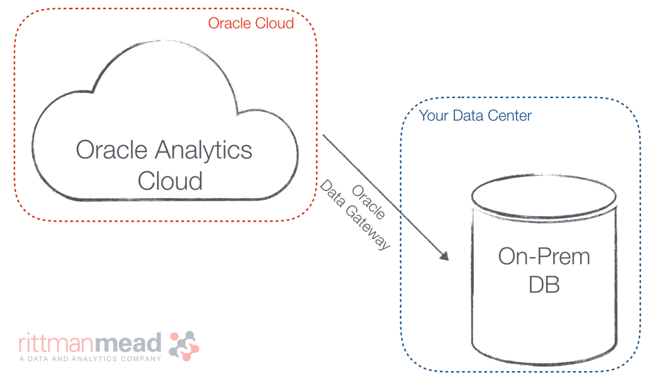
Can I connect to a Database in my Datacenter with OAC?

Yes you can, Data Visualization offers the option to connect to any datasource which is reachable from the Cloud. If you don’t want to expose your database directly, Oracle Data Gateway enables the connection from OAC (including RPD based connections) to on-prem data-sources without the need to open any firewall port.
Where does DV come into this?

Data Visualization (formerly known as Visual Analyzer) is Oracle’s self-service tool. If you’re an OBIEE 12c user, you may be paying extra license fees to use DV. If you’re already using OAC, you may have noticed DV is included with your license, and this will also be the case for OAS.
Ultimately, Oracle Analytics’ aim is to provide a mix and match offering, where you can choose which components are Cloud and on-prem. For example, you can upgrade to OAC and point it to your on-prem database. Or if you’re Cloud averse for whatever reason, you can migrate to OAS and utilise many of OAC’s features.
What does Rittman Mead recommend you do next?
There is probably a different answer for everyone, depending on where you are in your Oracle Analytics journey, so we’d recommend contacting us for an initial chat to go through your options. Broadly speaking, if you’re using OBIEE 11.1.1.7 onwards and you’re considering upgrading to 12c, you should factor OAS or OAC into your decision making process.
To help you decide which product is best for you, we are offering a FREE two-day Oracle Analytics assessment which aims to help you create a business case for migrating to OAC or OAS based on your pain points and anticipated usage. Contact us for more information.
Rittman Mead also provides OAC, OAS and OBIEE training. Our next OAC bootcamp is taking place in London, March 23rd - 26th 2020. For more information go to our training page or contact Dan Garrod.
Unify: Could it be any easier?
Rittman Mead’s Unify is the easiest and most efficient method to pull your OBIEE reporting data directly into your local Tableau environment. No longer will you have to worry about database connection credentials, Excel exports, or any other roundabout way to get your data where you need it to be.
Unify leverages OBIEE’s existing metadata layer to provide quick access to your curated data through a standard Tableau Web Data Connector. After a short installation and configuration process, you can be building Tableau workbooks from your OBIEE data in minutes.
This blog post will demonstrate how intuitive and easy it is to use the Unify application. We will only cover using Unify and it’s features, as once the data gets into Tableau it can be used the same as any other Tableau Data Source. The environment shown already has Unify installed and configured, so we can jump right in and start using the tool immediately.
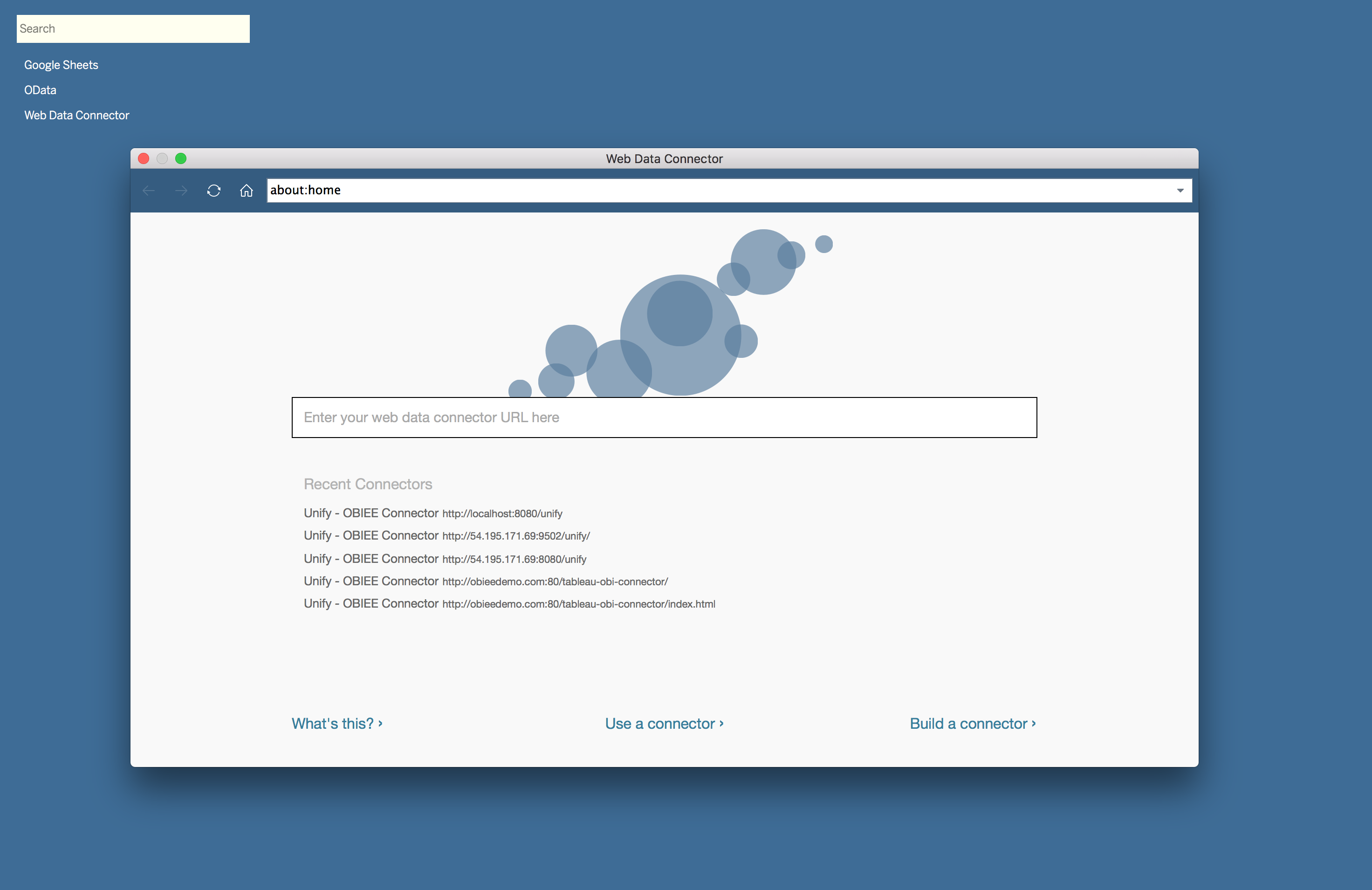
To start pulling data from OBIEE using Unify, we need to create a new Web Data Connector Data Source in Tableau. This data source will prompt us for a URL to access Unify. In this instance, Unify is installed as a desktop application, so the URL is http://localhost:8080/unify.
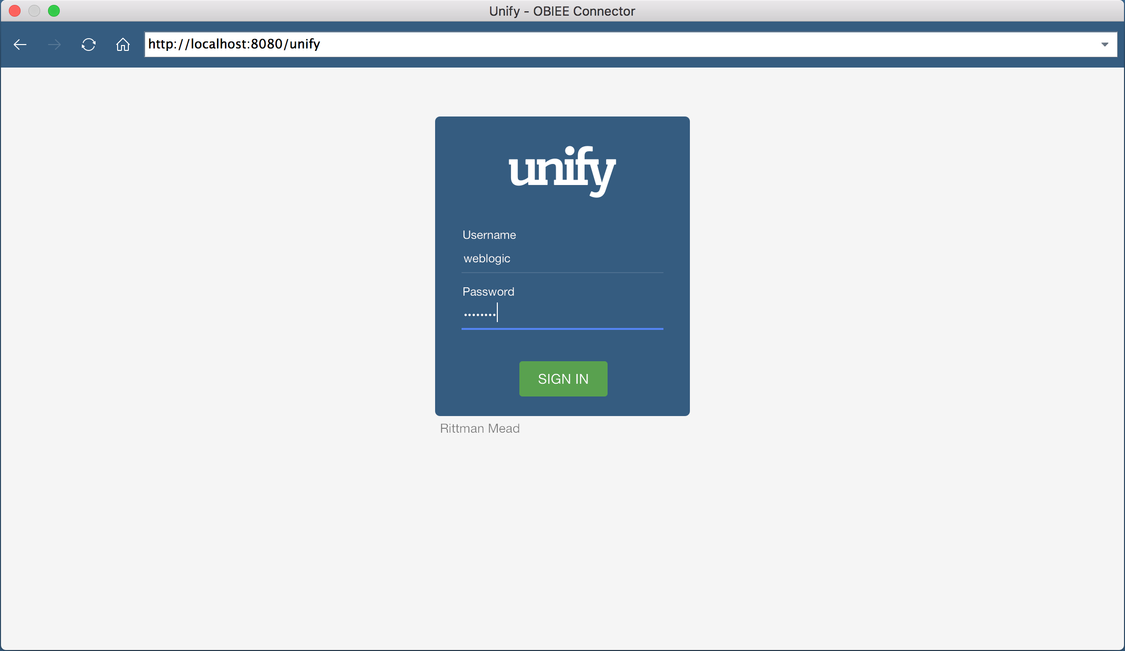
Once we put in the URL, we’re shown an authentication screen. This screen will allow us to authenticate against OBIEE using the same credentials. In this case, I will authenticate as the weblogic user.
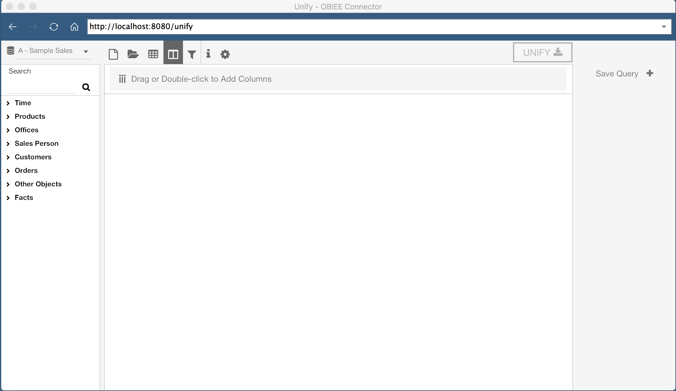
Once authenticated, we are welcomed by a window where we can construct an OBIEE query visually. On the left hand side of the application, I can select the Subject Area I wish to query, and users are shown a list of tables and columns in the selected Subject Area. There are additional options along the top of the window, and I can see all saved queries on the right hand side of the window.
The center of the window is where we can see the current query, as well as a preview of the query results. Since I have not started building a query yet, this area is blank.
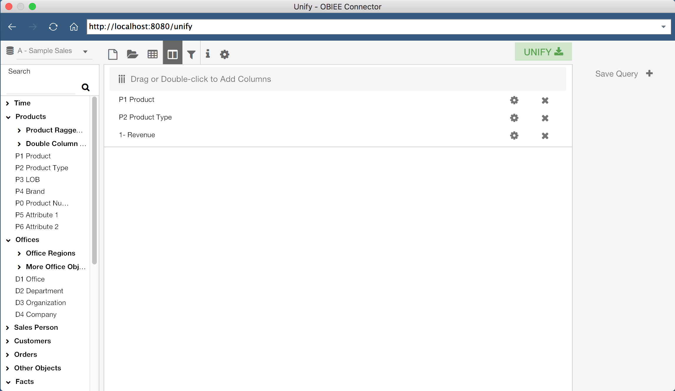
Unify allows us to either build a new query from scratch, or select an existing OBIEE report. First, let’s build our own query. The lefthand side of the screen displays the Subject Areas and Columns which I have access to in OBIEE. With a Subject Area selected, I can drag columns, or double click them, to add them to the current query. In the screenshot above, I have added three columns to my current query, “P1 Product”, “P2 Product Type”, and “1 - Revenue”.
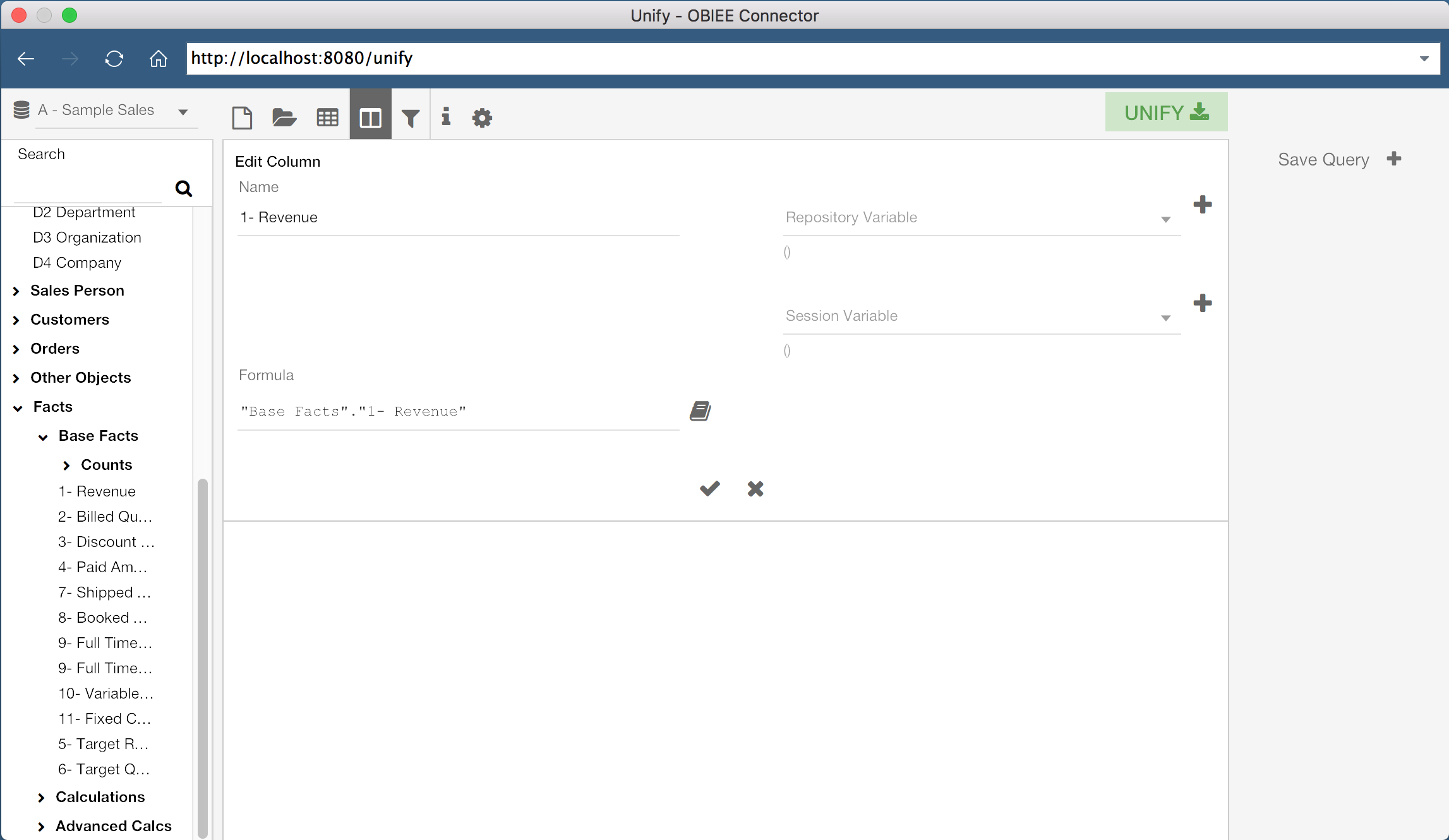
If we wanted to, we could also create new columns by defining a Column Name and Column Formula. We even have the ability to modify existing column formulas for our query. We can do this by clicking the gear icon for a specific column, or by double-clicking the grey bar at the top of the query window.
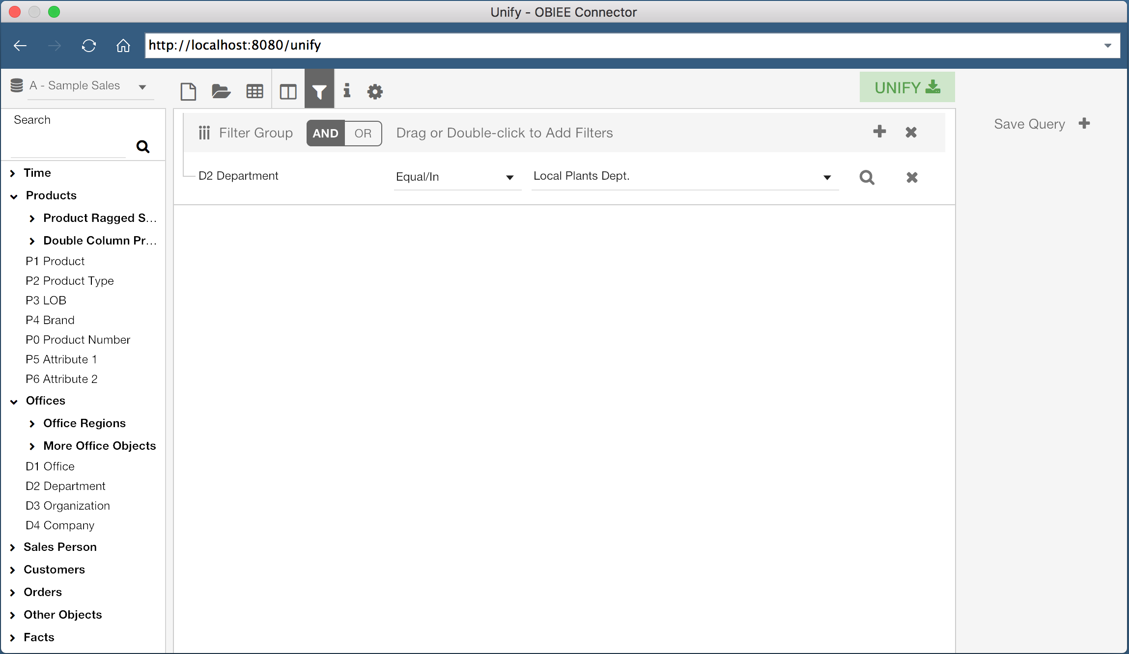
It’s also possible to add filters to our data set. By clicking the Filter icon at the top of the window, we can view the current filters for the query. We can then add filters the same way we would add columns, by double clicking or dragging the specific column. In the example shown, I have a query on the column “D2 Department” where the column value equals “Local Plants Dept.”.
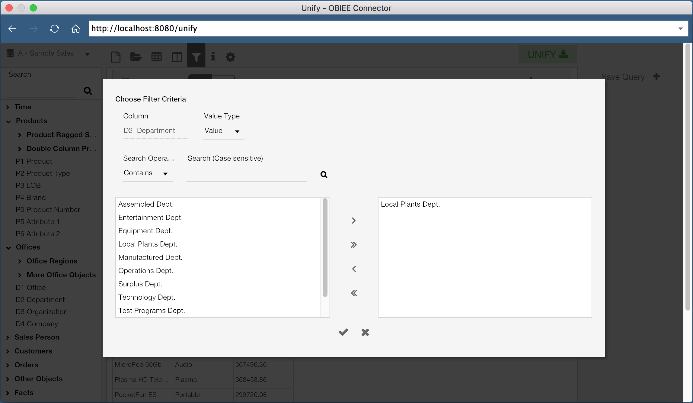
Filters can be configured using any of the familiar methods, such as checking if a value exists in a list of values, numerical comparisons, or even using repository or session variables.
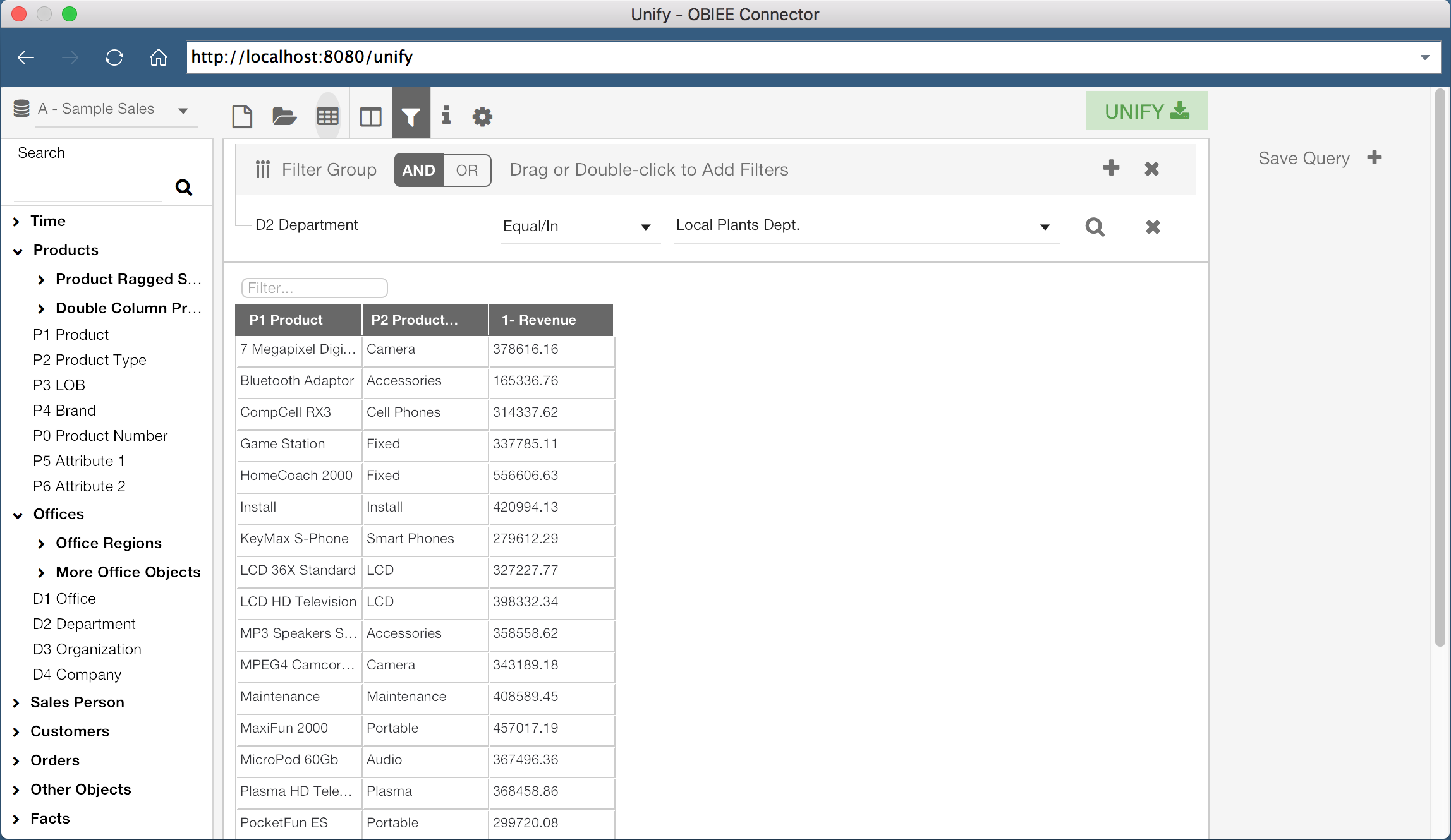
Now that we have our columns selected and our filters defined, we can execute this query and see a preview of the result set. By clicking the “Table” icon in the top header of the window, we can preview the result.
Once we are comfortable with the results of the query, we can export the results to Tableau. It is important to understand that the preview data is trimmed down to 500 rows by default, so don’t worry if you think something is missing! This value, and the export row limit, can be configured, but for now we can export the results using the green “Unify” button at the top right hand corner of the window.
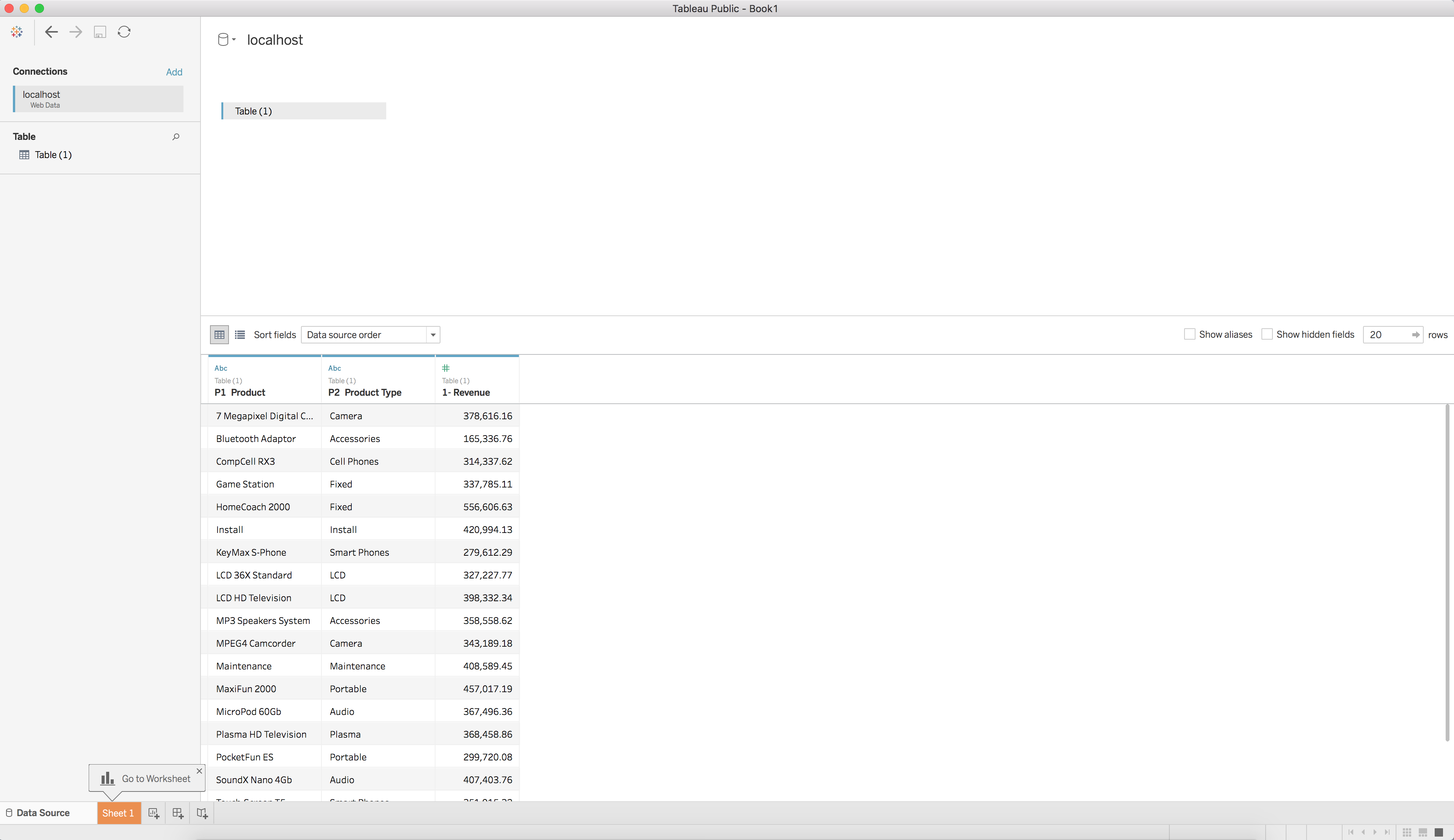
When this button is clicked, the Unify window will close and the query will execute. You will then be taken to a new Tableau Workbook with the results of the query as a Data Source. We can now use this query as a data source in Tableau, just as we would with any other data source.
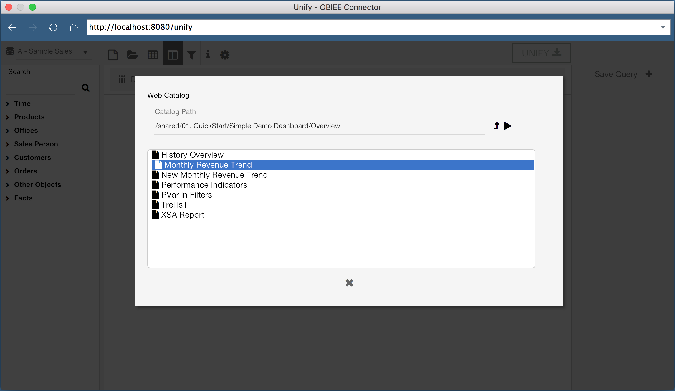
But what if we have existing reports we want to use? Do we have to rebuild the report from scratch in the web data connector? Of course not! With Unify, you can select existing reports and pull them directly into Tableau.
Instead of adding columns from the lefthand pane, we can instead select the “Open” icon, which will let us select an existing report. We can then export this report to Tableau, just as before.
Now let’s try to do something a little more complicated. OBIEE doesn’t have the capability to execute queries across Subject Areas without common tables in the business model, however Tableau can perform joins between two data sources (so long as we select the correct join conditions). We can use Unify to pull two queries from OBIEE from different Subject Areas, and perform a data mashup with the two Subject Areas in Tableau.
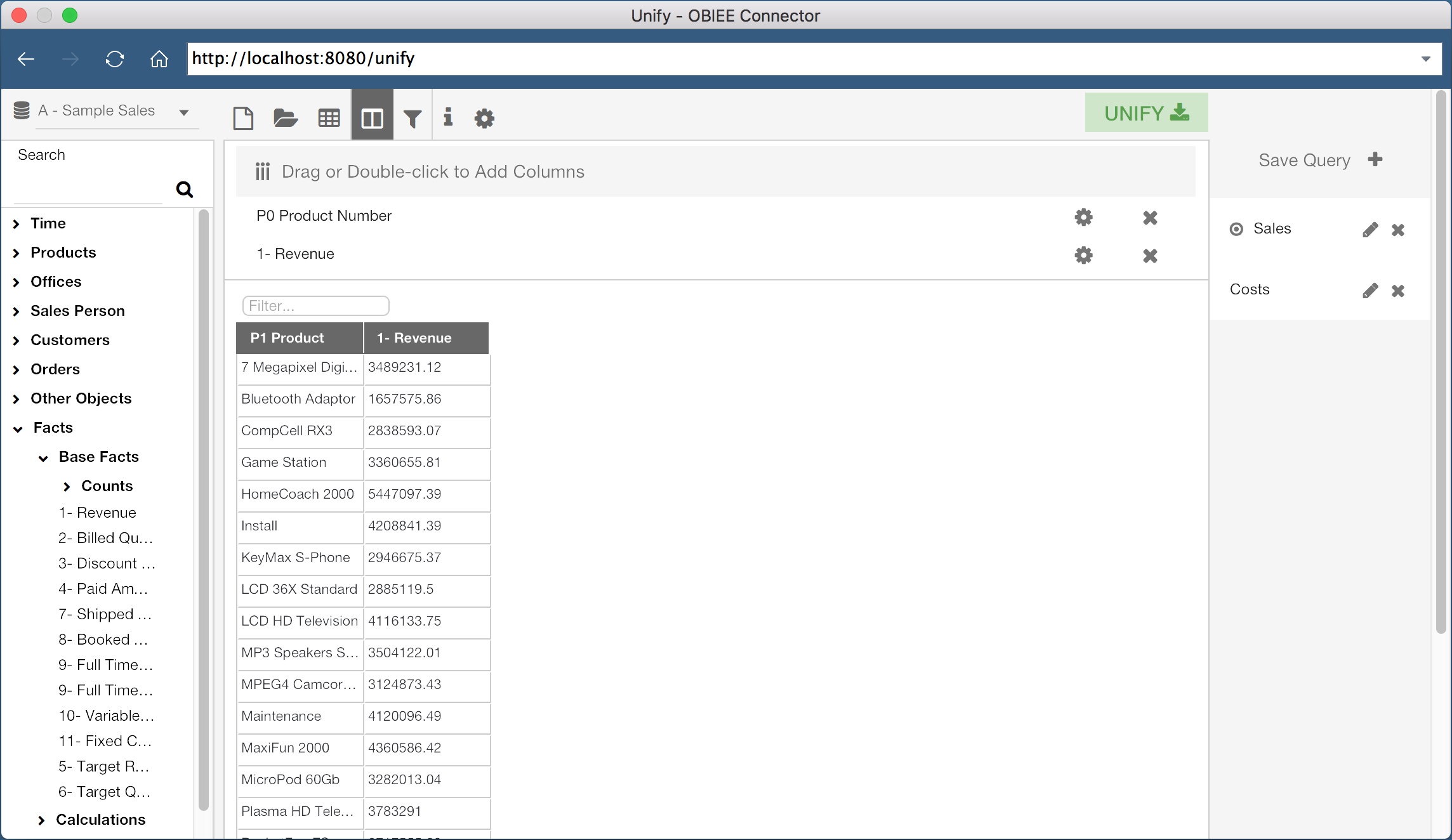
Here I’ve created a query with “Product Number” and “Revenue”, both from the Subject Area “A - Sample Sales”. I’ve saved this query as “Sales”. I can then click the “New” icon in the header to create a new query.
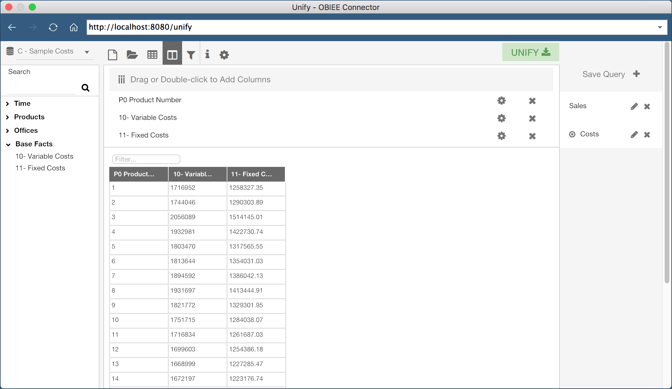
This second query is using the “C - Sample Costs” Subject Area, and is saved as “Costs”. This query contains the columns “Product Number”, “Variable Costs”, and “Fixed Costs”.
When I click the Unify button, both of these queries will be pulled into Tableau as two separate data sources. Since both of the queries contain the “Product Number” column, I can join these data sources on the “Product Number” column. In fact, Tableau is smart enough to do this for us:
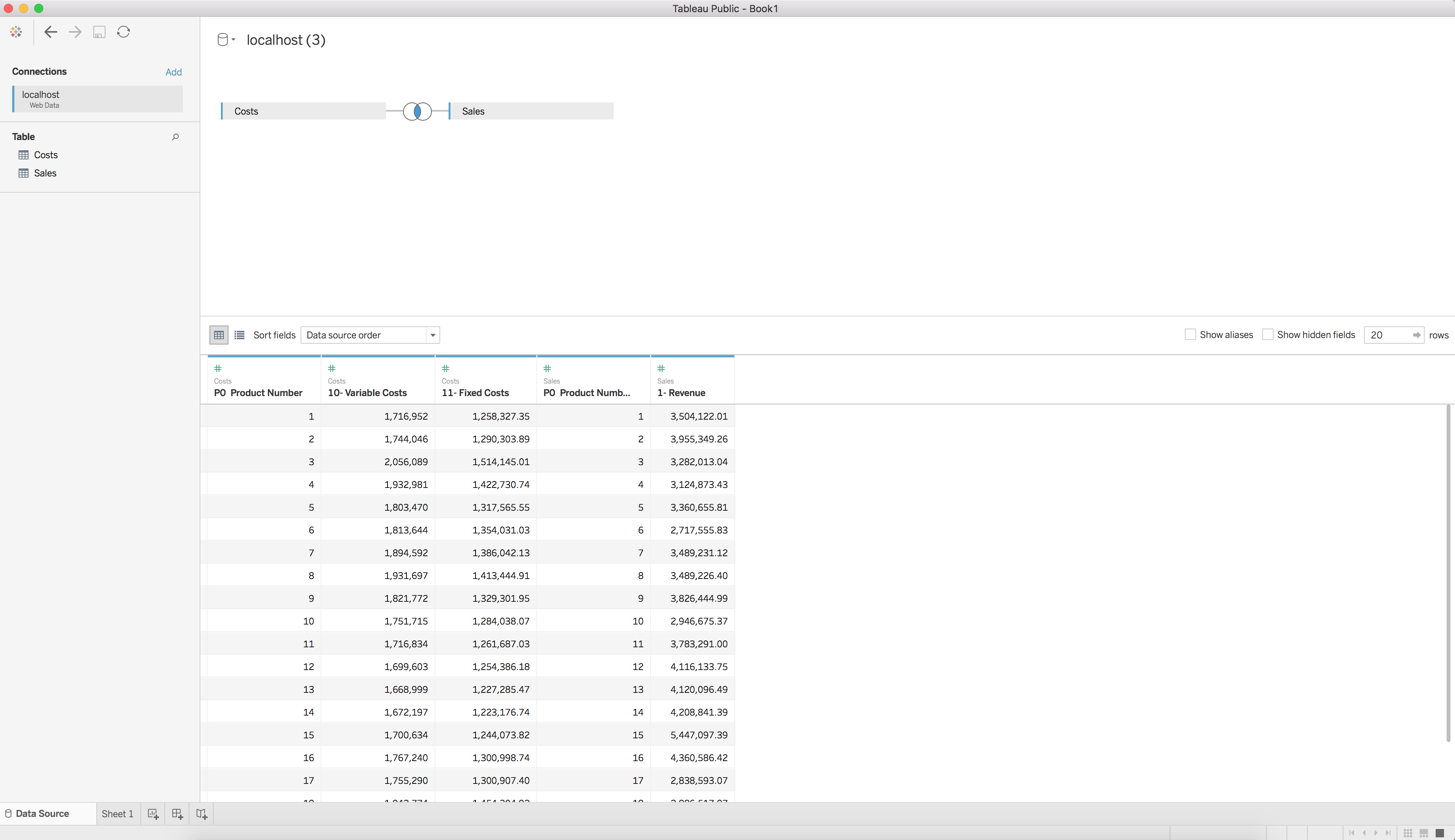
We now have two data sets, each from a different OBIEE subject area, joined and available for visualization in Tableau. Wow, that was easy!
What about refreshing the data? Good question! The exported data sources are published as data extracts, so all you need to do to refresh the data is select the data source and hit the refresh button. If you are not authenticated with OBIEE, or your session has expired, you will simply be prompted to re-authenticate.
Using Tableau to consume OBIEE data has never been easier. Rittman Mead’s Unify allows users to connect to OBIEE as a data source within a Tableau environment in an intuitive and efficient method. If only everything was this easy!
Interested in getting OBIEE data into Tableau? Contact us to see how we can help, or head over to https://unify.ritt.md to get a free Unify trial version.
OBIEE Component Status Notifications
At Rittman Mead, we often hear requests for features or solutions generally not provided by Oracle. These requests range from commentary functionality to custom javascript visualizations. There are many ways to implement these functionalities, but organizations often lack the in-house resources to engineer an acceptable solution.
Rittman Mead has the capability to engineer any solution desired, and in many cases, has already developed a solution. Many of our accelerators currently offered, such as Chit Chat or User Engagement, grew out of numerous requests for these features.
One of the more common requests we hear at Rittman Mead is for BI Administrators to receive notifications for the status of their OBIEE components. They want to be notified of the status of the system components throughout the day in a convenient manner, so any failures are recognized quickly.
This particular feature can easily be implemented with Rittman Mead's Performance Analytics service. However, Rittman Mead would like to publicly provide this capability independent of our accelerator. We have developed a small Python script to provide this functionality, and we would like to give this script to the community.
The provided script is available free of charge, and available under the MIT license. It has been tested on both OBIEE 11G and 12C environments, as well as on Windows and Linux operating systems. The rest of this blog will detail, at a high level, how the script works, and how to configure it correctly.
The script is available through our public Github repository here.
Script Output
First, let's clarify how we will gather the status of the components in the first place. Thankfully, OBIEE includes some scripts to display this information on both Linux and Windows. In 12C, the script is status.sh/status.cmd, and in 11G the primary command is opmnctl status.
When I execute this script on an OBIEE 12C OEL environment, I receive the following response:
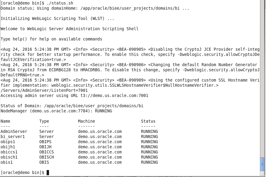
The output includes some extra information we don't require, but we can ignore it for now. With some programming knowledge, we can trim what we don't need, organize it into a nice table, and then send the output to nearly anywhere desired. For portability and stability, I will use Python to organize the message contents and I will also use email as the channel of communication.
Sending the Output Through Email
If we are only concerned with notifying administrators of the current status, one of the better avenues to send this data is through email. An email destination will allow users to be able to receive the status of the components almost instantaneously, and be able to take the appropriate action as soon as possible.
Additionally, Python's standard set of modules includes functions to assist in sending SMTP messages, making the script even more portable and maintainable. The simplest method to generate the email is just by sending the complete output as the body of the message. An example of this output is below:
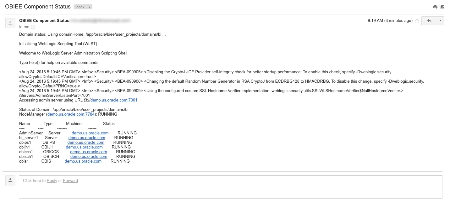
While this works, it's not exactly attractive. With some Python and HTML/CSS skills, we can style the email to look much nicer:
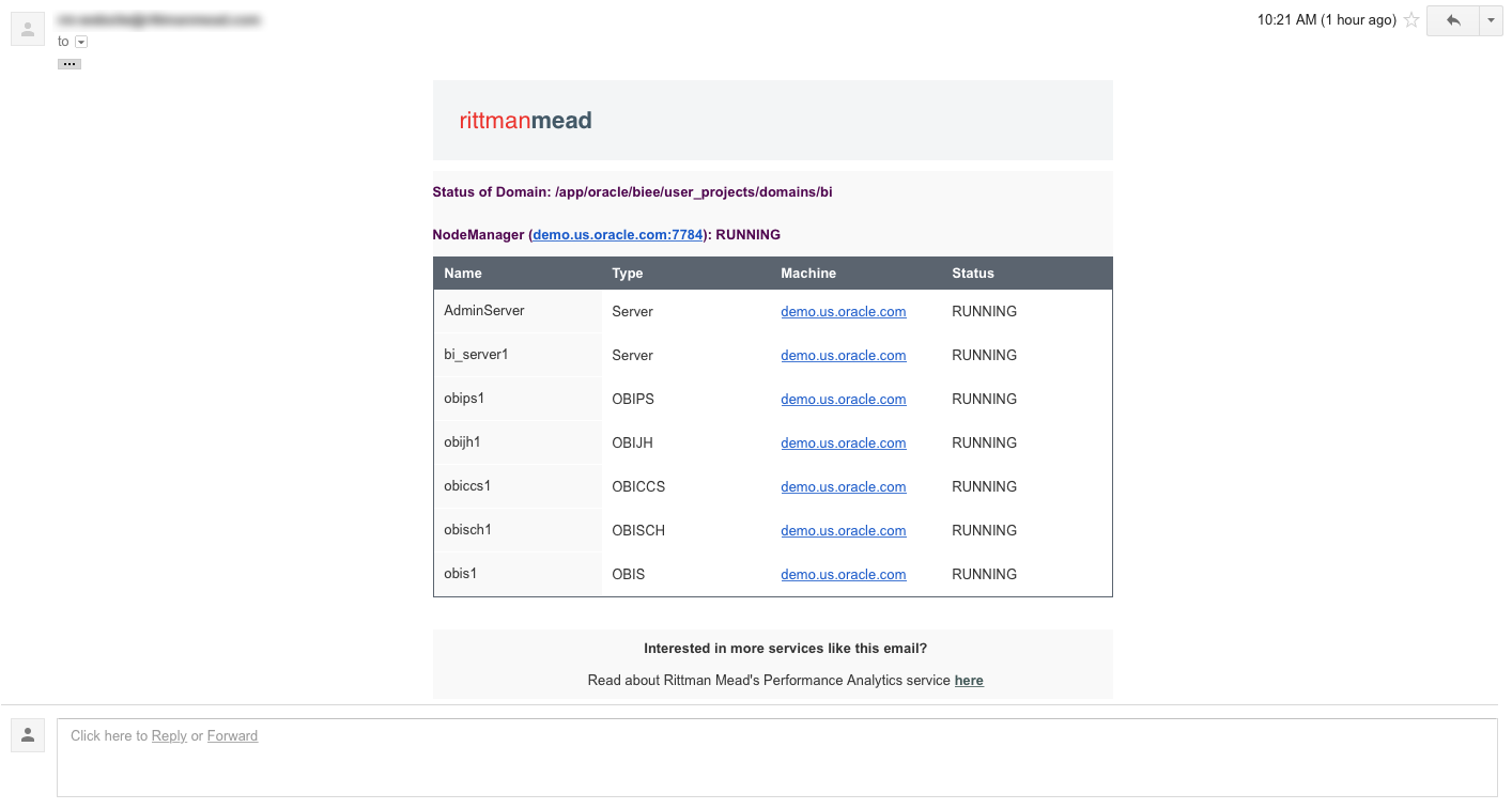
Now we have something nice we can send BI Administrators to show the status of the components.
Configuration and Use
To effectively utilize this script, you will have to change some of the configuration parameters, located at the top of the script. The parameters I am using are shown below (with sensitive information hidden, of course):
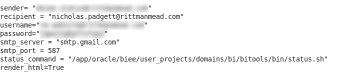
The sender and username fields should both be the user you are logging in as on the SMTP server to send the email. If you want the email address shown on a message to be different than the user configured on the SMTP server, then these can be set separately. The password field should be the password for the user being configured on the SMTP server.
The recipient field should be the address of the user who will be receiving the emails. For simple management, this should be a single user, who should then be configured to forward all incoming status emails to the responsible parties. This will allow easier maintenance, since modifying the list of users can take place in the email configuration, rather than the script configuration. In this example, I am just sending the emails to my Rittman Mead email address.
The SMTP settings should also be updated to reflect the SMTP server being utilized. If you are using Gmail as the SMTP server, then the configuration shown should work without modifications.
Finally, the python script requires the absolute path to the status command to execute to produce the output (the opmnctl or status commands). Environment variables may not be taken into consideration by this script, so it's best to not use a variable in this path.
NOTE: If the \ character is in the path, then you MUST use \\ instead. This is especially true on Windows environments. If this change is required but omitted, the script will not function properly.
Additionally, if you don't care about the HTML output (or if it doesn't render nicely in your email client), then it can be disabled by setting the value of render_html to False. If, for some reason, the nice HTML fails to render, then the email will just send the plain text output, instead of failing to deliver an email at all.
Once configured, try executing the script:
python email_component_status.py
If everything worked correctly, then you should have received an email with the status of the components. If you do not receive an email, then you should check both the configuration settings, and the internet connection of the machine (firewalls included). The script will also generate output that should assist you in troubleshooting the cause of the problem.
Additional Notifications or Destinations
The solution provided, while useful, is not perfect. What if you want to send this information to a destination other than an email address, such as a ticketing system like Atlassian JIRA? Or what if you want notifications based on other situations, such as slow running reports, or high CPU usage?
There may be many situations in which you would want one, or several, employees to receive different notifications based on events or circumstances that occur in your OBIEE environment. The script in this blog post only provides one of these notifications, but implementing many more will quickly become burdensome.
As part of Rittman Mead's Performance Analytics offering, we include custom software and code to fulfill this requirement. In addition to providing dashboards to explore the performance of your OBIEE systems, Performance Analytics can be configured to distribute alerts, based on any quantifiable condition, to any number of external systems.
The full Performance Analytics suite can not only alert users of down system components, but of any number of conditions that may occur in your BI environment.
If you have questions about this script, Performance Analytics, or anything else Contact Us here.
To find out more about Performance Analytics, contact us, visit the product page here, or read some of the fantastic blogs from Robin Moffatt.
A Case for Essbase and Oracle Data Visualization
So it’s the end of the month, or maybe even the end of the quarter. And you’ve found yourself faced, yet again, with the task of pulling whatever data will be needed to produce the usual standardized budgetary and / or finance reports. You’re dreading this as it will probably eat up most of your day just getting the data you need, combing through it to find the metrics you need, and plugging them into your monumentally complicated custom spreadsheet, only to find the numbers are, well, off.

Enter Data Visualization (DV), and its lightweight brother application, Data Visualization Desktop (DVD). My bud at RM, Matt Walding, already did a pretty great post on some of the cursory features of DVD, covering a lot of the important how-tos and what’s whats. So check that out if you need a bit of a walkthrough. Both of these great tools tout that you can go from zero to analysis pretty darn quick, and from the extensive testing and prodding we’ve done with both DV and DVD, this claim is accurate. Now how does this help us, however, in the previous scenario? Well, IT processes being what they are in a lot of mid to large size companies, getting the data we need, to do the crunching we need to do, can be quite the monumental task, let alone the correct data. So when we get it, we are going to want a solution that can take us from zero to report, pretty darn quick.
If you’re the one stuck with doing the crunching, and then providing the subsequent results, your solution or workflow probably resembles one of the following:
Scenario 1

Emailed a spreadsheet with a ton of rows. Download the csv/xlsx and then crunch the rows into something that you can force into a super spreadsheet that has a ton of moving pieces just waiting to throw an error.
Scenario 2

You have access to Essbase, which stays pretty fresh, especially as reporting time draws nigh. You connect to Smartview and extract what you need for your report. See scenario 1.
Scenario 3

You have OBIEE that you depend on for data dumps, and then just export whatever you need. See scenario 1.
While there are no doubt variations on these themes, the bigger picture here is that between the time you receive your dataset and the final report, there are likely a few iterations of said final report. Maybe you’re having to make corrections to your Excel templates, perhaps the numbers on your sheet just aren’t jiving. Whatever the case may be, this part of the process is often the one that can be the most demanding of your time, not to mention the most headache inducing. So what’s the point of my schpeal? Well, wouldn’t it be nice to expedite this part of the whole thing? Let’s take a look at how we can do just that with both Data Visualization in OBIEE and Data Visualization Desktop.
Data Visualization
With DV, we can simply access any of our existing OBIEE subject areas to quickly create a basic pivot table. Right away you can see the profound time savings garnered by using DV. What's more, you don't need to feel forced into managing OBIEE on premises, as DV is also part of BICS (Business Intelligence Cloud Service) and DVCS (Data Visualization Cloud Service).

Even if you have Smartview, and can do more or less the same thing, what if you wanted to delegate some of the tedium involved in manually crunching all those rows? You could simply hand off an export to another analyst, and have them plug it right into their own instance of Data Visualization Desktop, which, might I add, comes with your purchase of the DV license. This also, however, leads down the slippery slope into siloing off your department. This approach is essentially doing that, however kept under the quarantine that is DVD, as this blog is touting, and keeping the data with which you are working consistent, you shouldn't be able to do too much damage. The point I'm trying to make is that everything about using DV and DVD as your sort of report crafting and proofing mediums, is super-fluid and smooth. The process from source system to report and over and over again, is super-seamless. Even if I didn't have direct access to the data source I needed, and had to rely on emailed data dumps or other, I can simply upload that sheet right into DV, assign some data types, and get to work. I can even add dynamic filters to the analysis by simply dragging and dropping a column to the filters area. If you're feeling adventurous, you could also display these tables on a dashboard, that perhaps your department looks at to proof them and share in the pleasurable experience that is concocting period-end reporting.

![]()

Data Visualization Desktop
Right now, DVD is only out for Windows (with a version for the Mac on the roadmap), which is mostly ok, as most every medium to large size company I have worked with employs Windows as their go-to OS. An analyst can install the program on their desktop machine and be ready to plug away in under 10 minutes. We can take the example spreadsheet above that we dumped out of VA and create our own version of the report right in DVD. One better, we can also blend it with any other source DVD can connect to. This feature, especially, can save lots of time when trying to get your numbers just right for sign off.
Looks Just Like DV

Acts Just Like DV


And hold the phone! There's even a native Essbase connector!


Actually One Better Than DV!
Speaking of connectors, check out the rest of the list, as well as the custom data flow functionality, which allows you to construct and save in-app data transformations to be invoked again, and again, and again...

Summary
Flexibility is the name of the game with DV and DVD. So sure, while it isn't the ideal tool for creating precisely formatted financial statements for SEC submission, it sure beats massaging and munging all that data in Excel. And once we're happy with our numbers, either by sharing our reports on a dashboard, or export, we can go ahead and plug our numbers right into whatever tool we are going to use to produce the final product. We've covered a couple of really good concepts, so let's just do a bit of a wrap up to make everything a bit more cohesive.
We can pull data into Data Visualization from OBIEE, from a spreadsheet, or even mash up the two to handle any inconsistencies that may exist at month's/quarter's end. Note that we can also use Smartview to pull directly to Excel. Note that you will be unable to use the OLAP capabilities of Essbase / Essbase in OBIEE, as the data will presented in DV and DVD as flattened hierarchies.
We can share reports in Data Visualization with other analysts or approvers via a dashboard (note that this is not a supported feature, but something that requires only a 'bit' of a hack) or PDF, or hand off our exported data set for further work. This can be to another person using DV or DVD.
Data Visualization Desktop can connect directly to our Essbase source or utilize a data dump from DV / OBIEE to do further work and analysis on the data set. We can also connect DVD to OBIEE, as posted here, in order to extract an analysis from the web catalog. This will at least save us the step of dumping / emailing the report.
All of this app-to-app compatability encourages a sustainable, functional, and fluid reporting environment (warning: data silos!), especially for those who are unfamiliar with the ins and outs of Essbase and / or working with OBIEE.
What’s new in Training in 2017?
2016 - Thank you for a great year!
Rittman Mead would like to thank everyone that attended or showed an interest in our Training courses in 2016. Since we started back in 2007, Training has been a mainstay of our service offerings.
My personal opinion is that Q3 & Q4 saw the emergence of OBIEE 12c being properly adopted within the marketplace. It made sense for companies to wait for some of the bugs from earlier releases to be ironed out as well as waiting for clarity around the release of things such as Data Visualization Desktop.
It meant that we started to really see numbers pick up in our OBIEE 12c bootcamp. For the first time we’ve really tried to stress the fact that different parts of the course can be suitable for different people based on their everyday use of the product. This has led to more business focused end-users of OBIEE attending our training.
We love travelling and 2016 yet again took us to some amazing places to deliver courses to a variety of different clients. Locations we visited included South Africa, India, Sweden, Jamaica, Bulgaria and Ireland to name a few.
Finally we were really proud to release our new On Demand Training platform in December 2016 with our first online course, OBIEE 12c Front End Development & Data Visualization.

What’s new in 2017
We’re looking forward to another busy year in 2017 and it’s certainly already underway!!
Our public training schedule has been published with a number of courses available in OBIEE & ODI.
Here you can find the course dates for UK & Europe
And here you can find the courses available in the US
2017 will also see the release of some new courses including:
Advanced Analytics and Oracle R
We are seeing more and more investment in Predictive Analytics projects from companies looking to make as much value out of their data as possible.
Our 3 day course will teach you about the tools available & the techniques required to start or continue your Predictive Analytics journey.
From acquiring to tidying and transforming data, moving into the types of Predictive Models and how to the deploy them, our course will strengthen your knowledge and teach you valuable techniques.
The Advanced Analytics & Oracle R course will be available from March 2017, please get in touch for more details.
2017 will also see the refresh of our ODI 12c Bootcamp. There are some very handy new features in the latest version such as the Big Data Integration and also Lifecycle Management. We'll also be including some lessons on advanced techniques such as Groovy Scripting in ODI.
We’re looking forward to teaching these extra modules soon.
The new course will be released in Q2 2017.
On Demand Training
We will be adding more courses to our On Demand Training platform throughout 2017. We recognise the value of classroom instructor led training however we also understand that people have busy lives and that sometimes flexibility to learn at your own pace is important.
Our On Demand Training platform provides this opportunity whether you’re trying to reaffirm your learning post-classroom training or looking to learn a new skill for the first time.
Courses that will be added online in 2017 include OBIEE 12c RPD Modeling, OBIEE 12c Systems Management & Performance, OBIEE 11g Front End Development, ODI 12c Bootcamp, ODI 11g for BI Apps and many more….
For more information and updates, please head to our webpage