Tag Archives: Obiee
Unify – bringing together the best of both worlds
Since I started teaching OBIEE in 2011, I had the pleasure of meeting many fascinating people who work with Business Intelligence.
In talking to my students, I would generally notice three different situations:
Folks were heavy users of OBIEE, and just ready to take their skills to the next level.
They were happily transitioning to OBIEE from a legacy reporting tool, that didn’t have the power that they needed.
There were not-so-good times, like when people were being forced to transition to OBIEE. They felt that they were moving away from their comfort zone and diving into a world of complicated mappings that would first require them to become rocket scientists. They were resistant to change.
It was this more challenging crowd, that mostly sparked my interest for other analytics tools. I received questions like: “Why are we switching to another system? What are the benefits?”

I wanted to have a good answer to these questions. Over the years, different projects have allowed me the opportunity to work with diverse reporting tools. My students’ questions were always in mind: Why? And what are the benefits? So, I always took the time to compare/contrast the differences between OBIEE and these other tools.
I noticed that many of them did a fantastic job at answering the questions needed, and so did OBIEE. It didn’t take me long to have the answer that I needed: the main difference in OBIEE is the RPD!

The RPD is where so much Business Intelligence happens. There, developers spend mind boggling times connecting the data, deriving complex metrics and hierarchies, joining hundreds of tables, and making everything a beautiful drag and drop dream for report writers.
Yes, many other tools will allow us to do magic with metadata, but most of them require this magic to be redefined every time we need a new report, or the report has a different criteria. Yes, the RPD requires a lot of work upfront, but that work is good for years to come. We never lose any of our previous work, we just enhance our model. Overtime, the RPD becomes a giant pool of knowledge for a company and is impressively saved as a file.

For tapping into the RPD metadata, traditionally we have used BI Publisher and OBIEE. They are both very powerful and generally complement each other well. Other tools have become very popular in the past few years. Tableau is an example that quickly won the appreciation of the BI community and has kept consistent leadership in Gartner’s BI Magic quadrant since 2013. With a very slick interface and super fast reporting capability, Tableau introduced less complex methods to create amazing dashboards - and fast! So, what is there not to like? There is really so much TO like!
Going back to the comparing and contrasting, the main thing that Tableau doesn’t offer is… the RPD. It lacks a repository with the ability to save the join definitions, calculations and the overall intelligence that can be used for all future reports.
At Rittman Mead, we’ve been using these tools and appreciate their substantial capabilities, but we really missed the RPD as a data source. We wanted to come up with a solution that would allow our clients to take advantage of the many hours they had likely already put into metadata modeling by creating a seamless transition from OBIEE’s metadata layer to Tableau.

This past week, I was asked to test our new product, called Unify. Wow. Once again, I am so proud of my fellow coworkers. Unify has a simple interface and uses a Tableau web connector to create a direct line to your OBIEE repository for use in Tableau reports, stories and dashboards.
In Unify, we select the subject areas from our RPD presentation layer and choose our tables and columns as needed. Below is a screenshot of Unify using the OBIEE 12c Sample App environment. If you are not familiar with OBIEE 12c, Oracle provides the Sample App - a standalone virtual image with everything that you need to test the product. You can download the SampleApp here: http://www.oracle.com/technetwork/middleware/bi-foundation/obiee-samples-167534.html
We are immediately able to leverage all joins, calculated columns, hierarchies, RPD variables, session variables and that’s not all… our RPD security too! Yes, even row level security is respected when we press the “Unify” button and data is brought back into Tableau. So now, there is no reason to lose years of metadata work because one team prefers to visualize with Tableau instead of OBIEE.
Unify allows us to import only those data needed for the report, as we can utilize ‘in-tool’ filtering, keeping our query sets small, and our performance high.
In sum, Unify unites it all - have your cake and eat it too. No matter which tool you love the most, add them together and you will certainly love them both more.

Using Tableau to Show Variance and Uncertainty
Recently, I watched an amazing keynote presentation from Amanda Cox at OpenVis. Toward the beginning of the presentation, Amanda explained that people tend to feel and interpret things differently. She went on to say that, “There’s this gap between what you say or what you think you’re saying, and what people hear.”
While I found her entire presentation extremely interesting, that statement in particular really made me think. When I view a visualization or report, am I truly understanding what the results are telling me? Personally, when I’m presented a chart or graph I tend to take what I’m seeing as absolute fact, but often there’s a bit of nuance there. When we have a fair amount of variance or uncertainty in our data, what are some effective ways to communicate that to our intended audience?
In this blog I'll demonstrate some examples of how to show uncertainty and variance in Tableau. All of the following visualizations are made using Tableau Public so while I won’t go into all the nitty-gritty detail here, follow this link to download the workbook and reverse engineer the visualizations yourself if you'd like.
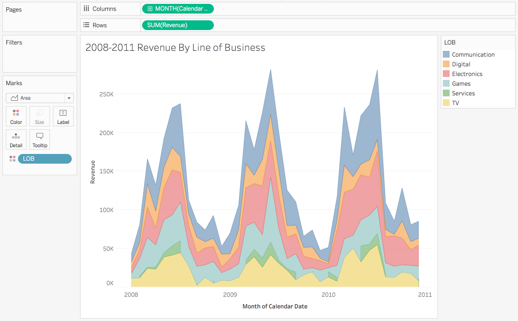
First things first, I need some data to explore. If you've ever taken our training you might recall the Gourmet Coffee & Bakery Company (GCBC) data that we use for our courses. Since I’m more interested in demonstrating what we can do with the visualizations and less interested in the actual data itself, this sample dataset will be more than suitable for my needs. I'll begin by pulling the relevant data into Tableau using Unify.
If you haven't already heard about Unify, it allows Tableau to seamlessly connect to OBIEE so that you can take advantage of the subject areas created there. Now that I have some data, let’s look at our average order history by month. To keep things simple, I’ve filtered so that we’re only viewing data for Times Square.
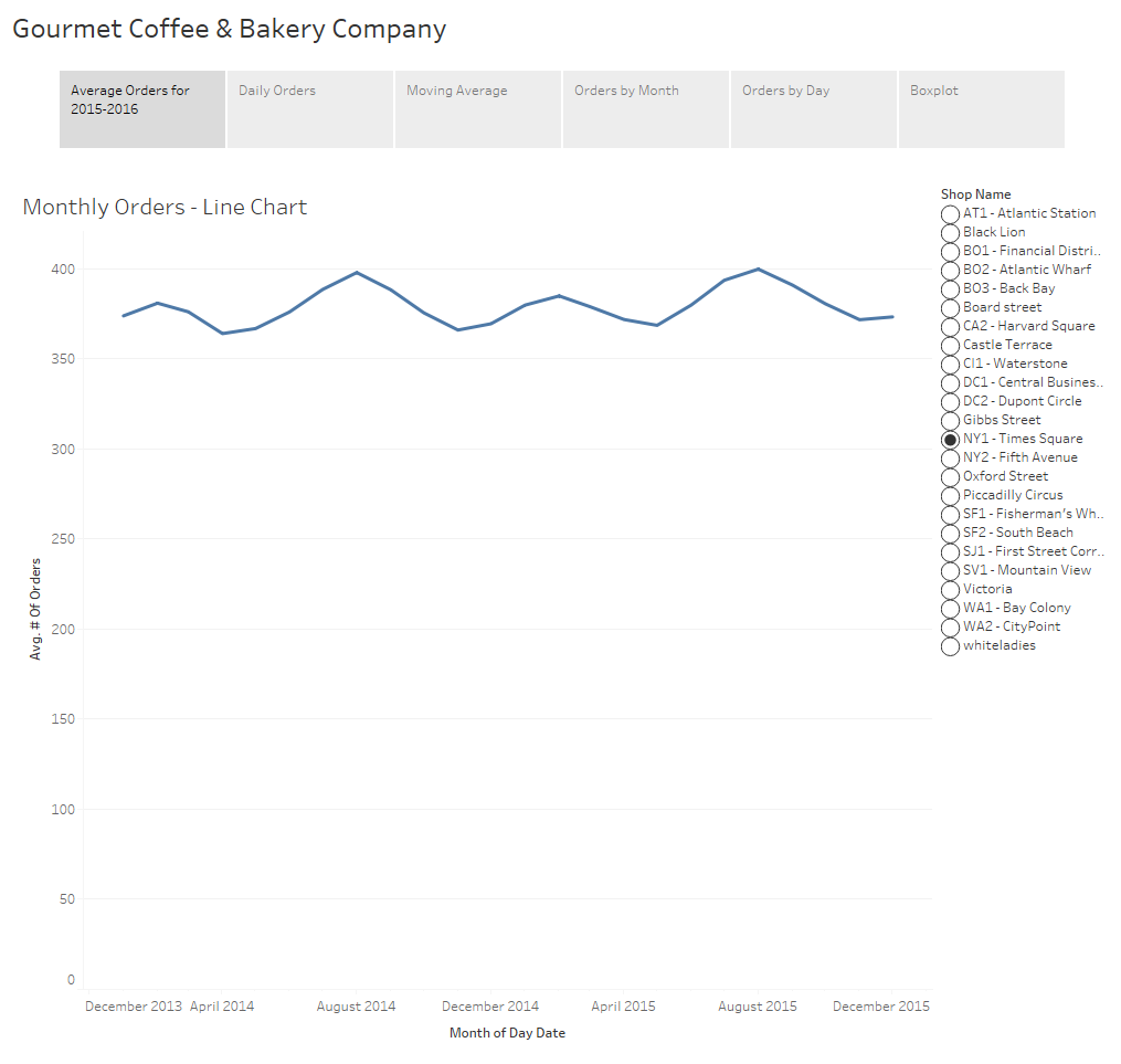
On this simple visualization we can already draw some insights. We can see that the data is cyclical with a peak early in the year around February and another in August. We can also visually see the minimum number of orders in a month appears to be about 360 orders while the maximum is just under 400 orders.
When someone asks to see “average orders by month”, this is generally what people expect to see and depending upon the intended audience a chart like this might be completely acceptable. However, when we display aggregated data we no longer have any visibility into the variance of the underlying data.
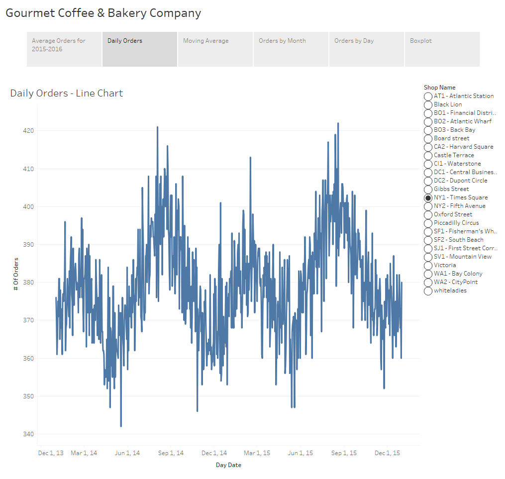
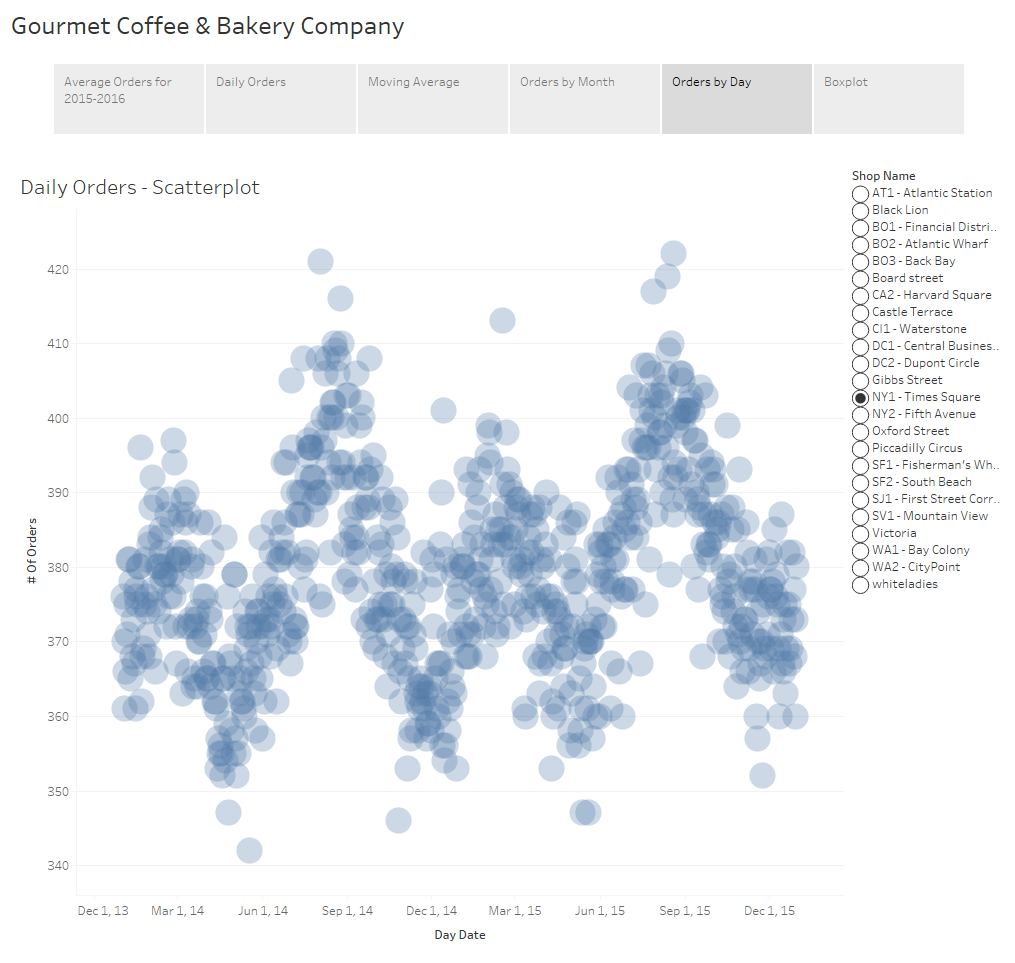
If we display the orders at the day level instead of month we can still see the cyclical nature of the data but we also can see additional detail and you’ll notice there’s quite a bit more “noise” to the data. We had a particularly poor day in mid-May of 2014 with under 350 orders. We’ve also had a considerable number of good days during the summer months when we cleared 415 orders.
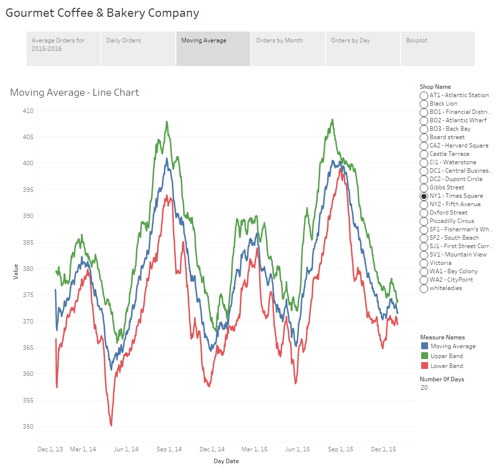
Depending upon your audience and the dataset, some of these charts might include too much information and be too busy. If the viewer can’t make sense of what you’re putting in front of them there’s no way they’ll be able to discern any meaningful insights from the underlying dataset. Visualizations must be easy to read. One way to provide information about the volatility of the data but with less detail would be to use confidence bands, similar to how one might view stock data. In this example I’ve calculated and displayed a moving average, as well as upper and lower confidence bands using the 3rd standard deviation. Confidence bands show how much uncertainty there is in your data. When the bands are close you can be more confident in your results and expectations.
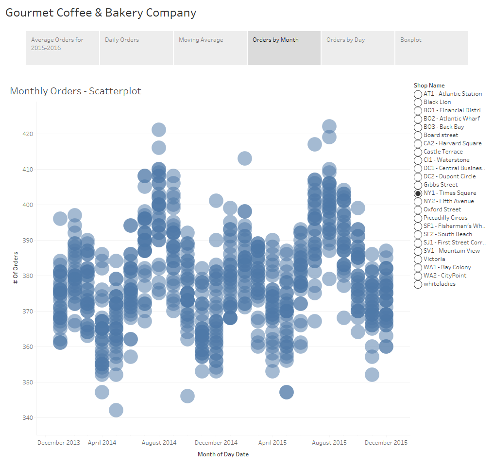
An additional option is the use of a scatterplot. The awesome thing about a scatterplots is that not only does it allow you to see the variance of your data, but if you play with the size of your shapes and tweak the transparency just right, you also get a sense of density of your dataset because you can visualize where those points lie in relation to each other.
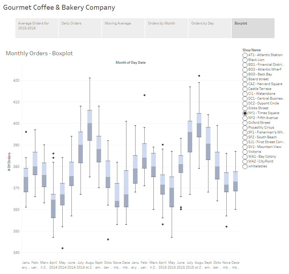
The final example I have for you is to show the distribution of your data using a boxplot. If you’re not familiar with boxplots, the line in the middle of the box is the median. The bottom and top of the box, known as the bottom and top hinge, give you the 25th and 75th percentiles respectively and the whiskers outside out the box show the minimum and maximum values excluding any outliers. Outliers are shown as dots.
I want to take a brief moment to touch on a fairly controversial subject of whether or not to include a zero value in your axes. When you have a non-zero baseline it distorts your data and differences are exaggerated. This can be misleading and might lead your audience into drawing inaccurate conclusions.

For example, a quick Google search revealed this image on Accuweather showing the count of tornados in the U.S. for 2013-2016. At first glance it appears as though there were almost 3 times more tornados in 2015 than in 2013 and 2014, but that would be incorrect.
On the flipside, there are cases where slight fluctuations in the data are extremely important but are too small to be noticed when the axis extends to zero. Philip Bump did an excellent job demonstrating this in his "Why this National Review global temperature graph is so misleading" article in the The Washington Post.
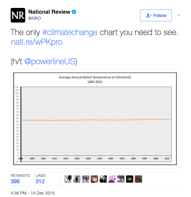
Philip begins his article with this chart tweeted by the National Review which appears to prove that global temperatures haven’t changed in the last 100 years. As he goes on to explain, this chart is misleading because of the scale used. The y-axis stretches from -10 to 110 degrees making it impossible to see a 2 degree increase over the last 50 years or so.
The general rule of thumb is that you should always start from zero. In fact, when you create a visualization in Tableau, it includes a zero by default. Usually, I agree with this rule and the vast majority of the time I do include a zero, but I don’t believe there can be a hard and fast rule as there will always be an exception. Bar charts are used to communicate absolute values so the size of that bar needs to be proportional to the overall value. I agree that bar charts should extend to zero because if it doesn’t we distort what the data is telling us. With line charts and scatterplots we tend to look at the positioning of the data points relative to each other. Since we’re not as interested in the value of the data, I don’t feel the decision to include a zero or not is as cut and dry.
The issue boils down to what it is you’re trying to communicate with your chart. In this particular case, I’m trying to highlight the uncertainty so the chart needs to draw attention to the range of that uncertainty. For this reason, I have not extended the axes in the above examples to zero. You are free to disagree with me on this, but as long as you’re not intentionally misleading your audience I feel that in instances such as these this rule can be relaxed.
These are only a few examples of the many ways to show uncertainty and variance within your data. Displaying the volatility of the data and giving viewers a level of confidence in the results is immensely powerful. Remember that while we can come up with the most amazing visualizations, if the results are misleading or misinterpreted and users draw inaccurate conclusions, what’s the point?
Unify: Could it be any easier?
Rittman Mead’s Unify is the easiest and most efficient method to pull your OBIEE reporting data directly into your local Tableau environment. No longer will you have to worry about database connection credentials, Excel exports, or any other roundabout way to get your data where you need it to be.
Unify leverages OBIEE’s existing metadata layer to provide quick access to your curated data through a standard Tableau Web Data Connector. After a short installation and configuration process, you can be building Tableau workbooks from your OBIEE data in minutes.
This blog post will demonstrate how intuitive and easy it is to use the Unify application. We will only cover using Unify and it’s features, as once the data gets into Tableau it can be used the same as any other Tableau Data Source. The environment shown already has Unify installed and configured, so we can jump right in and start using the tool immediately.
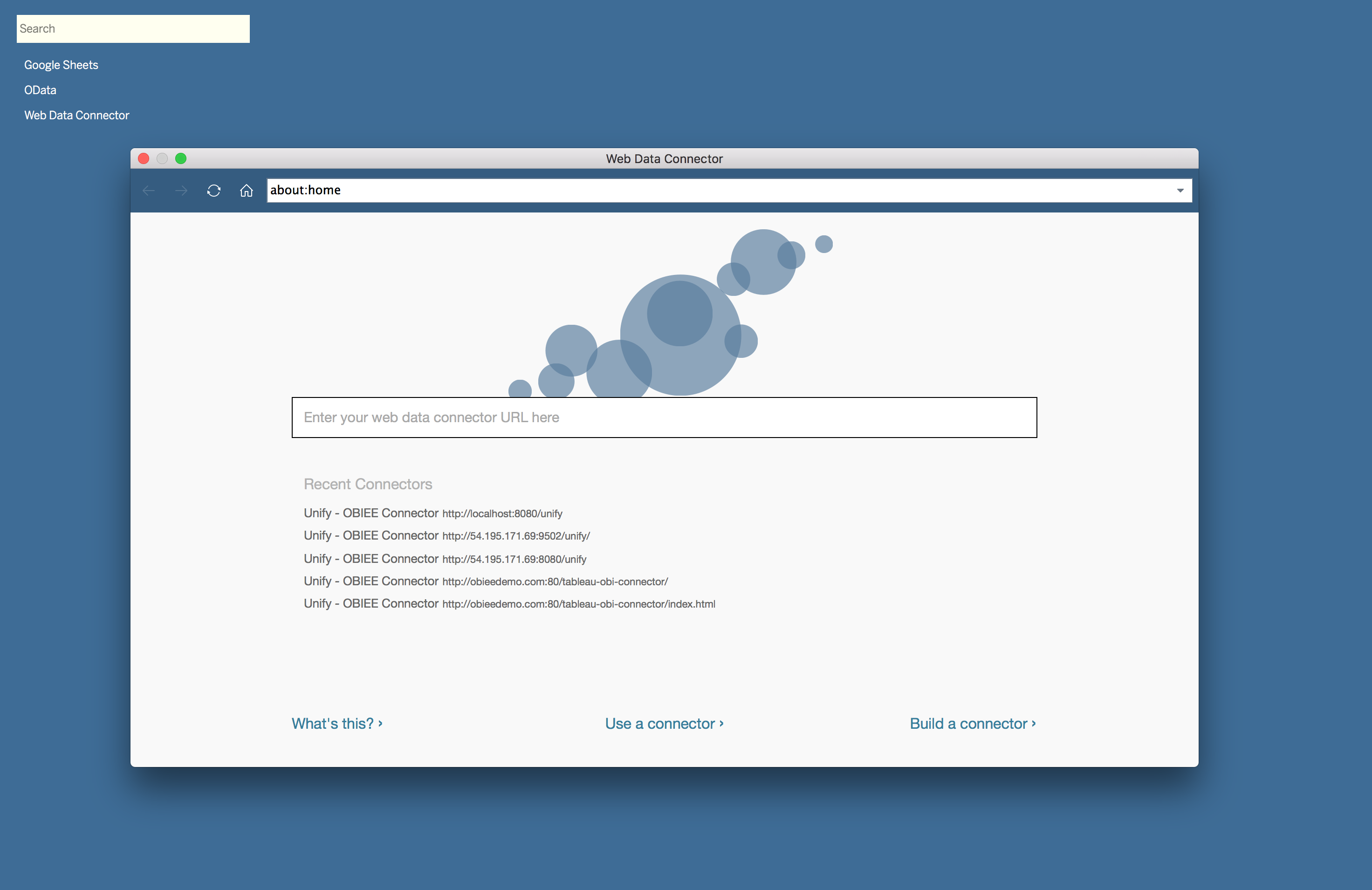
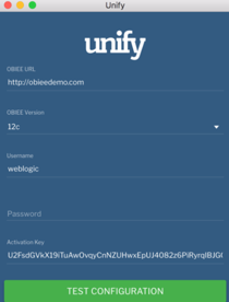
To start pulling data from OBIEE using Unify, we need to create a new Web Data Connector Data Source in Tableau. This data source will prompt us for a URL to access Unify. In this instance, Unify is installed as a desktop application, so the URL is http://localhost:8080/unify.
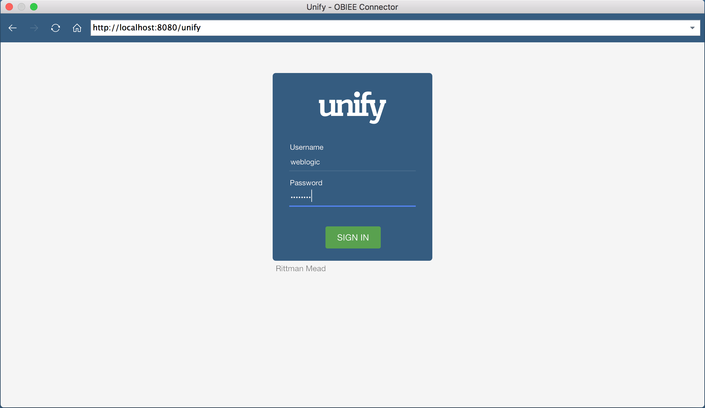
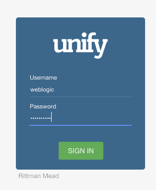
Once we put in the URL, we’re shown an authentication screen. This screen will allow us to authenticate against OBIEE using the same credentials. In this case, I will authenticate as the weblogic user.
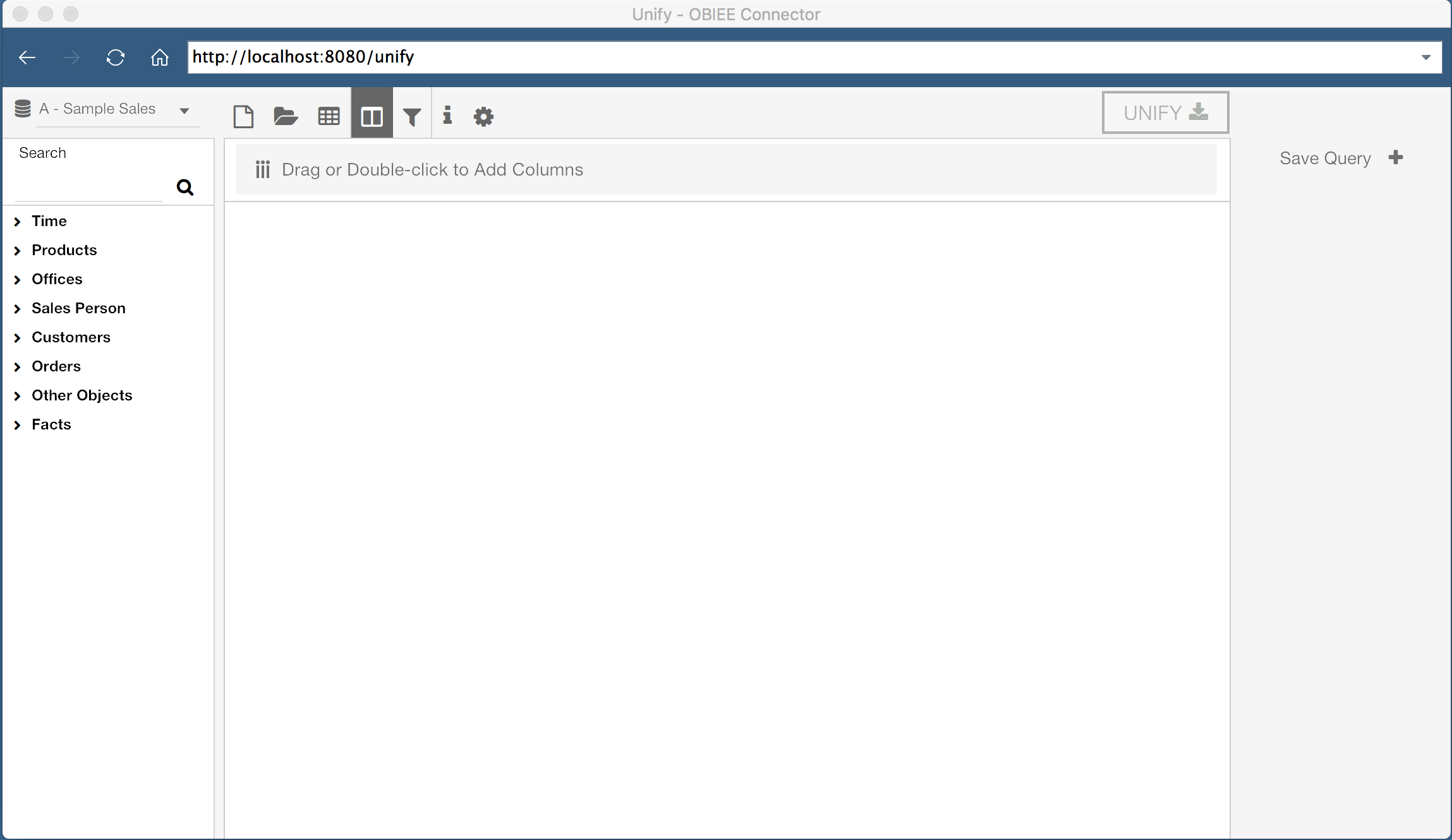
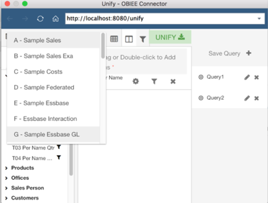
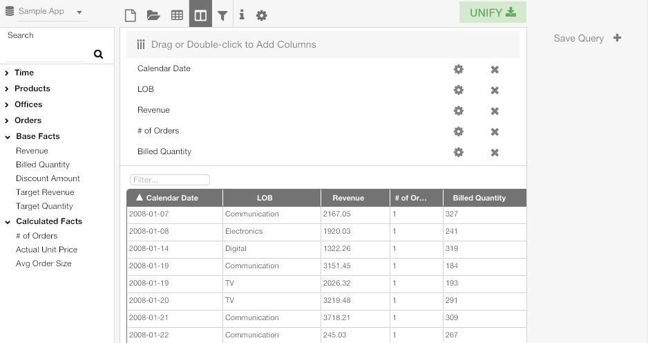
Once authenticated, we are welcomed by a window where we can construct an OBIEE query visually. On the left hand side of the application, I can select the Subject Area I wish to query, and users are shown a list of tables and columns in the selected Subject Area. There are additional options along the top of the window, and I can see all saved queries on the right hand side of the window.
The center of the window is where we can see the current query, as well as a preview of the query results. Since I have not started building a query yet, this area is blank.
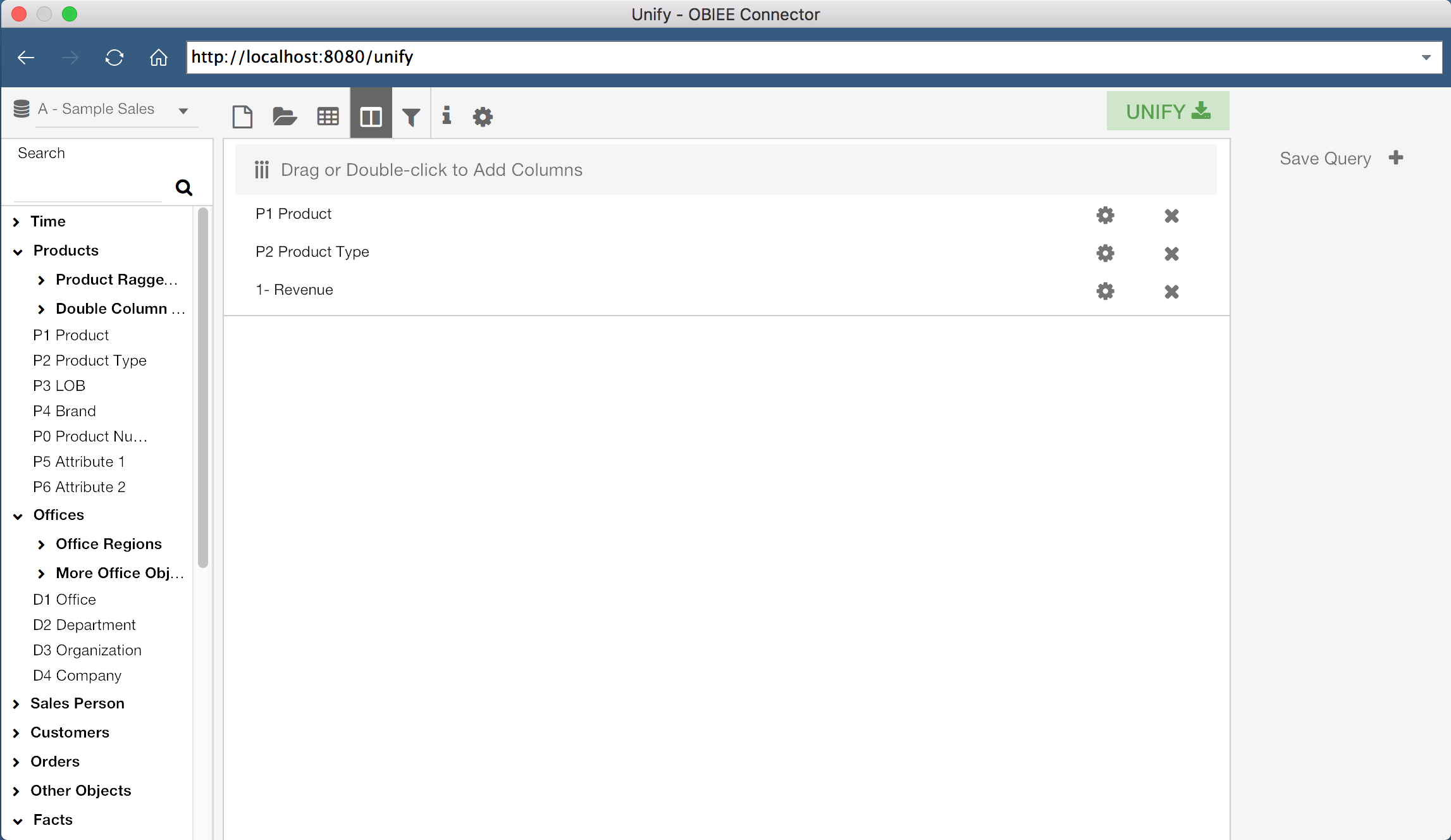
Unify allows us to either build a new query from scratch, or select an existing OBIEE report. First, let’s build our own query. The lefthand side of the screen displays the Subject Areas and Columns which I have access to in OBIEE. With a Subject Area selected, I can drag columns, or double click them, to add them to the current query. In the screenshot above, I have added three columns to my current query, “P1 Product”, “P2 Product Type”, and “1 - Revenue”.
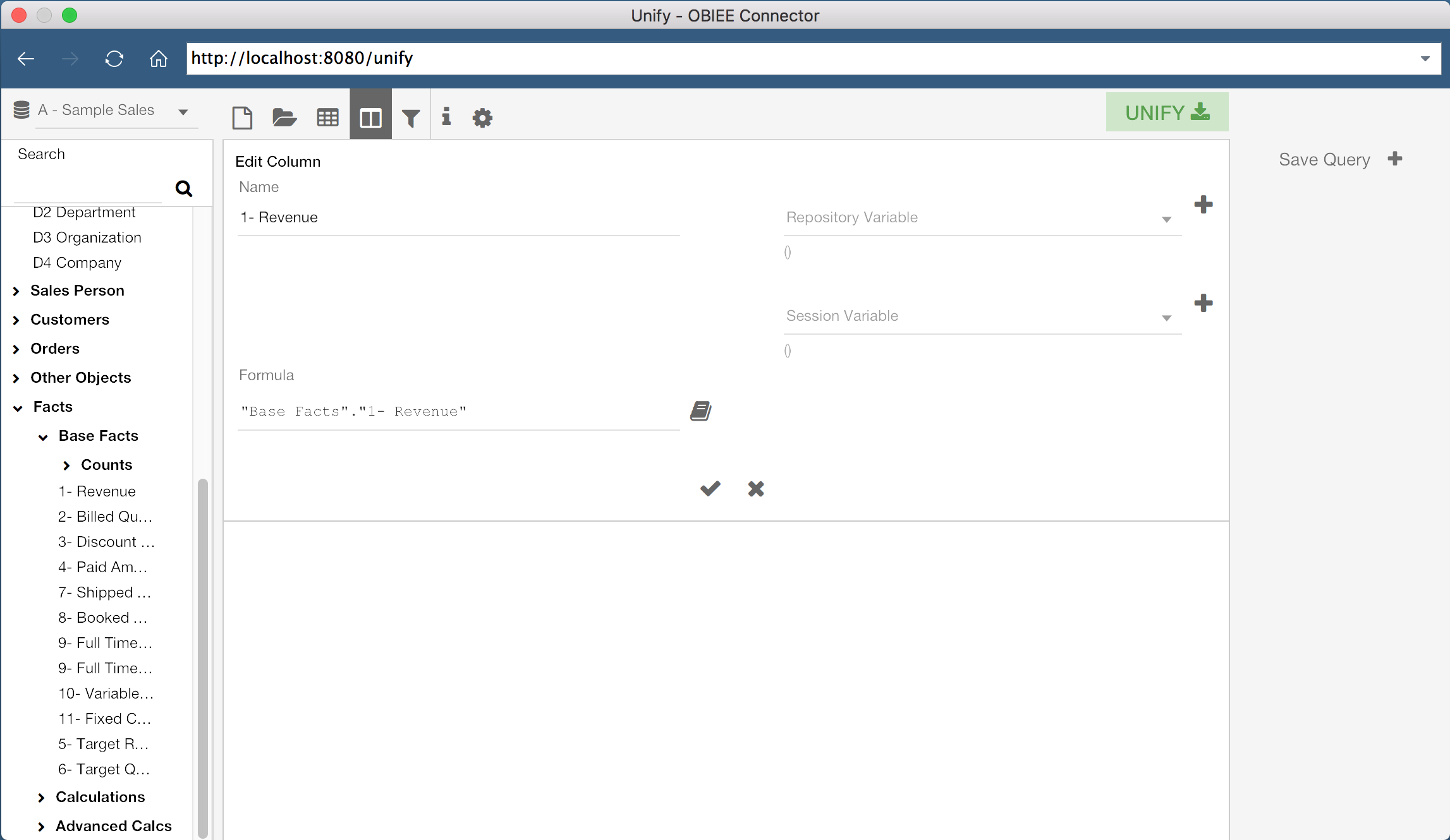
If we wanted to, we could also create new columns by defining a Column Name and Column Formula. We even have the ability to modify existing column formulas for our query. We can do this by clicking the gear icon for a specific column, or by double-clicking the grey bar at the top of the query window.
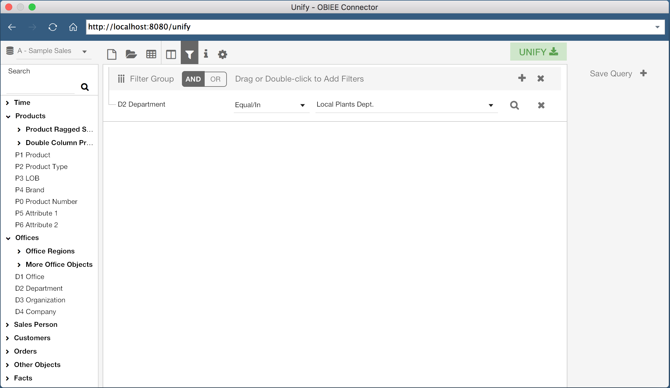
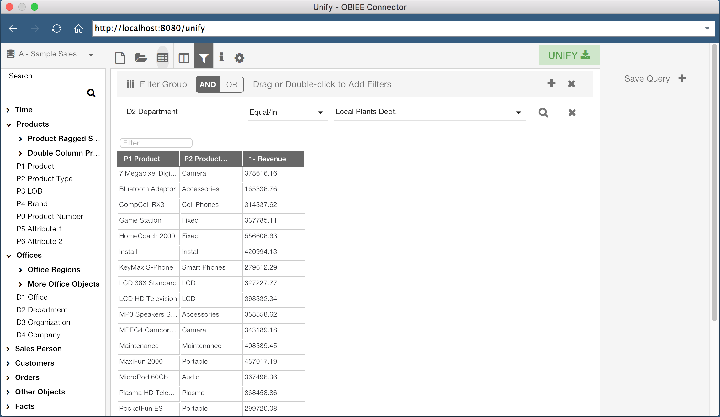
It’s also possible to add filters to our data set. By clicking the Filter icon at the top of the window, we can view the current filters for the query. We can then add filters the same way we would add columns, by double clicking or dragging the specific column. In the example shown, I have a query on the column “D2 Department” where the column value equals “Local Plants Dept.”.
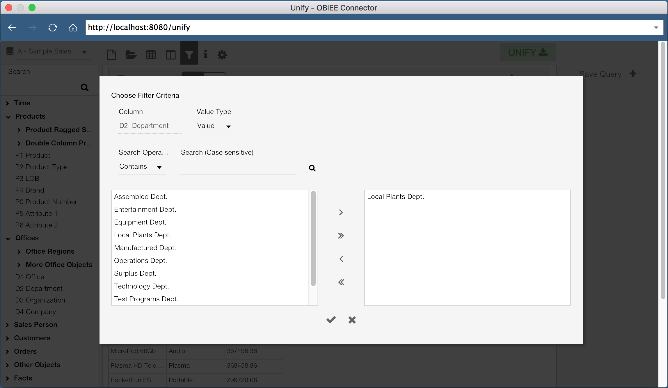
Filters can be configured using any of the familiar methods, such as checking if a value exists in a list of values, numerical comparisons, or even using repository or session variables.
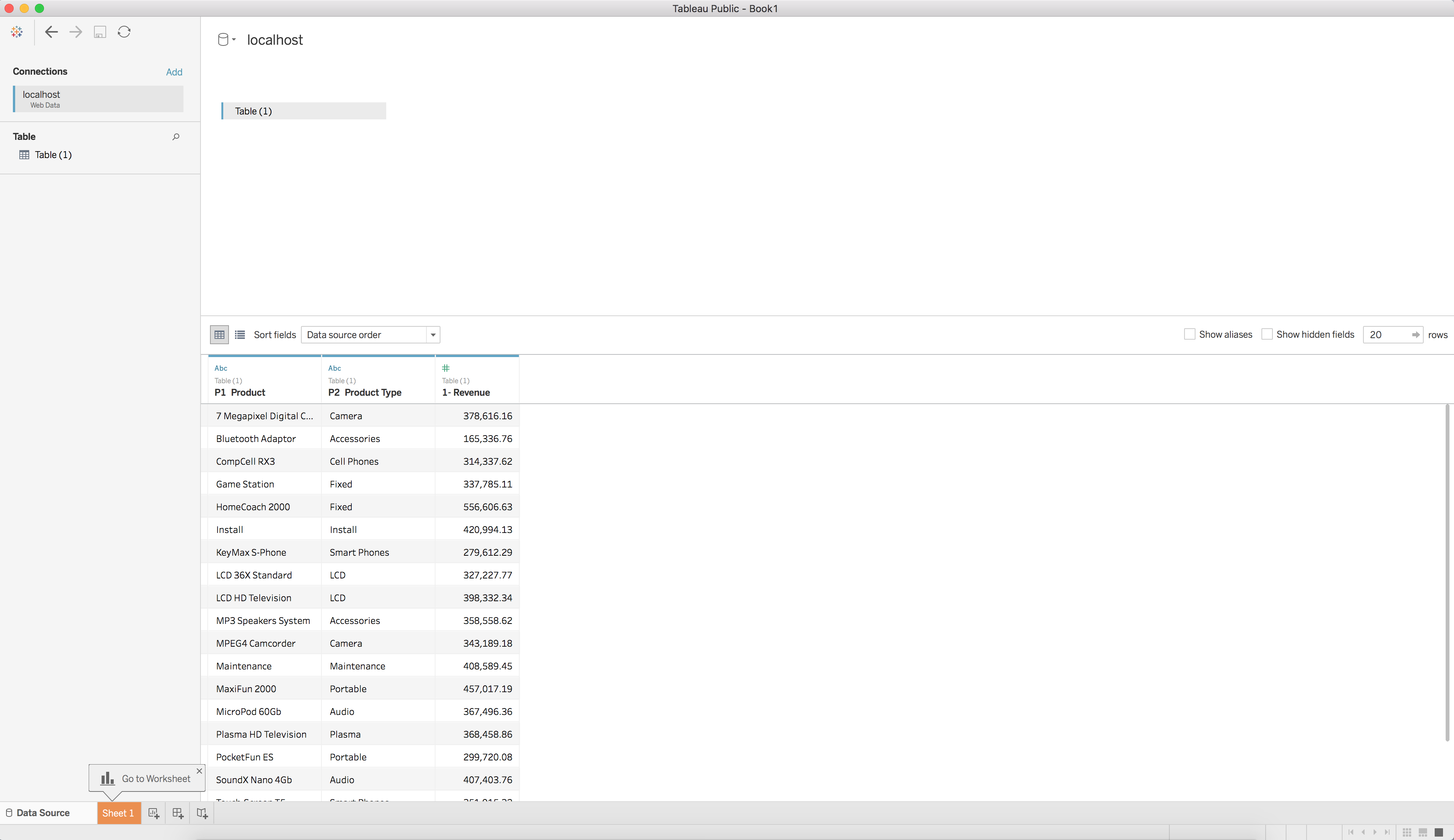
Now that we have our columns selected and our filters defined, we can execute this query and see a preview of the result set. By clicking the “Table” icon in the top header of the window, we can preview the result.
Once we are comfortable with the results of the query, we can export the results to Tableau. It is important to understand that the preview data is trimmed down to 500 rows by default, so don’t worry if you think something is missing! This value, and the export row limit, can be configured, but for now we can export the results using the green “Unify” button at the top right hand corner of the window.
When this button is clicked, the Unify window will close and the query will execute. You will then be taken to a new Tableau Workbook with the results of the query as a Data Source. We can now use this query as a data source in Tableau, just as we would with any other data source.
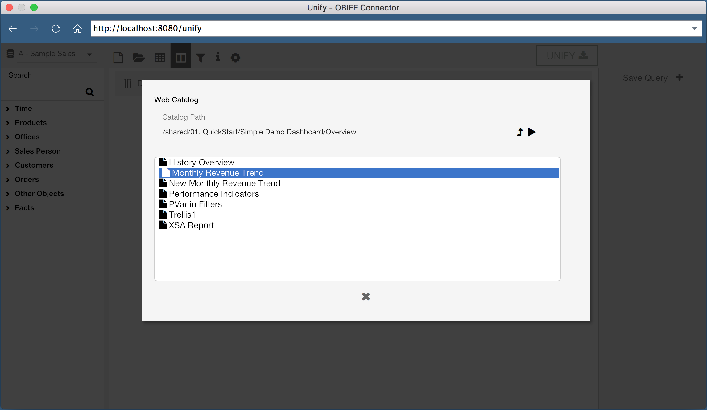
But what if we have existing reports we want to use? Do we have to rebuild the report from scratch in the web data connector? Of course not! With Unify, you can select existing reports and pull them directly into Tableau.
Instead of adding columns from the lefthand pane, we can instead select the “Open” icon, which will let us select an existing report. We can then export this report to Tableau, just as before.
Now let’s try to do something a little more complicated. OBIEE doesn’t have the capability to execute queries across Subject Areas without common tables in the business model, however Tableau can perform joins between two data sources (so long as we select the correct join conditions). We can use Unify to pull two queries from OBIEE from different Subject Areas, and perform a data mashup with the two Subject Areas in Tableau.
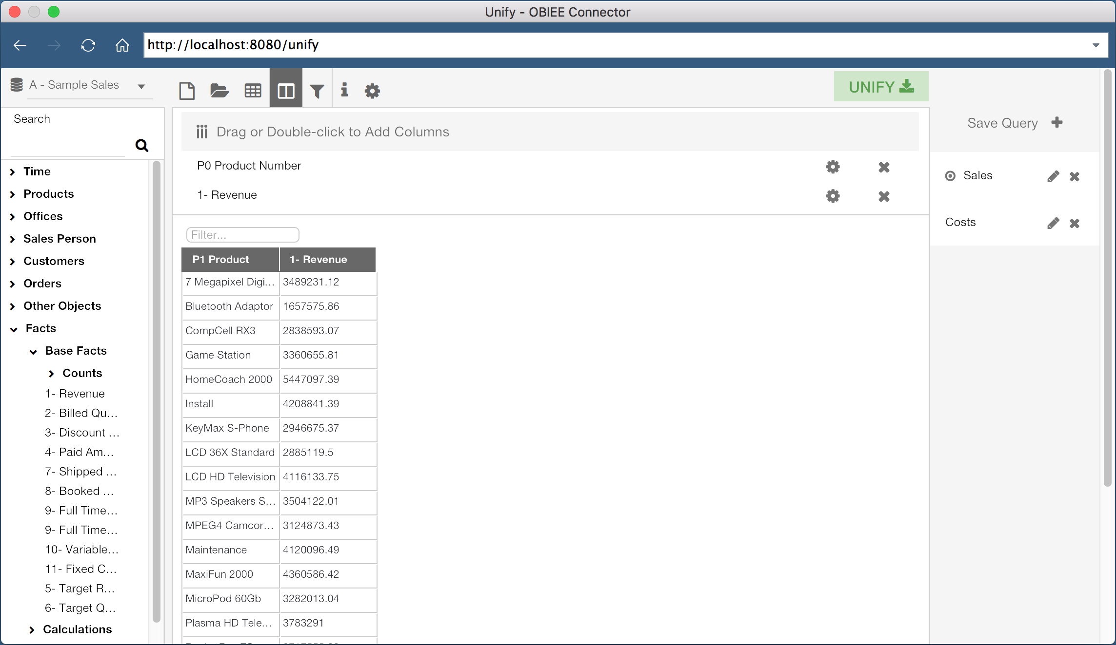
Here I’ve created a query with “Product Number” and “Revenue”, both from the Subject Area “A - Sample Sales”. I’ve saved this query as “Sales”. I can then click the “New” icon in the header to create a new query.
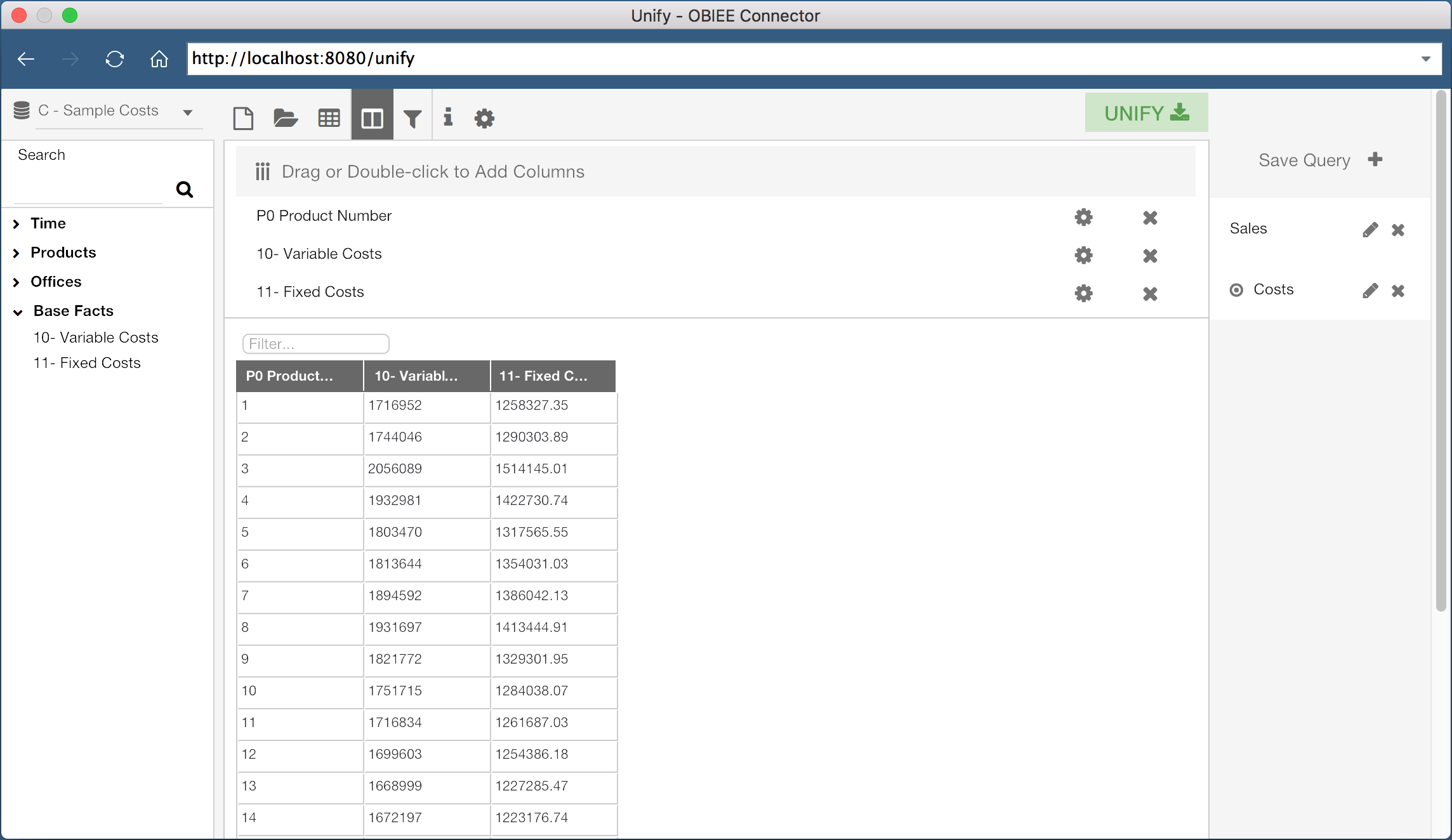
This second query is using the “C - Sample Costs” Subject Area, and is saved as “Costs”. This query contains the columns “Product Number”, “Variable Costs”, and “Fixed Costs”.
When I click the Unify button, both of these queries will be pulled into Tableau as two separate data sources. Since both of the queries contain the “Product Number” column, I can join these data sources on the “Product Number” column. In fact, Tableau is smart enough to do this for us:
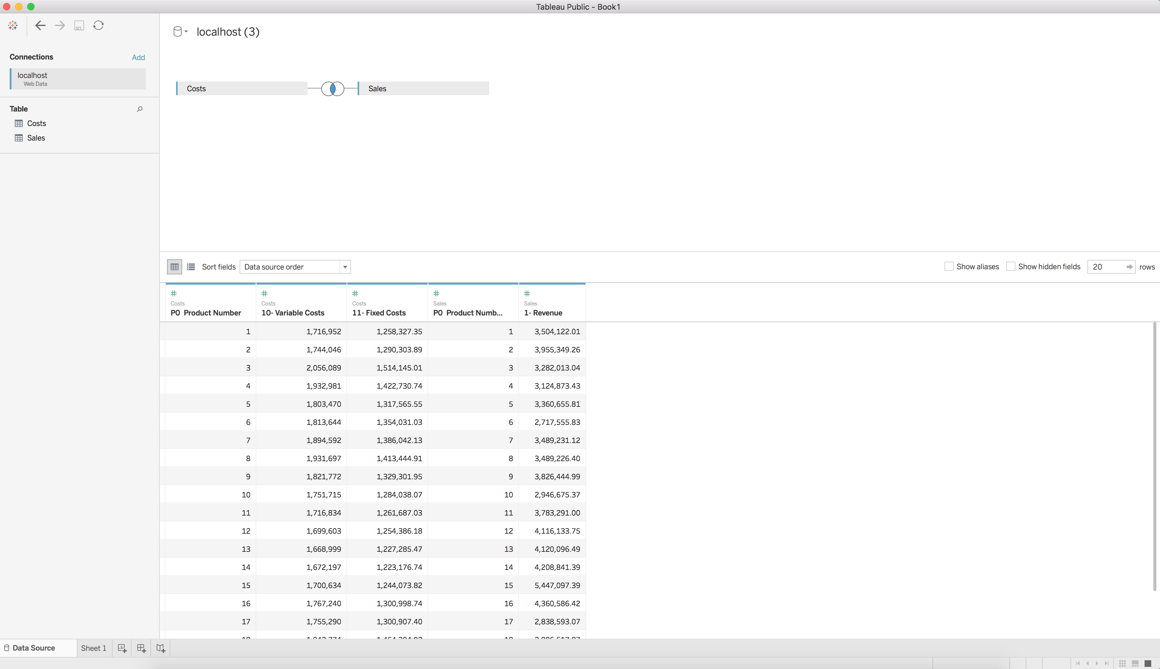
We now have two data sets, each from a different OBIEE subject area, joined and available for visualization in Tableau. Wow, that was easy!
What about refreshing the data? Good question! The exported data sources are published as data extracts, so all you need to do to refresh the data is select the data source and hit the refresh button. If you are not authenticated with OBIEE, or your session has expired, you will simply be prompted to re-authenticate.
Using Tableau to consume OBIEE data has never been easier. Rittman Mead’s Unify allows users to connect to OBIEE as a data source within a Tableau environment in an intuitive and efficient method. If only everything was this easy!
Interested in getting OBIEE data into Tableau? Contact us to see how we can help, or head over to https://unify.ritt.md to get a free Unify trial version.
Unify – An Insight Into the Product
Monday, 12 Jun saw the official release of Unify, Rittman Mead's very own connector between Tableau and OBIEE. It provides a simple but powerful integration between the two applications that allows you to execute queries through OBIEE and manipulate and render the datasets using Tableau.
Why We Made It
One of the first questions of course would be why we would want to do this in the first place. The excellent thing about OBI is that it acts as an abstraction layer on top of a database, allowing analysts to write efficient and secure reports without going into the detail of writing queries. As with any abstraction, it is a trade of simplicity for capability. Products like Tableau and Data Visualiser seek to reverse this trade, putting the power back in the hands of the report builder. However, without quoting Spiderman, care should be taken when doing this.
The result can be that users write inefficient queries, or worse still, incorrect ones. We know there will be some out there that use self service tools as purely a visualisation engine, simply dropping pre-made datasets into it. If you are looking to produce sustainable, scalable and accessible reporting systems, you need to tackle the problem both at the data acquisition stage as well as the communication stage at the end.
If you are already meeting both requirements, perhaps by using OBI with Data Visualiser (formerly Visual Analyser) or by other means then that's perfectly good. However, We know from experience that there are many of you out there that have already invested heavily into both OBI and Tableau as separate solutions. Rather than have them linger in a state of conflict, we'd rather we nurse them into a state of symbiosis.
The idea behind Unify is that it bridges this gap, allowing you to use your OBIEE system as an efficient data acquisition platform and Tableau as an intuitive playground for users who want to do a a bit more with their data. Unify works by using the Tableau Web Data Connector as a data source and then our customised software to act as an interface for creating OBIEE queries and them exporting them into Tableau.
How It Works
Unify uses Tableau's latest Web Data Connector data source to allow us to dynamically query OBIEE and extract data into Tableau. Once a dataset is extracted into Tableau, it can be used with Tableau as normal, taking advantages of all of the powerful features of Tableau. This native integration means you can add in OBIEE data sources just as you would add in any others - Excel files, SQL results etc. Then you can join the data sources using Tableau itself, even if the data sources don't join up together in the background.
First you open up Tableau and add a Web Data Connector source:
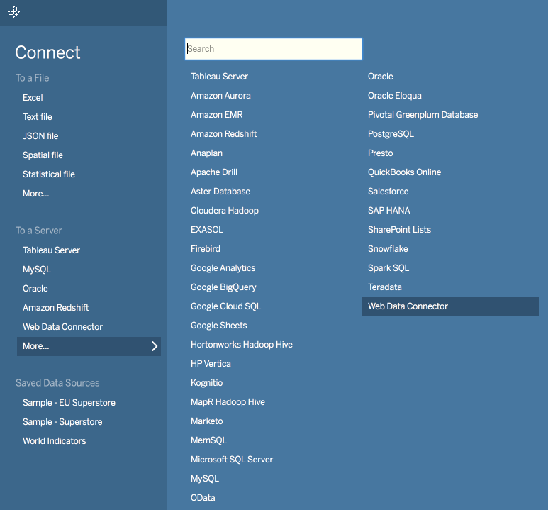
Then give the link to the Unify application, e.g. http://localhost:8080/unify. This will open up Unify and prompt you to login with your OBIEE credentials. This is important as Unify operates through the OBIEE server layer in order to maintain all security permissions that you've already defined.
Now that the application is open, you can make OBIEE queries using the interface provided. This is a bit like Answers and allows you to query from any of your available subject areas and presentation columns. The interface also allows you to use filtering, column formulae and OBIEE variables much in the same way as Answers does.
Alternatively, you can open up an existing report that you've made in OBIEE and then edit it at your leisure. Unify will display a preview of the dataset so you can tweak it until you are happy that is what you want to bring into Tableau.
Once you're happy with your dataset, click the Unify button in the top right and it will export the data into Tableau. From this point, it behaves exactly as Tableau does with any other data set. This means you can join your OBIEE dataset to external sources, or bring in queries from multiple subject areas from OBIEE and join them in Tableau. Then of course, take advantage of Tableau's powerful and interactive visualisation engine.
Unify Server
Unify comes in desktop and server flavours. The main difference between the two is that the server version allows you to upload Tableau workbooks with OBIEE data to Tableau Server and refresh them. With the desktop version, you will only be able to upload static workbooks that you've created, however with the server version of Unify, you can tell Tableau Server to refresh data from OBIEE in accordance with a schedule. This lets you produce production quality dashboards for your users, sourcing data from OBIEE as a well as any other source you choose.
Unify Your Data
In a nutshell, Unify allows you to combine the best aspects of two very powerful BI tools and will prevent the need for building all of your reporting artefacts from scratch if you already have a good, working system.
I hope you've found this brief introduction to Unify informative and if you have OBIEE and would like to try it with Tableau, I encourage you to register for a free desktop trial. If you have any questions, please don't hesitate to get in touch.
Unify – An Insight Into the Product
Monday, 12 Jun saw the official release of Unify, Rittman Mead's very own connector between Tableau and OBIEE. It provides a simple but powerful integration between the two applications that allows you to execute queries through OBIEE and manipulate and render the datasets using Tableau.
Why We Made It
One of the first questions of course would be why we would want to do this in the first place. The excellent thing about OBI is that it acts as an abstraction layer on top of a database, allowing analysts to write efficient and secure reports without going into the detail of writing queries. As with any abstraction, it is a trade of simplicity for capability. Products like Tableau and Data Visualiser seek to reverse this trade, putting the power back in the hands of the report builder. However, without quoting Spiderman, care should be taken when doing this.
The result can be that users write inefficient queries, or worse still, incorrect ones. We know there will be some out there that use self service tools as purely a visualisation engine, simply dropping pre-made datasets into it. If you are looking to produce sustainable, scalable and accessible reporting systems, you need to tackle the problem both at the data acquisition stage as well as the communication stage at the end.
If you are already meeting both requirements, perhaps by using OBI with Data Visualiser (formerly Visual Analyser) or by other means then that's perfectly good. However, We know from experience that there are many of you out there that have already invested heavily into both OBI and Tableau as separate solutions. Rather than have them linger in a state of conflict, we'd rather we nurse them into a state of symbiosis.
The idea behind Unify is that it bridges this gap, allowing you to use your OBIEE system as an efficient data acquisition platform and Tableau as an intuitive playground for users who want to do a a bit more with their data. Unify works by using the Tableau Web Data Connector as a data source and then our customised software to act as an interface for creating OBIEE queries and them exporting them into Tableau.
How It Works
Unify uses Tableau's latest Web Data Connector data source to allow us to dynamically query OBIEE and extract data into Tableau. Once a dataset is extracted into Tableau, it can be used with Tableau as normal, taking advantages of all of the powerful features of Tableau. This native integration means you can add in OBIEE data sources just as you would add in any others - Excel files, SQL results etc. Then you can join the data sources using Tableau itself, even if the data sources don't join up together in the background.
First you open up Tableau and add a Web Data Connector source:
Then give the link to the Unify application, e.g. http://localhost:8080/unify. This will open up Unify and prompt you to login with your OBIEE credentials. This is important as Unify operates through the OBIEE server layer in order to maintain all security permissions that you've already defined.
Now that the application is open, you can make OBIEE queries using the interface provided. This is a bit like Answers and allows you to query from any of your available subject areas and presentation columns. The interface also allows you to use filtering, column formulae and OBIEE variables much in the same way as Answers does.
Alternatively, you can open up an existing report that you've made in OBIEE and then edit it at your leisure. Unify will display a preview of the dataset so you can tweak it until you are happy that is what you want to bring into Tableau.
Once you're happy with your dataset, click the Unify button in the top right and it will export the data into Tableau. From this point, it behaves exactly as Tableau does with any other data set. This means you can join your OBIEE dataset to external sources, or bring in queries from multiple subject areas from OBIEE and join them in Tableau. Then of course, take advantage of Tableau's powerful and interactive visualisation engine.
Unify Server
Unify comes in desktop and server flavours. The main difference between the two is that the server version allows you to upload Tableau workbooks with OBIEE data to Tableau Server and refresh them. With the desktop version, you will only be able to upload static workbooks that you've created, however with the server version of Unify, you can tell Tableau Server to refresh data from OBIEE in accordance with a schedule. This lets you produce production quality dashboards for your users, sourcing data from OBIEE as a well as any other source you choose.
Unify Your Data
In a nutshell, Unify allows you to combine the best aspects of two very powerful BI tools and will prevent the need for building all of your reporting artefacts from scratch if you already have a good, working system.
I hope you've found this brief introduction to Unify informative and if you have OBIEE and would like to try it with Tableau, I encourage you to register for a free desktop trial. If you have any questions, please don't hesitate to get in touch.