Category Archives: Rittman Mead
OOW 2019 Review: Free Tier, New Datacenters and a New End-to-End Path for Analytics and Data Science
In the Oracle world, last week was "the week" with Oracle Openworld 2019 happening in San Francisco. A week full of exciting news, some of it were also associated with words like "Free", never heard before in any Oracle associated topic. This blog post will go in detail into some of the news with a special focus on the Analytics and Data Science topics.
Oracle Cloud Free Tier
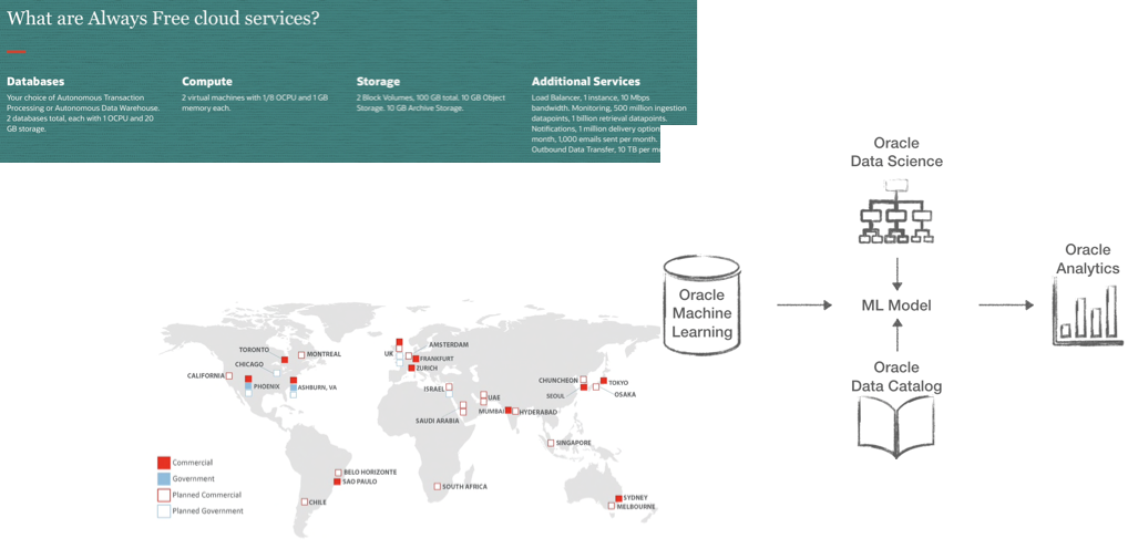
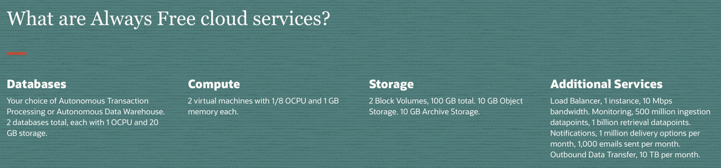
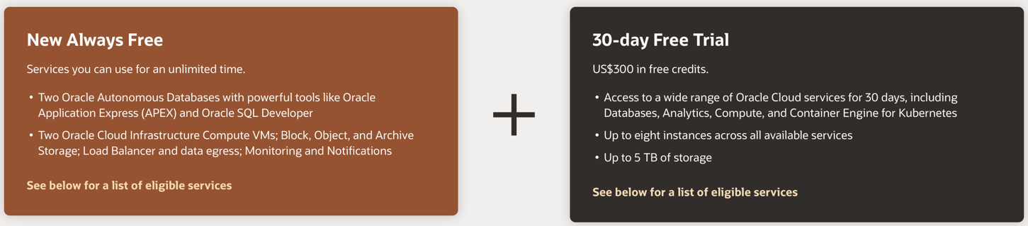
Let's start with the big news: Oracle Cloud Free Tier! A set of services that can ALWAYS be used for free which include Oracle's best offering in the database space like ATP (Autonomous Transaction Processing) and ADW (Autonomous Data Warehouse) as well as Compute, Storage and additional services for networking, monitoring and notifications.
This is a huge news in Oracle ecosystem since it enables everyone to start using the products without the need of a credit card! The always free schema can be also used in conjunction with the 30-day Free Trial (with associated 300$ in credits) to experience the full set of Oracle products without spending a single cent.
An additional interesting point (compared to previous Oracle's developer licensing models) is that there is nothing in the licensing terms blocking any customer to use the free tier for production usage! This means that potentially, if the resources provided satisfy the business requirements, anyone could potentially run production applications directly on the free tier! And, in cases when an upscale is needed, Oracle will provide a very easy option to switch from a free instance to a paid one.
However, as one can expect, the free tier has limitations, for example the databases will allow only 1 OCPU and 20GB of Storage each. On top of the technical limitation, for any of the products in the free tier there is no support and no SLAs. This means, for example, that in case of problems, you'll not be able to open a ticket to Oracle support. Something definitely to ponder about when implementing a production system.
OCI Gen2 and New Datacenters
During his Keynote, Larry Ellison also announced the plan to launch 20 new OCI Gen2 datacenters in the next year! An average of a new datacenter every 23 days!
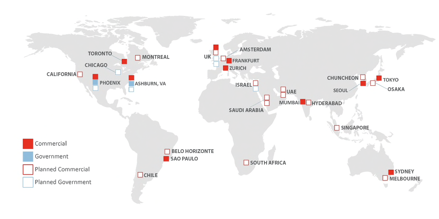
This is very impressive and, as mentioned during the Keynote, will mean Oracle overtake Amazon for the number of datacenters. A particular mention needs to be given also to the OCI Gen2, the new version of Oracle Cloud Interface. The first generation of OCI mission was the pay per usage: offering a set of services available on demand and payable by hour. The OCI Gen2 adds the autonomous features to Gen1: services are now self-managed, self-patched, self-monitored, self-secured with no downtime required. OCI Gen2 removes a huge set of activities from the hands of administrators taking the human error out of the equation.
Analytics & Data Science
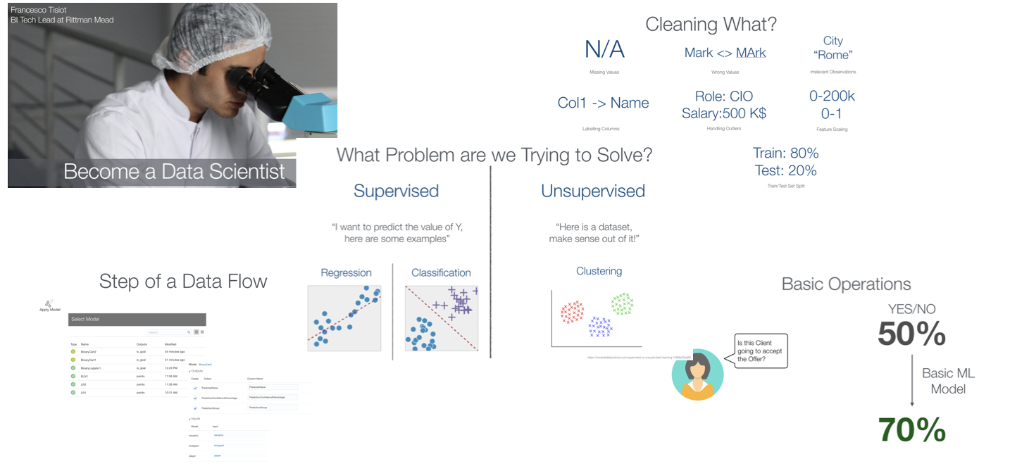
I had a talk on how to Become a Data Scientist with Oracle Analytics Cloud. The topic of Analytics & Data Science was really what interested me most, and my expectation for exciting news was met.
A whole new set of products will be shipped soon, making the whole Data Science experience more continuous and pervasive across the Oracle Products. Let's have a look at the news, I'll try to add links to the relevant sessions I attended.
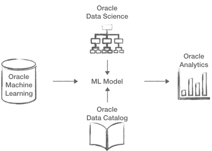
- Oracle Machine Learning: ML will be more pervasive in the Oracle Database, the Oracle Machine Learning Notebooks will be capable of handling R and Python in addition to SQL. All of this will be available on the Cloud Databases including ADW. A new Spark option is also coming enabling Machine Learning on the BDA.
- Oracle Data Science: This is a brand new product for Data Science collaboration, work in team on projects, with sharing and versioning options available out of the box.
- Oracle Data Catalog: Again a new product aimed at creating inventories of company's data assets and make them searchable and easily usable by business users or data scientist.
- Oracle Analytics Cloud: A lot of new announcements for this product which is mature and consolidated in the market, like Natural Language Generation or enhancements in the Data Enrichment, which I'll address in a separate blog post.
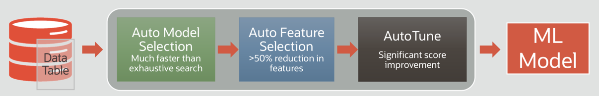
An interesting feature is AutoML, available both in Oracle Machine Learning and Oracle Data Science, which removes some barriers to Data Science by automating most of the steps in the Machine Learning model creation such as model and feature selection, and hyper-parameters tuning.
You might notice several enhancements in different products. However, the key indicator of Oracle's Data Science maturity is the fact that all of the products above can be easily combined! Oracle Data Science will use Oracle Machine Learning optimizations when running on supported platforms on top of datasets easily discoverable by Oracle Data Catalog. Machine Learning models developed by OML or ODS can then be exposed and used by Oracle Analytics Cloud. This provides an end to end path from data scientist to data analyst and business user all within the same toolset and on top of the best hardware (with support for GPUs coming)!
All in all a great OOW full of exciting news: no more barriers to access Oracle Cloud with the free tier, 20 new datacenters coming in the next year and a set of tools to perform Data Science, from the Analyst to the Data Scientist, in a collaborative and extremely performant way! If you want to have more news regarding Oracle Analytics Cloud, don't miss my next blog post!
Tableau | Dashboard Design ::Revoke A50 Petition Data::
Dashboards are most powerful through visual simplicity. They’re designed to automatically keep track of a specific set of metrics and keep human beings updated. Visual overload is like a binary demon in analytics that many developers seem possessed by; but less is more.
For example, many qualified drivers know very little about their dashboard besides speed, revs, temperature and fuel gauge. When an additional dash warning light comes on, even if it is just the tyre pressure icon let alone engine diagnostics light, most people will just take their car to the garage. The most obvious metrics in a car are in regard to its operation; if you didn't know your speed while driving you'd feel pretty blind. The additional and not so obvious metrics (i.e. dash warning lights) are more likely to be picked up by the second type of person who will spend the most time with that car: its mechanic. It would be pointless to overload a regular driver with all the data the car can possibly output in one go; that would just intimidate them. That's not what you want a car to do to the driver and that's certainly not what any organisation would want their operatives to feel like while their “car” is moving.
In light of recent political events, the exact same can metaphorically be applied to the big red Brexit bus. Making sense of it all might be a stretch too far for this article. Still, with appropriate use of Tableau dashboard design it is possible to answer seemingly critical questions on the topic with publicly available data.
There's An Ongoing Question That Needs Answering?
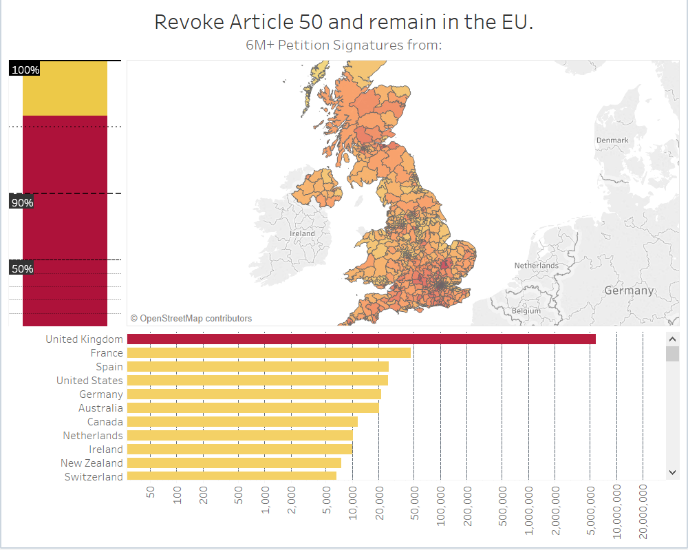
Where did 6 million+ signatures really come from?
Back in the UK, the Brexit fiasco is definitely still ongoing. Just before the recent A50 extensions took place, a petition to revoke article 50 and remain in the EU attracted more than 6 million signatures, becoming the biggest and fastest growing ever in history and sparking right wing criticism over the origin of thousands of signatures, claiming that most came from overseas and discrediting its legitimacy. Government responded by rejecting the petition.
Thankfully the data is publicly available (https://petition.parliament.uk/petitions/241584.json) for us to use as an example of how a dashboard can be designed to settle such a question (potentially in real time too as more signatures come in).
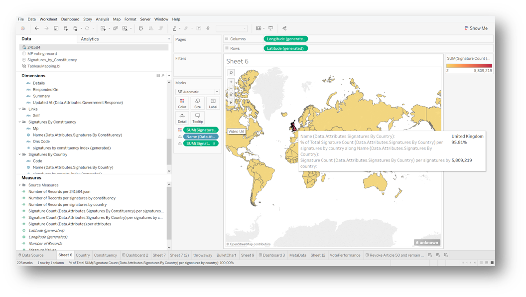
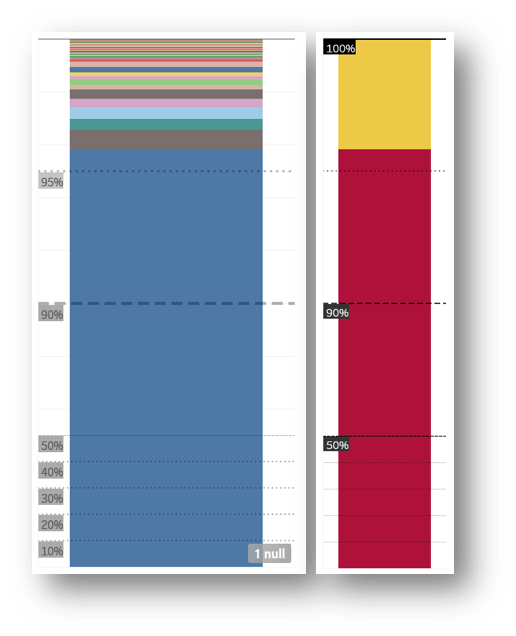
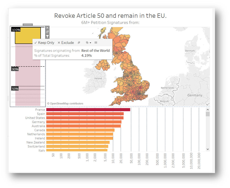
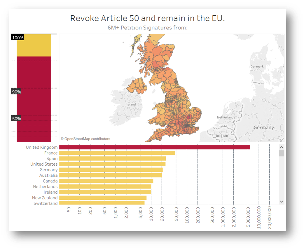
Tableau can handle JSON data quite well and, to nobody’s surprise, we quickly discover that over 95% of signatures are coming from the UK.
Now that we know what we're dealing with, lets focus the map on Britain and provide additional countries data in a format that is easier to digest visually. As cool as it is to hover over the world map, there's simpler ways to take this in.
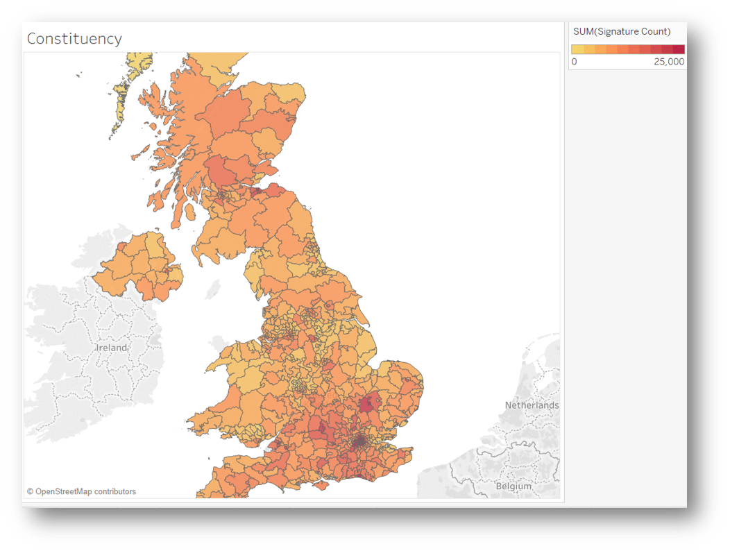
Because in this case we know more than 95% of signatures originate from the UK, the heatmap above is far more useful, showing us the signature count for each constituency at a glance. The hotter the shading, the higher the count.
Scales Might Need Calibration
Bar Chart All The Way
Humans of all levels compute a bar chart well and it's perfect for what we need to know on how many signatures are coming from abroad altogether and from what countries in descending order.
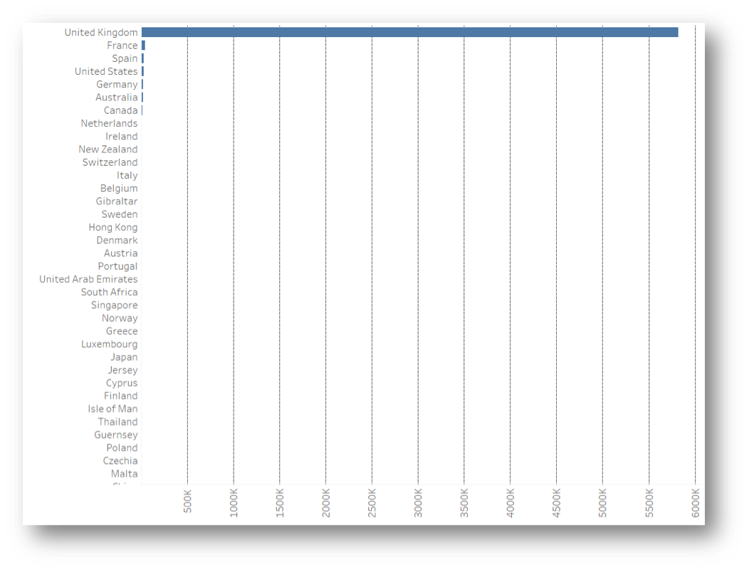
With a margin so tiny, it's trickier to get a visual that makes sense. A pie chart, for example, would hardly display the smaller slice containing all of the non-UK origin signatures. Even with a bar chart we are struggling to see anything outside of the UK in a linear scale; but it is perfect if using logarithmic scales, which are definitely a must in this scenario.
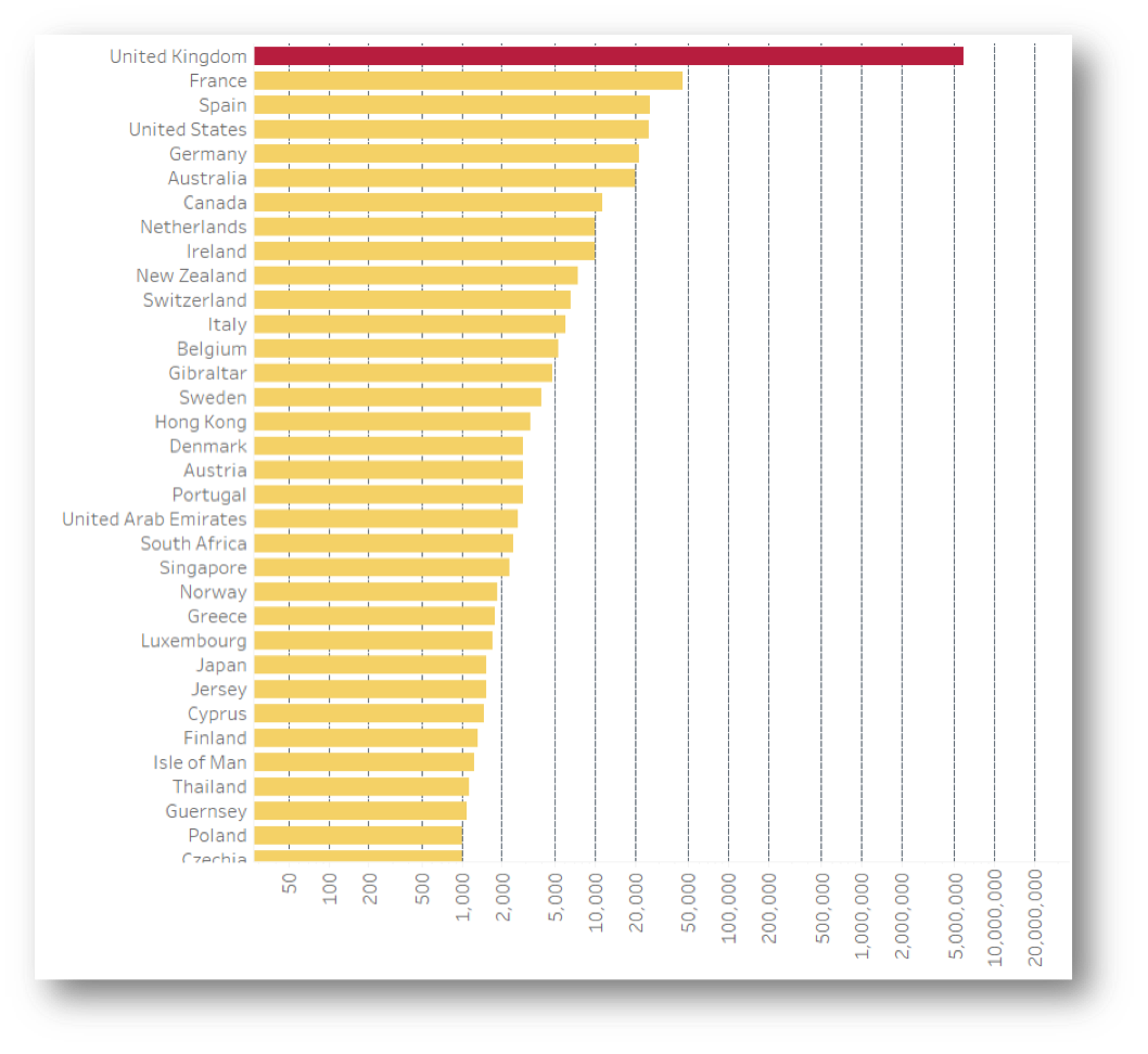
And voila! The logarithmic scale allows the remaining counts to appear alongside the UK, even though France, the next country after the UK with most signatures, has a count below 50k. This means we can keep an eye on the outliers in more detail quite effortlessly. Not much looks out of place right now considering the number of expats Britain produces to the countries on the list. Now we know, as long as none of the other countries turn red, we have nothing to worry about!
Innovate When Needed
The logarithmic scale in Tableau isn't as useful for these %, so hacking the visualised values in order to amplify the data sections of interest is a perfectly valid way of thinking outside the box. In this example, half the graph is dedicated to 90-100% and the other half 0-90%. The blue chunk is the percentage of signatures coming from the UK, while every other country colour chunk is still so small. Since the totals from other countries are about the same as each mainland constituency, it's more useful to see it as one chunk. Lastly, adding the heat colour coding keeps the visual integrity.
Interactivity
Now that we have the count, percentage and location breakdown into 3 simple graphs we feel much wiser. So it's time to make them interact with each other.
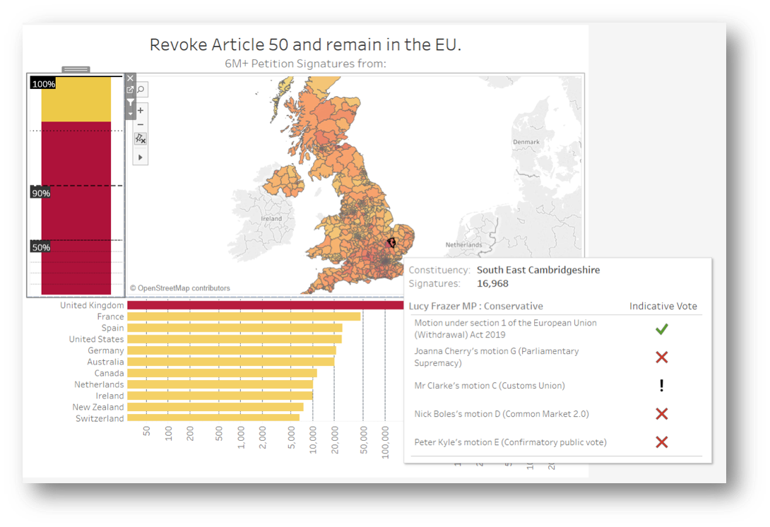
The constituency heatmap doesn't need to interact with the bar charts. The correlation between the hottest bars and the heatmap is obvious from the get go, but if we were to filter the bars using the map, the percentages would be so tiny you wouldn't see much on the % graph. The same occurs for the Country bar chart, meaning that only the percentage chart can be usefully used as a filter. Selecting the yellow chunk will show the count of signatures for every country within it only.
Another way in which interactivity can be introduced is through adding further visualisations to the tooltip. The petition data contains the MP responsible for each constituency, so we can effectively put a count of signatures to each name. It's nice to be able to see what their parliamentary voting record has been throughout this Brexit deadlock, which was obtained publicly from the House of Commons portal https://commonsvotes.digiminster.com and blended in; as more votes come in, the list will automatically increase.
Keep It Simple
As you can see, 3 is a magic number here. The trio of visuals working together makes a dashing delivery of intel to the brain. With very little effort, we can see how many signatures come from the UK compared to rest of the world, how many thousands are coming from each country, how many from each constituency, who the MP you should be writing to is and how they voted in the indicative votes. Furthermore, this dashboard can keep track of all of that in real time, flagging any incoming surge of signatures from abroad, continuously counting the additional signatures until August 2019 and providing a transparent record of parliamentary votes in a format that is very easy to visually digest.
Kafka | IoT Ecosystem ::Cluster; Performance Metrics; Sensorboards & OBD-II::
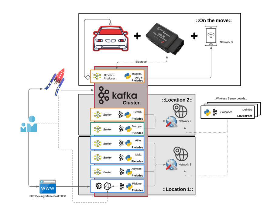
Infrastructure is the place to start and the keyword here is scalability. Whether it needs to run on premise, on cloud or both, Kafka makes it possible to scale at low complexity cost when more brokers are either required or made redundant. It is also equally easy to deploy nodes and nest them in different networks and geographical locations. As for IoT devices, whether it’s a taxi company, a haulage fleet, a racing team or just a personal car, Kafka can make use of the existing vehicle OBDII port using the same process; whether it’s a recording studio or a server room packed with sensitive electronic equipment and where climate control is critical, sensorboards can be quickly deployed and stream almost immediately into the same Kafka ecosystem. Essentially, pretty much anything that can generate data and touch python will be able to join this ecosystem.
In large data centres it is fundamental to keep a close eye on misbehaving nodes, possibly overheating, constantly failing jobs or causing unexpected issues. Fires can occur too. This is quite a challenge with thousands and thousands of nodes. Though, Kafka allows for all of the node stats to individually stream in real time and get picked up by any database or machine, using Kafka Connect or kafka-python for consumption.
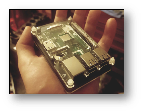
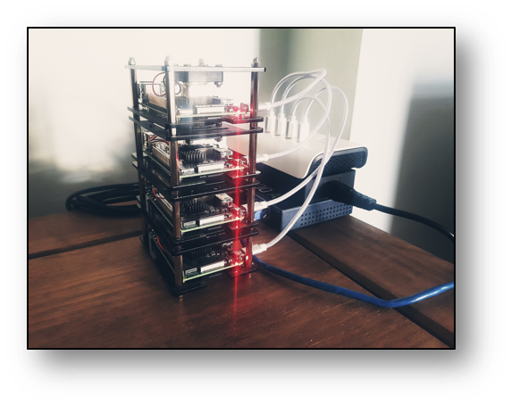
To demonstrate this on a smaller scale with a RaspberryPi 3 B+ cluster and test a humble variety of different conditions, a cluster of 7 nodes, Pleiades, was set up. Then, to make it easier to identify them, each computer was named after the respective stars of the Pleiades constellation.
- 4 nodes {Alcyone; Atlas; Pleione; Maia} in a stack with cooling fans and heatsinks
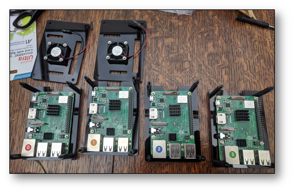
- 1 node in metal case with heatsink {Merope}
- 1 node in plastic case {Taygeta}
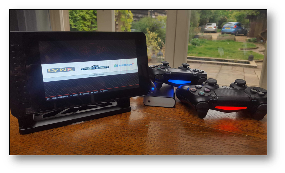
- 1 node in touchscreen plastic case {Electra}
Every single node has been equipped with the same python Kafka-producer script, from which the stream is updated every second in real-time under 1 topic, Pleiades. Measures taken include CPU-Percentage-%, CPU-Temperature, Total-Free-Memory, Available-System-Memory, CPU-Current-Hz.
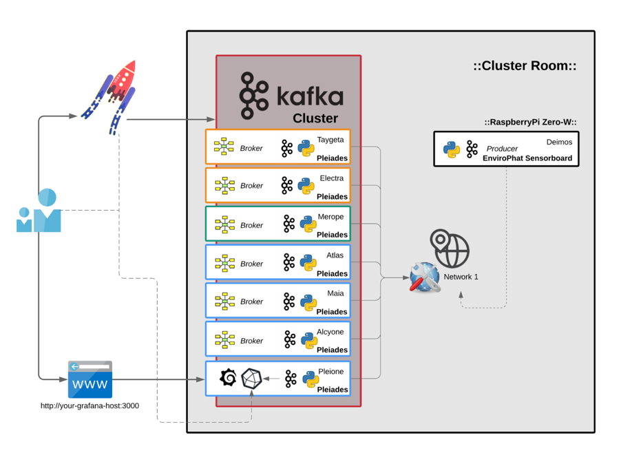
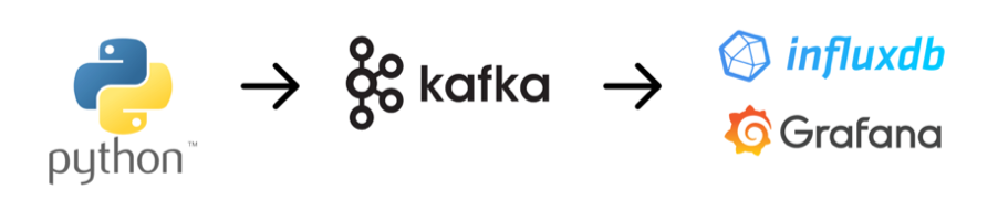
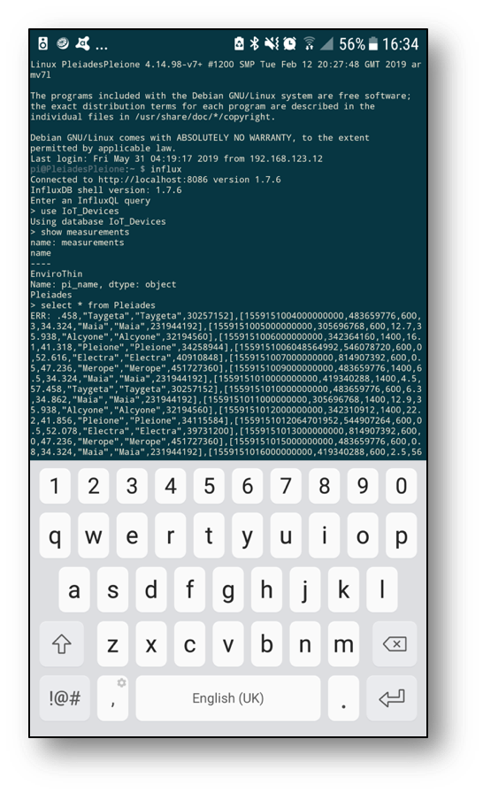
Kafka then connects to InfluxDB on Pleione, which can be queried using the terminal through a desktop or android SSH client. Nothing to worry about in terms of duplication, load balancing or gaps in the data. Worst case scenario InfluxDB, for example, crashes and the data will still be retrievable using KSQL to rebuild gap in DB depending on the retention policy set.
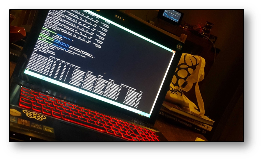
We can query InfluxDB directly from the command line. The Measure (InfluxDB table) for Pleiades is looking good and holding plenty of data for us to see in Grafana next.
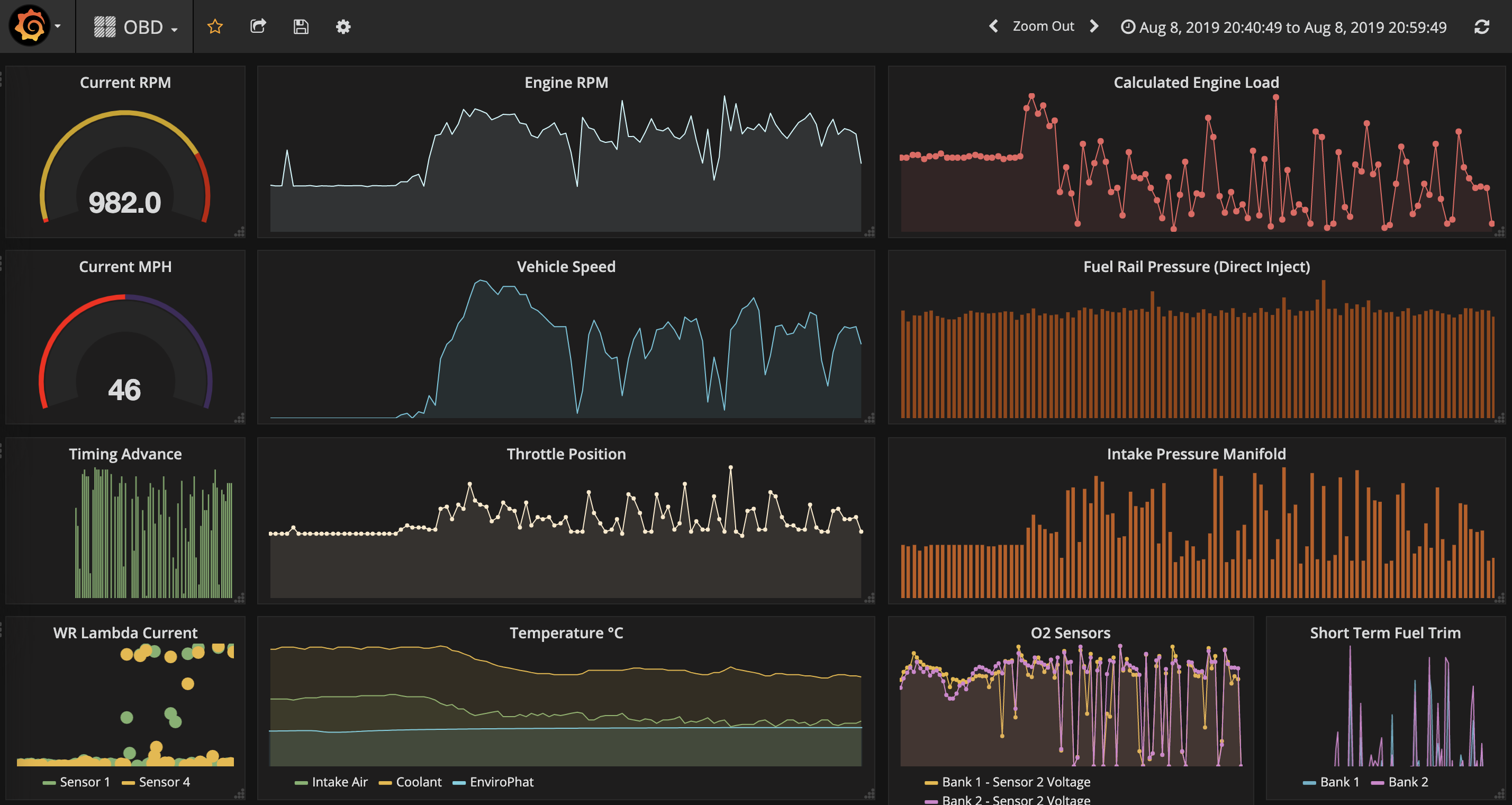
A live feed is then delivered with Grafana dashboards. It's worth noting how mobile friendly these dashboards really are.
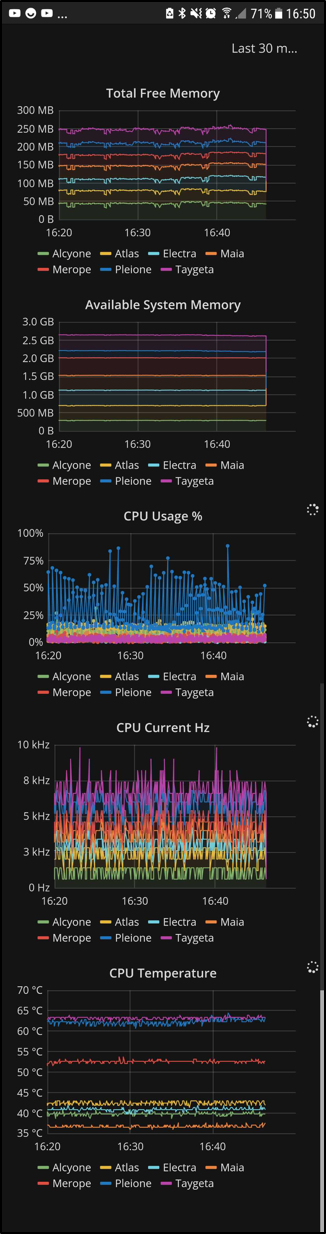
At a glance, we know the critical factors such as how much available memory there is and how much processing power is being used, for the whole cluster as well as each individual node, in real time and anywhere in the world (with an internet connection).
It has then been observed that the nodes in the stack remain fairly cool and stable between 37 °C and 43 °C, whereas the nodes in plastic cases around 63 °C. Merope is in the metal casing with a heatsink, so it makes sense to see it right in the middle there at 52 °C. Spikes in temperature and CPU usage are directly linked to running processes. These spikes are followed by software crashes. Moving some of the processes from the plastic enclosures over to the stack nodes stopped Grafana from choking; this was a recurring issue when connecting to the dashboards from an external network. Kafka made it possible to track the problem in real time and allow us to come up with a solution much quicker and effortlessly; and then immediately also track if that solution was the correct approach. In the end, the SD cards between Electra and Pleione were quickly swapped, effectively moving Pleione to the fan cooled stack where it was much happier living.
If too many spikes begin to occur, we should expect for nodes to soon need maintenance, repair or replacement. KSQL makes it possible to tap into the Kafka Streams and join to DW stored data to forecast these events with increased precision and notification time. It's machine-learning heaven as a platform. KSQL also makes it possible to join 2 streams together and thus create a brand new stream, so to add external environment metrics and see how they may affect our cluster metrics, a sensor board on a RaspberryPi Zero-W was setup producing data into our Kafka ecosystem too.
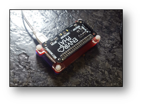
To keep track of the room conditions where the cluster sits, an EnviroPhat sensor board is being used. It measures temperature, pressure, colour and motion. There are many available sensorboards for SBCs like RaspberryPi that can just as easily be added to this Kafka ecosystem. Again, important to emphasize both data streams and dashboards can be accessed from anywhere with an internet connection.
OBDII data from vehicles can be added to the ecosystem just as well. There are a few ways this can be achieved. The most practical, cable free option is with a Bluetooth ELM327 device. This is a low cost adaptor that can be purchased and installed on pretty much any vehicle after 1995. The adaptor plugs into the OBDII socket in the vehicle, connects via Bluetooth to a Pi-Zero-W, which then connects to a mobile phone’s 4G set up as a wi-fi hotspot. Once the data is flowing as far as needing a Kafka topic, the create command is pretty straight forward.
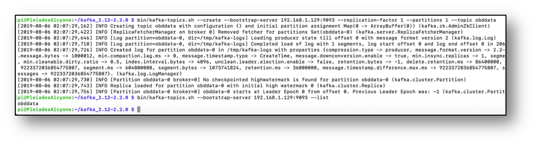
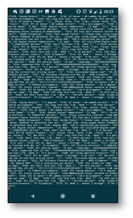
With the obd-producer python script running, another equivalently difficult command opens up the console consumer for the topic OBD in Alcyone, and we can check if we have streams and if the OBD data is flowing through Kafka. A quick check on my phone reveals we have flow.
To make things more interesting, the non-fan nodes in plastic and metal enclosures {Taygeta; Electra; Merope} were moved to a different geographical location and setup under a different network. This helps network outages and power cuts become less likely to affect our dashboard services or ability to access the IoT data. Adding cloud services to mirror this setup at this point would make it virtually bulletproof; zero point of failure is the aim of the game. When the car is on the move, Kafka is updating InfluxDB + Grafana in real time, and the intel can be tracked live as it happens from a laptop, desktop or phone from anywhere in the world.
In a fleet scenario, harsh braking could trigger a warning and have the on-duty tracking team take immediate action; if the accelerometer spikes as well, then that could suggest an accident may have just occurred or payload checks may be necessary. Fuel management systems could pick up on driving patterns and below average MPG performance, even sense when the driver is perhaps not having the best day. This is where the value of Kafka in IoT and the possibilities of using ML algorithms really becomes apparent because it makes all of this possible in real time without a huge overhead of complexity.

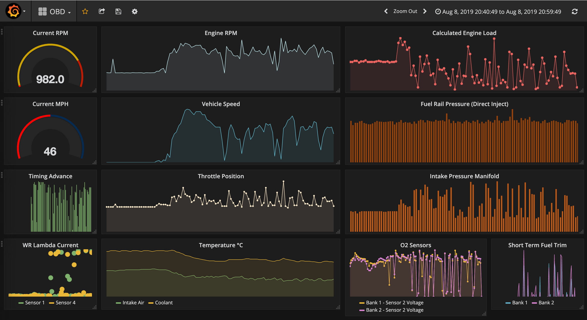
After plugging in the OBDII bluetooth adapter to the old e92-335i and driving it for 20 minutes, having it automatically stream data over the internet to the kafka master, Alcyone, and automatically create and update an OBD influxdb measure in Pleione, it can quickly be observed in Grafana that it doesn't enjoy idling that much; the coolant and intake air temperature dropped right down as it started moving at a reasonable speed. This kind of correlation is easier to spot in time series Grafana dashboards whereas it would be far less intuitive with standard vehicle dashboards that provide only current values.
So now that a real bare-metal infrastructure exists - and it’s a self-monitoring, low power consumption cluster, spread across multiple geographical locations, keeping track of enviro-sensor producers from multiple places/rooms, logging all vehicle data and learning to detect problems as far ahead as possible - adding sensor data pickup points to this Kafka ecosystem is as simple as its inherent scalability. As such, with the right Kafka-Fu, pretty much everything is kind of plug-&-play from this point onwards, meaning we can now go onto connecting, centralising and automating as many things in life as possible that can become IoT using Kafka as the core engine under the hood.
OAC Row Limits and Scale Up or Down
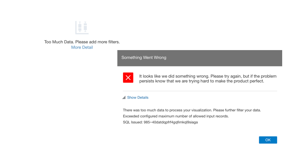
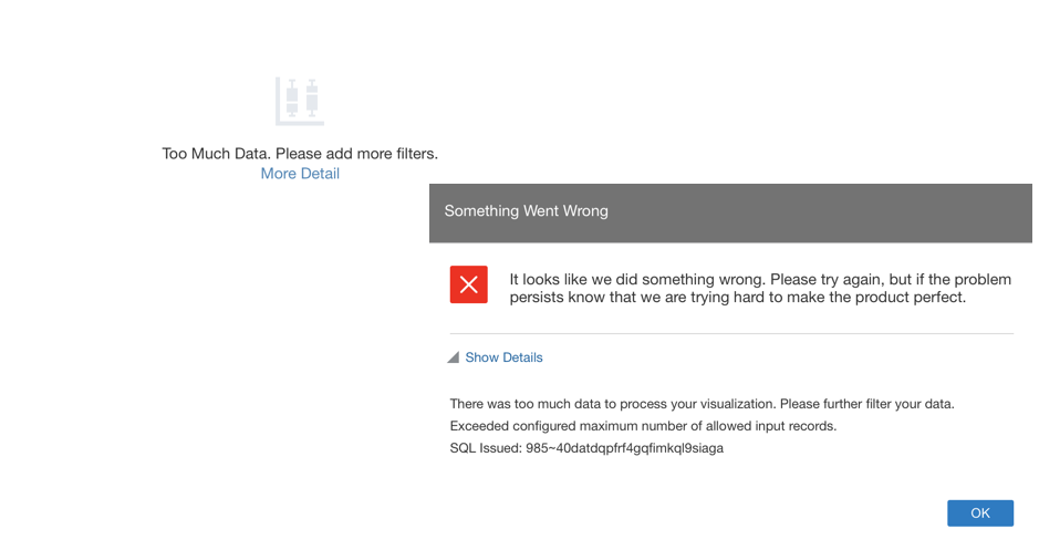
I created an OAC instance the other day for some analysis in preparation of my OOW talk, and during the analytic journey I reached the row limit with the error Exceeded configured maximum number of allowed input records.
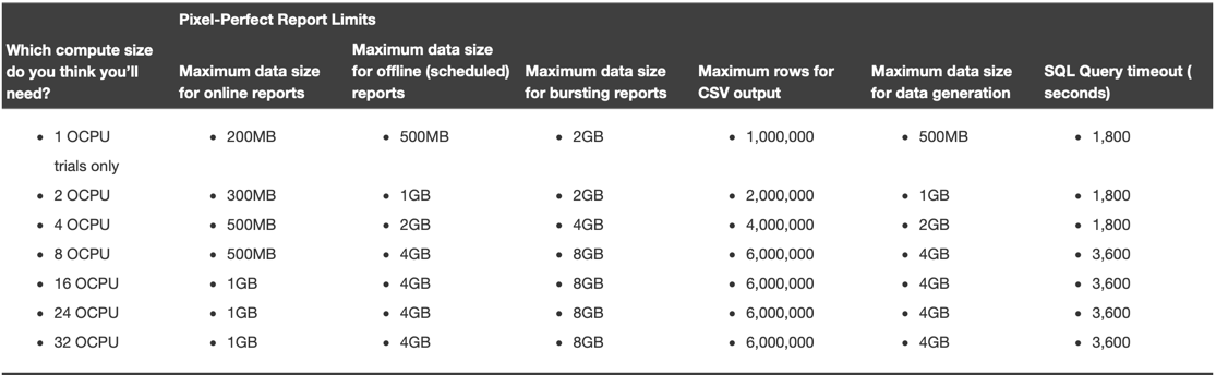
Since a few releases back, each OAC instance has fixed row limits depending by the number of OCPU assigned that can be checked in the related documentation, with the current ones shown in the table below.
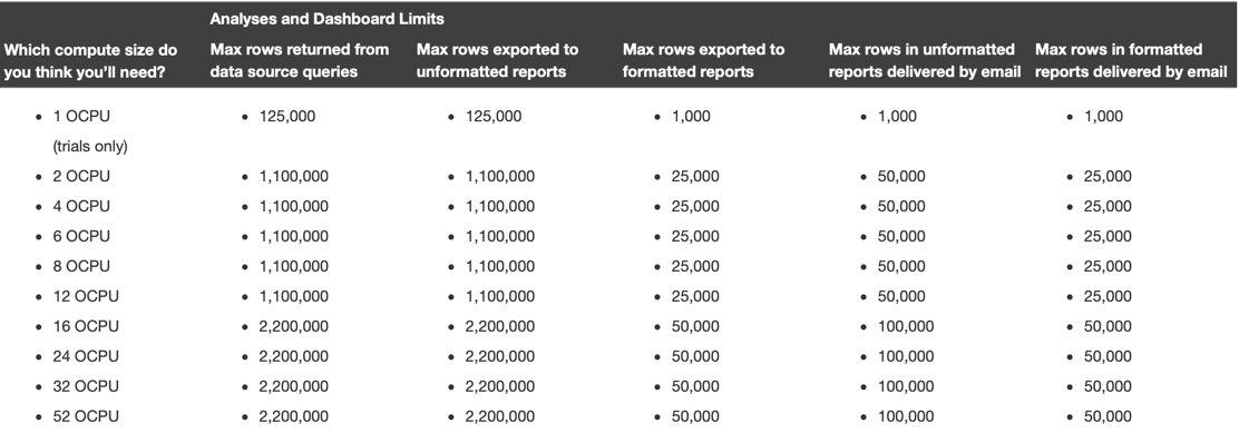
If you plan using BI Publisher (included in OAC a few versions ago) check also the related limits.
Since in my analytical journey I reached the row limit, I wanted to scale up my instance, but surprise surprise, the Scale Up or Down option wasn't available.
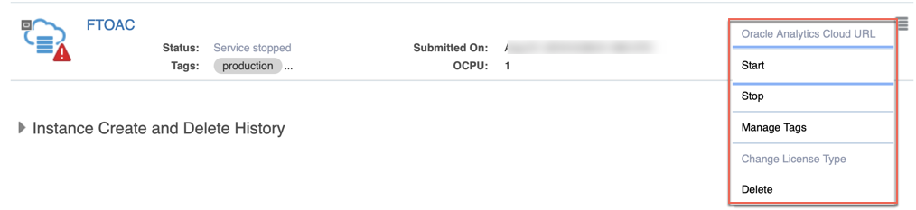
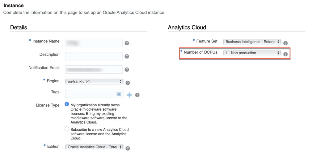
After some research I understood that Scaling Up&Down is available only if you chose originally a number of OCPUs greater than one. This is in line with Oracle's suggestion to use 1 OCPU only for non-production instances as stated in the instance creation GUI.
When choosing originally an OAC instance with 4 OCPUs the Scale Up/Down option becomes available (you need to start the instance first).
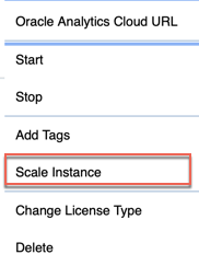
When choosing the scale option, we can decide whether to increase/decrease the number of OCPUs.
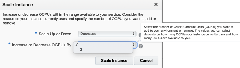
Please note that we could have limited choice in the number of OCPUs we can increase/decrease by depending on the availability and current usage.
Concluding, if you want to be able to Scale Up/Down your OAC instances depending on your analytic/traffic requirements, always start your instance with a number of OCPUs greater than one!
Rittman Mead at Oracle OpenWorld 2019

Oracle OpenWorld is coming soon! 16th-20th September in Moscone Center, San Francisco. It's Oracle's biggest conference and I'll represent Rittman Mead there with the talk "Become a Data Scientist" exploring how Oracle Analytics Cloud can speed any analyst path to data science. If you are an analyst looking to move your first steps in data-science or a manager trying to understand how to optimize your business analytics workforce, look no further, this presentation is your kickstarter!
To have an introduction to the topic have a look at my blog post series episodes I, II and III.
If you'll be at OOW2019 and you see me around, don't hesitate to stop me! I’d be pleased to speak with you about OAC, Analytics, ML, and more important topics like food or wine as well!