Category Archives: Rittman Mead
Enhanced Usage Tracking for OBIEE – Now Available as Open Source!
Introduction
OBIEE provides Usage Tracking as part of the core product functionality. It writes directly to a database table every Logical Query that hits the BI Server, including details of who ran it, when, and information about how it executed including for how long, how many rows, and so on. This in itself is a veritable goldmine of information about your OBIEE system. All OBIEE deployments should have Usage Tracking enabled, for supporting performance analysis, capacity planning, catalog rationalisation, and more.
What Usage Tracking doesn't track is interactions between the end user and the Presentation Services component. Presentation Services sits between the end user and the BI Server from where the actual queries get executed. This means that until a user executes an analysis, there's no record of their actions in Usage Tracking. There is this audit data available, but you have to manually enable and collect it, which can be tricky. This is where Enhanced Usage Tracking comes in. It enables the collection and parsing of every click a user makes in OBIEE. For an overview of the potential of this data, see the article here and here.
Today we're pleased to announce the release into open-source of Enhanced Usage Tracking! You can find the github repository here: https://github.com/RittmanMead/obi-enhanced-usage-tracking.
Highlights of the data that Enhanced Usage Tracking provides includes:
Which web browsers do people use? Who is accessing OBIEE with a mobile device?
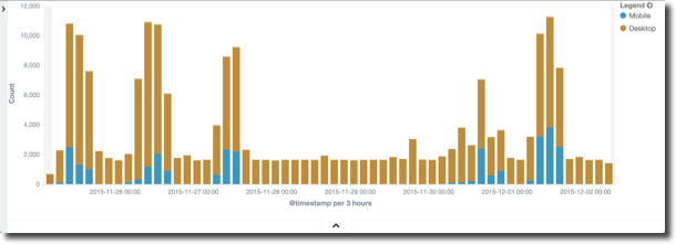
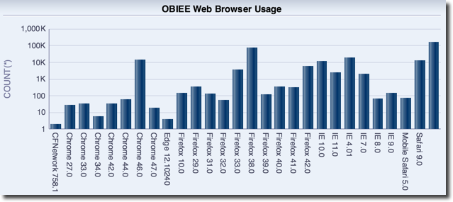
Who deleted a catalog object? Who moved it?

What dashboards get exported to Excel most frequently, and by whom?

The above visualisations are from both Kibana, and OBIEE. The data from Enhanced Usage Tracking can be loaded into Elasticsearch, and is also available from Oracle tables too, hence you can put OBIEE itself on top of it, or DV:

How to use Enhanced Usage Tracking
See the github repository for full detail on how to install and run the code.
TODO
What's left TODO? Here are a few ideas if you'd like to help build on this tool. I've linked each title to the relevant github issue.
TODO 01
The sawlog is a rich source of lots of data, but the Logstash script has to know how to parse it. It's all down to the grok statement which identifies fields to extract and defined their deliniators. Use grokdebug.herokuapp.com to help master your syntax. From there, the data can be emitted to CSV and loaded into Oracle.
Here's an example of something yet to build - when items are moved and deleted in the Catalog, it is all logged. What, who, and when. The Logstash grok currently scrapes this, but the data isn't included in the CSV output, nor loaded into Oracle.

Don't forget to submit a pull request for any changes to the code that would benefit others in the community!
You'll also find loading the data directly into Elasticsearch easier than redefining the Oracle table DDL and load script each time, since in Elasticsearch the 'schema' can evolve based simply on the data that Logstash sends to it.
TODO 02
Version 5 of the Elastic stack was released in late 2016, and it would be good to test this code with it and update the README section above to indicate if it works - or submit the required changes needed for it to do so.
TODO 03
There's lots of possibilities for this data. Auditing who did what, when, is useful (e.g. who deleted a report?). Taking it a step further, are there patterns in user behaviour? Certain patterns of clicks that could be identified to highlight users who are struggling to find the data that they want? For example, opening lots of presentation folders in the Answers editor before adding columns to the analysis? Can we extend that to identify users who are struggling to use the tool and are going to "churn" (stop using it) and thus contact them before they do so to help resolve any issues they have?
TODO 04
At the moment the scripts are manual to invoke and run. It would be neat to package this up into a service (or set of services) that could run automagically at server boot.
Until then, using GNU screen is a handy hack for setting scripts running and being able to disconnect from the server without terminating them. It's like using nohup ... &, except you can reconnect to the session itself as and when you want to.
TODO 05
Click events have defined 'Request' types, and these I have roughly grouped together into 'Request Groups' to help describe what the user was doing (e.g. Logon / Edit Report / Run Report). Not all requests have been assigned to request groups. It would be useful to identify all request types, and refine further the groupings.
TODO 06
At the moment only clicks in Presentation Services are captured and analysed. I bet the same can be done for Data Visualization/Visual Analyzer too ...
Problems?
Please raise any issues on the github issue tracker. This is open source, so bear in mind that it's no-one's "job" to maintain the code - it's open to the community to use, benefit from, and maintain.
If you'd like specific help with an implementation, Rittman Mead would be delighted to assist - please do get in touch to discuss our rates.
Insights – An Open-Source Visualisation Platform for OBIEE
On and off over the last year, I have spent some time developing a customisable framework for building visualisations and dashboards, using OBIEE as the back-end. The result is Insights, a JavaScript web application that offers a modern alternative to OBIEE Answers. As of today, we have officially open sourced the project, so you are free to download, install, hack and contribute as you please.
The primary motive for building this application was to meet some very bespoke reporting requirements for a client, which I mention in my previous blog describing the prototype. During this piece of work I wrote an object orientated interface for the OBIEE web services. The icing on the cake was tying it into Tom Underhill's Visual Plugin Pack.
You can see more information about Insights in a presentation that I did at the recent UKOUG conference here: Bridging the Gap: Enhancing OBIEE with a Custom Visualisation Platform
Since then a lot of the work has been put in to make it developer friendly, visually appealing and hopefully easier to use. I'll be the first to admit that it's far from perfect, but it should be a decent starting point.
Getting Started
In order to use Insights you will need OBIEE 11.1.1.9 or above. Additionally, the application has only been tested using IE11 or Chrome browsers and so compatibility with other browsers cannot be guaranteed.
First, download the application or fork the Git repository.
There is an installation guide in the project at docs/installation.html. Follow this guide to deploy the application on your OBIEE server.
Demo
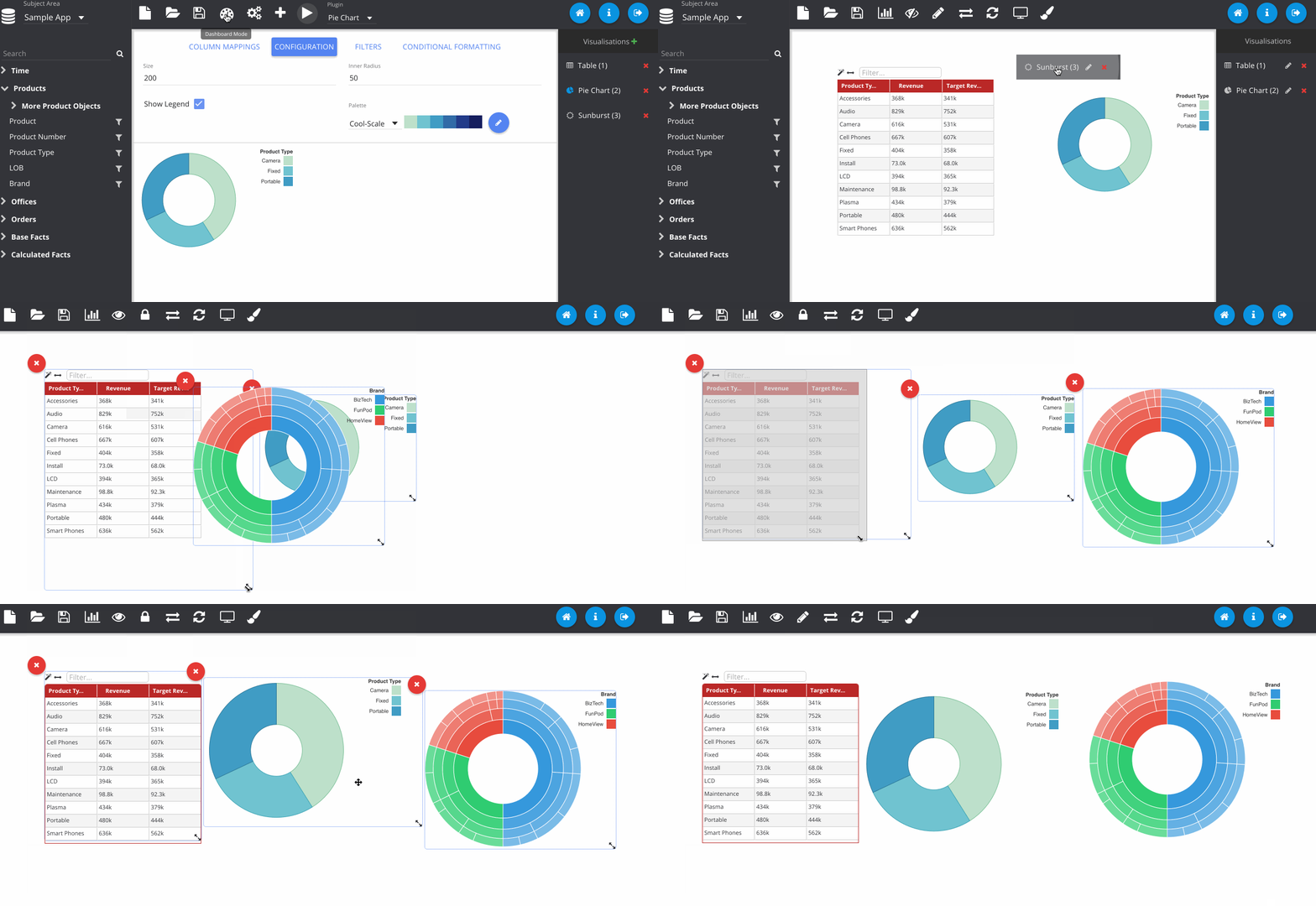
This is a quick step-by-step demonstration creating a basic dashboard, showing off some of the features in the application (apologies if the GIFs take a while to load).
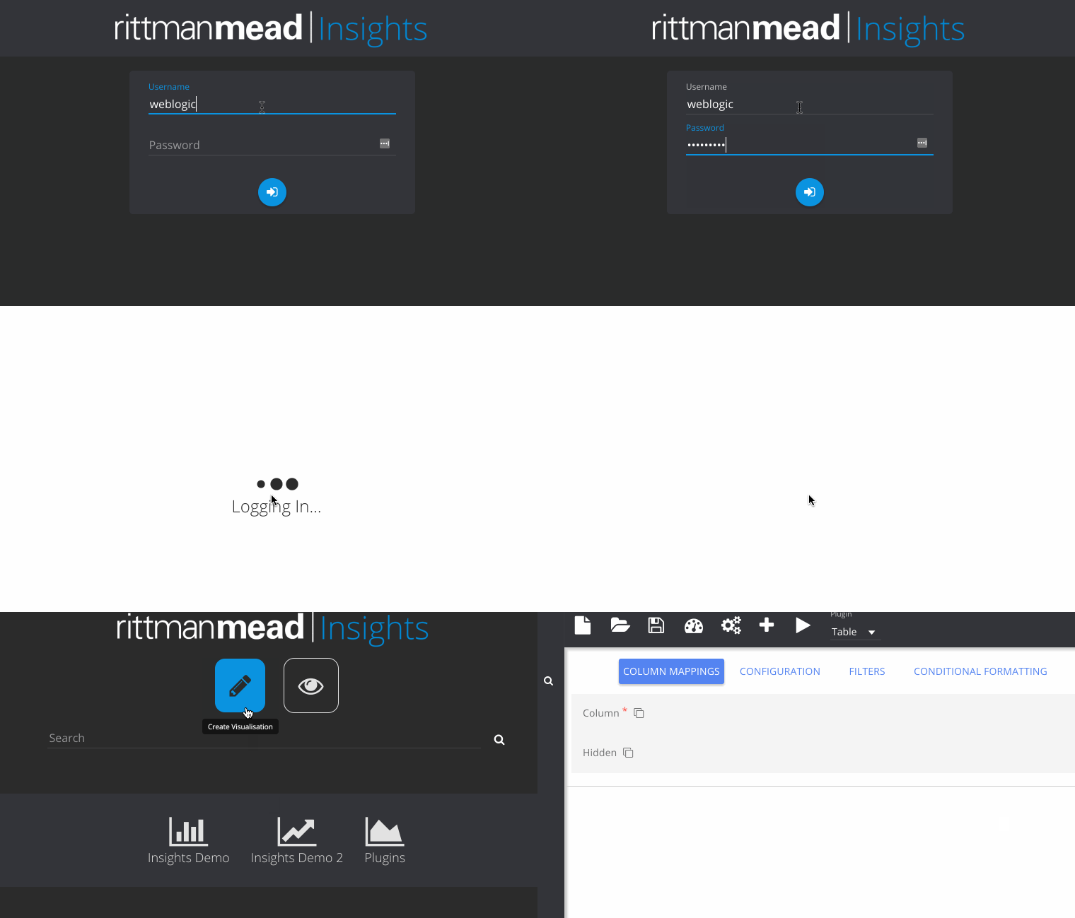
First you log in, using your usual OBIEE credentials. The homepage shows some pre-configured dashboards here, but we're going to click the pencil to create a new one.
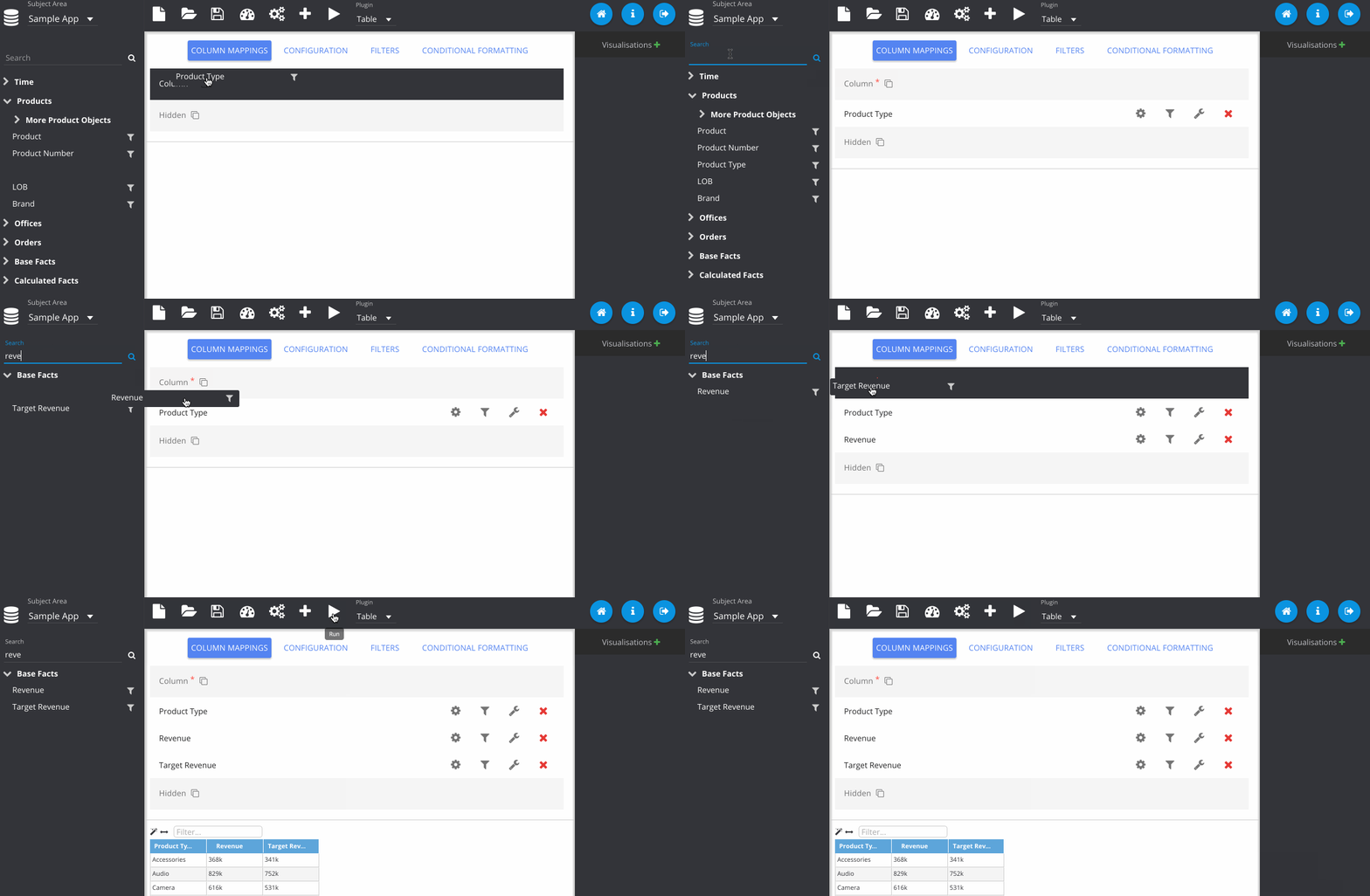
Next I've dragged in some columns from my subject area, Sample App and run the query, displaying the default table plugin.
In this step, I've gone to the configuration tab, and changed the colour of my table.
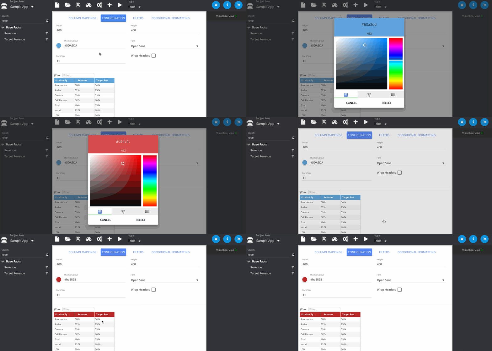
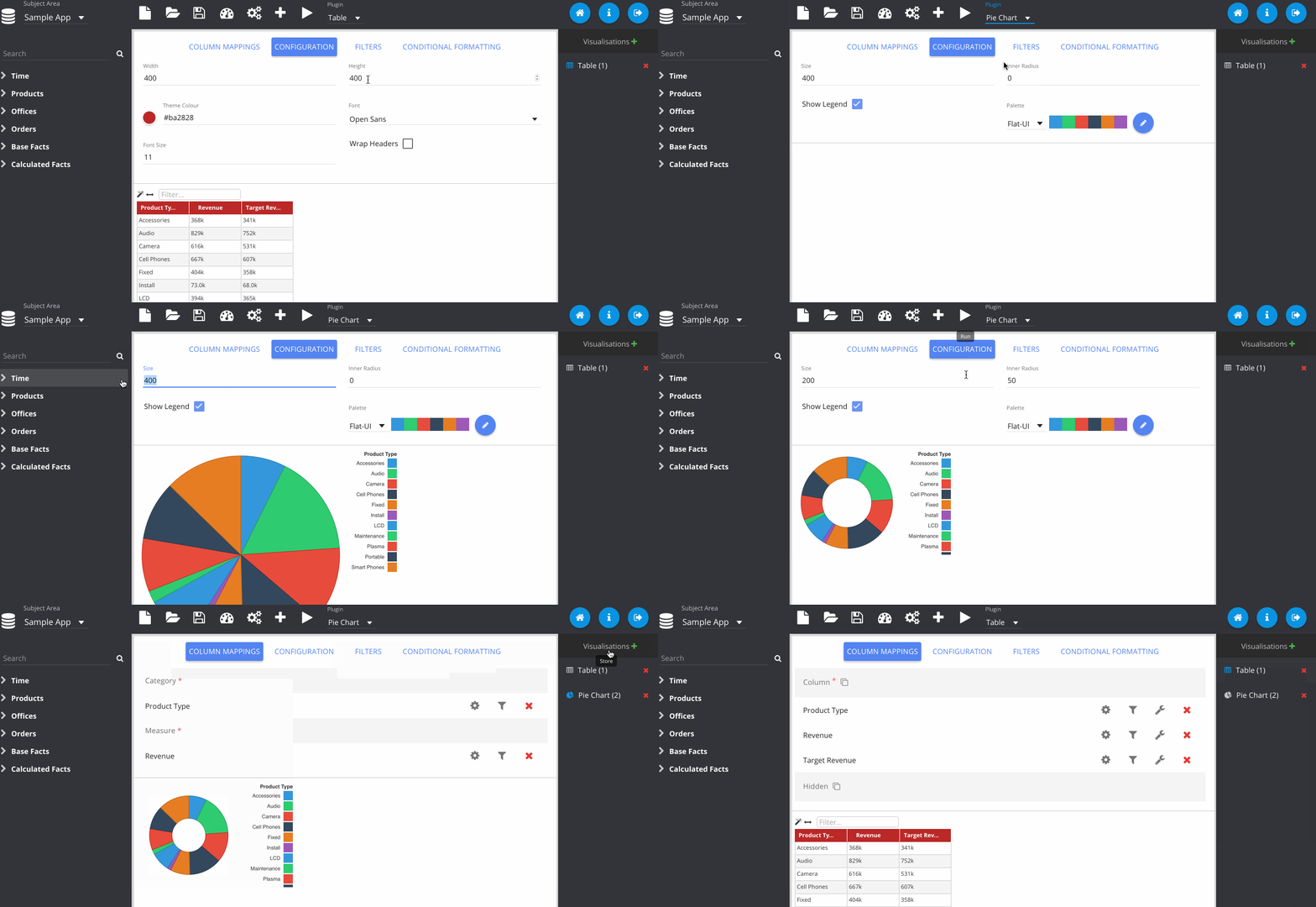
Now I change the plugin type using the drop down menu at the top. Notice that my previous table visualisation gets stored on the right. By clicking the Store button manually, it also adds my new pie chart. Then we can flick between them easily.
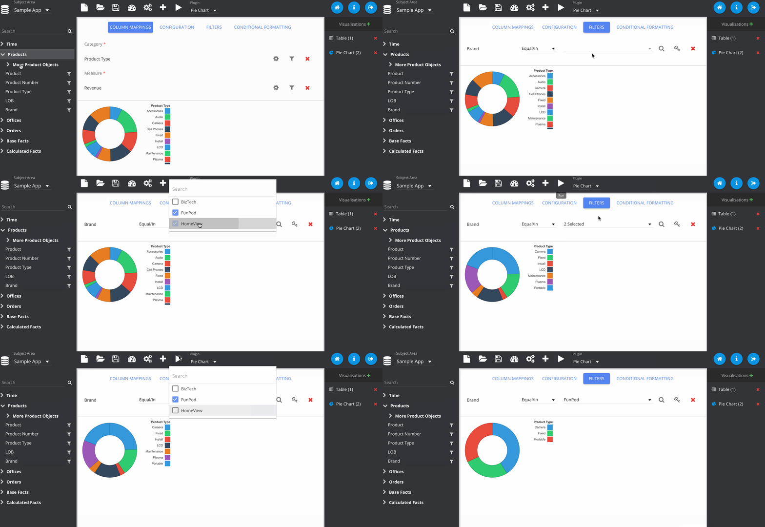
Filters can be added by clicking the icon next to the column on the subject area panel.
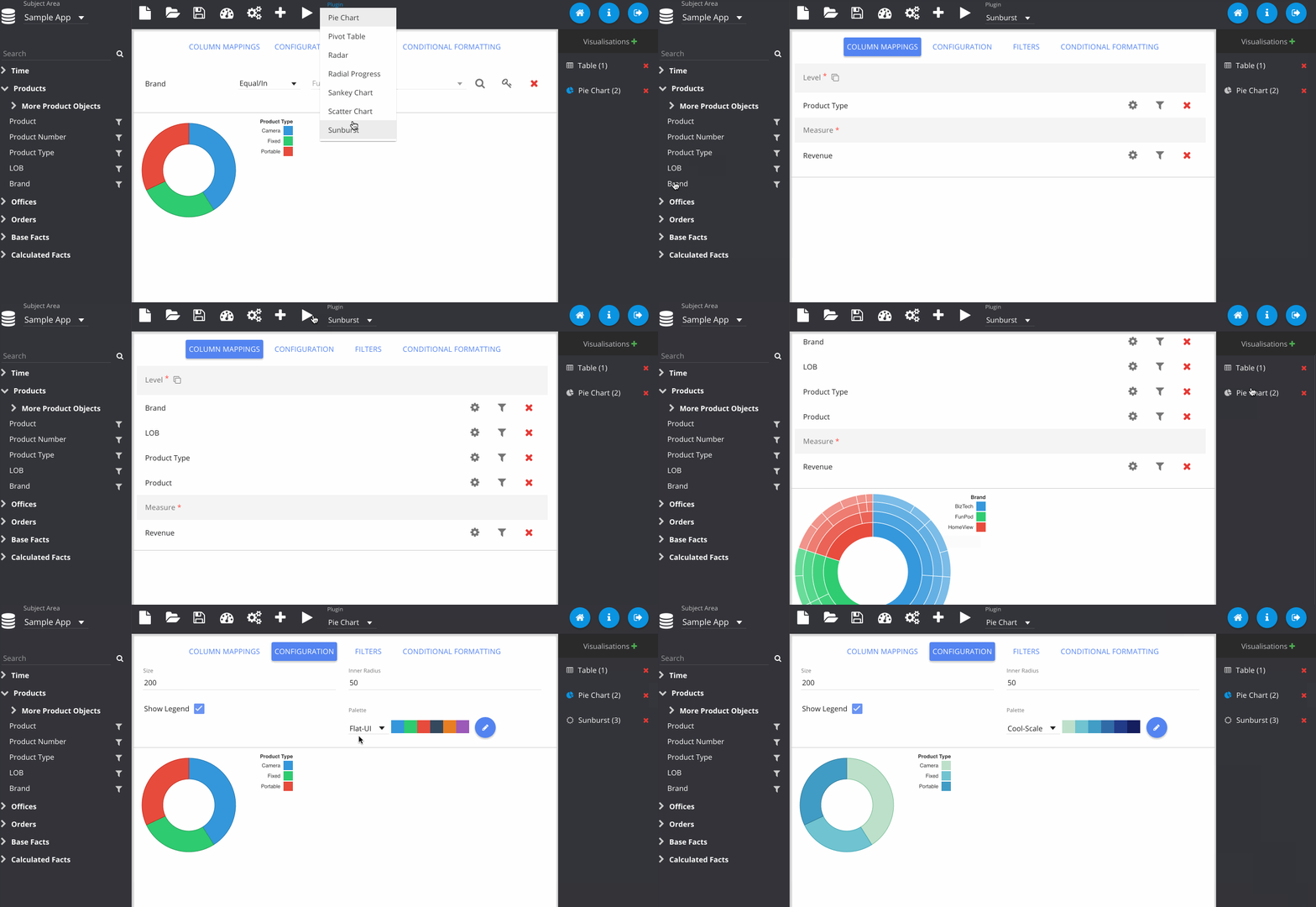
Adding in a sunburst chart, and playing with some of the colours here.
Now we have our visualisations, we can begin constructing our dashboard. You can freely move around and resize the visualisations as you choose. I recommend hiding the panels for this, as the full screen is much closer to what users will see when viewing the dashboard.
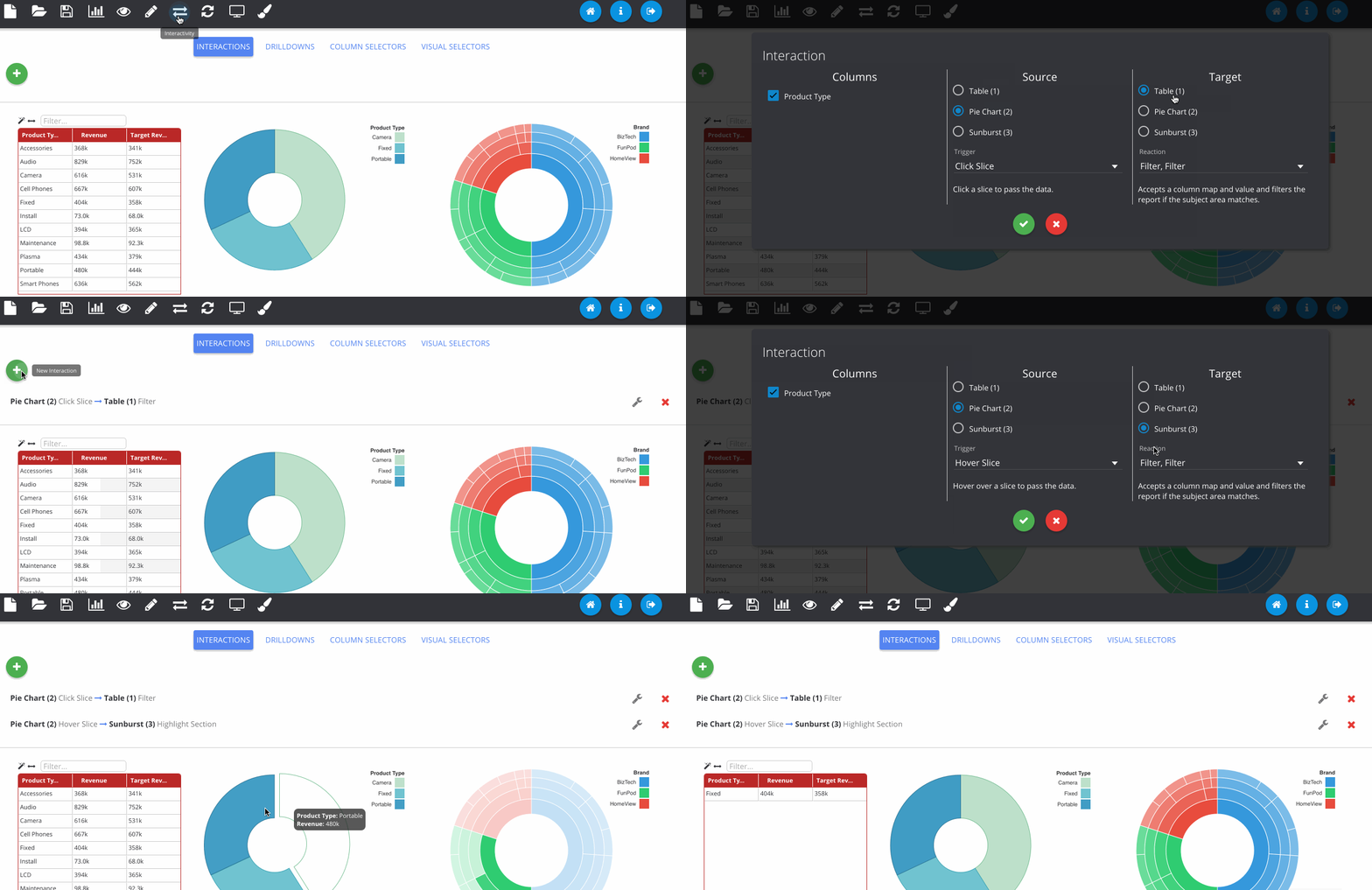
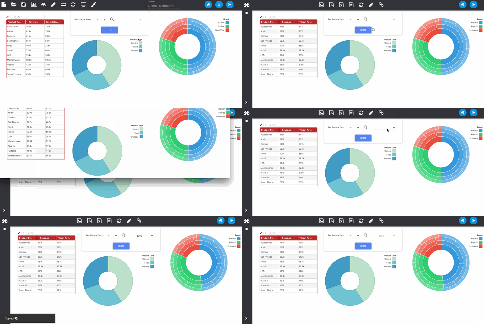
The next GIF shows the interaction framework, which can be used to implement UI features where the user interacts with one visualisation and another visualisation on the page reacts to it. In its most basic form, each plugin type can be filtered - where OBIEE runs the query again. Although more complex reactions that are specific to a certain chart type can also be configured, as seen below with the sunburst chart.
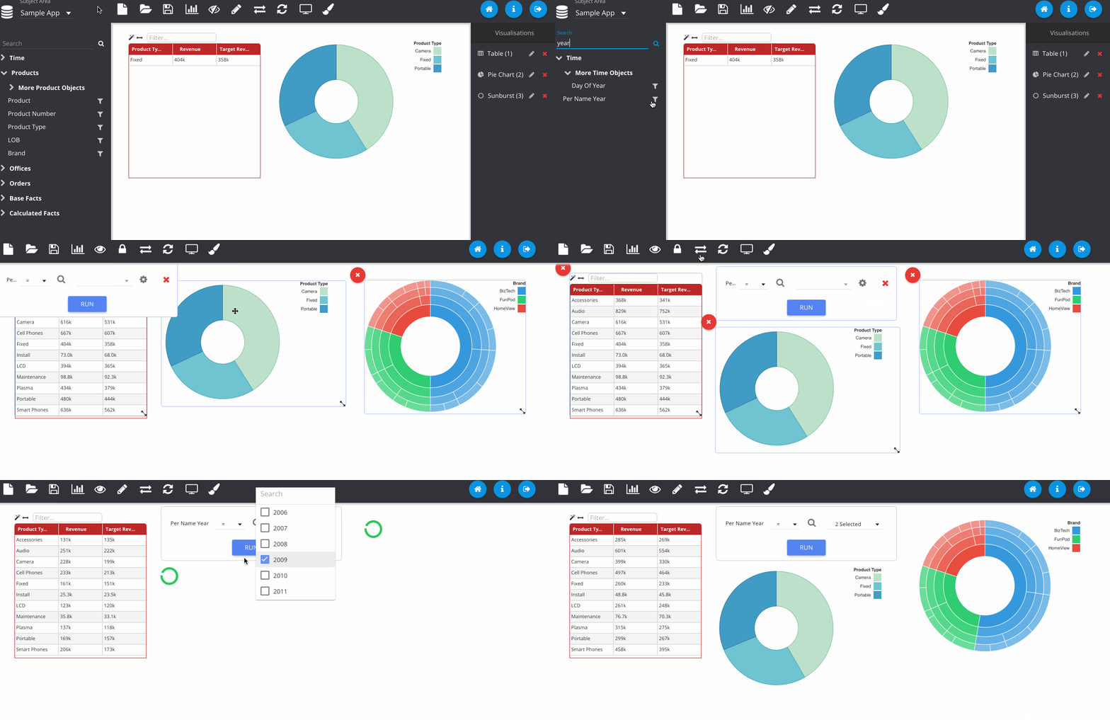
Dashboard prompts can be added by clicking the filter icon next to one of the RPD columns. Any visualisations using this subject area will respond to the prompt. The prompt box can be freely placed on the canvas like any other object.
Finally, we can save the object to the web catalogue. This saves as a hidden analysis object in the OBIEE web catalogue and contains all of the information to recreate the dashboard when loading. All OBIEE security features are preserved, so users will only be able to access folders and reports they have permissions for.
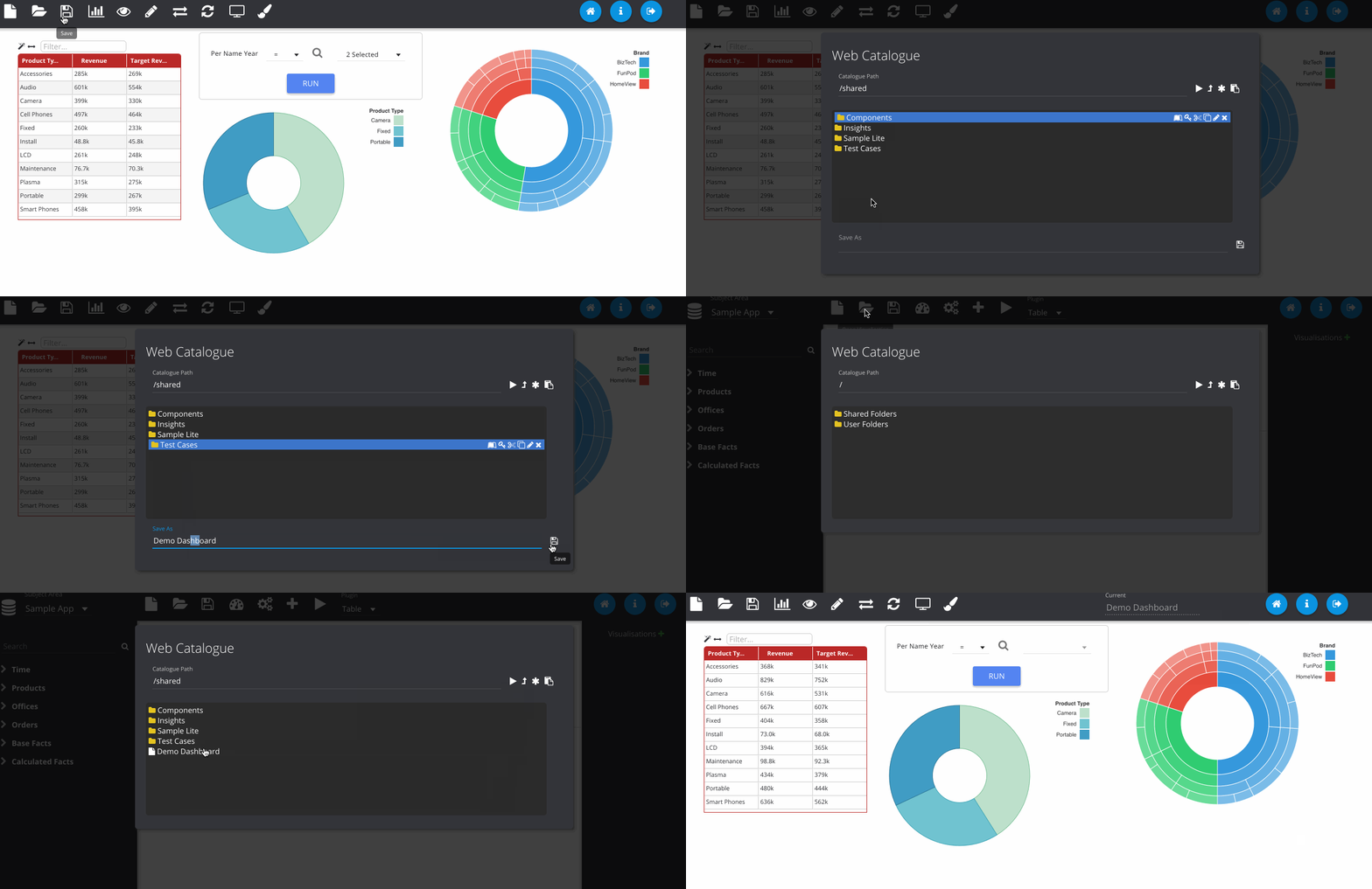
Finished dashboards can be viewed in the application once they have been saved. The dashboard viewer will show all dashboard objects in that folder as different pages, available from the left pane. Images can be exported to PNG and PDF as well as data from the visualisations exporting to Excel and CSV.
So How Do I Learn More?
The slides that I did at UKOUG describing Insights give a comprehensive overview of the design behind the tool. You can find them here.
Summary
In a nutshell, those are the main features of the application. Feel free to try it out and have a read through the documentation (available through the application itself or offline as HTML files in the docs directory).
As an open source application there is no official support, however if you experience any bugs or have any requests for enhancements, please post them on the issue tracker.
We hope you enjoy using the app and if you would like to enlist our expertise to help you deploy and develop using this platform, feel free to contact us to discuss it further.
The Rittman Mead Open Source Project
We have a strong innovation spirit at Rittman Mead, with all staff encouraged to use technology to its best advantage in order to do things with the software that haven't been done before. Some of these projects may may be 'scratching the itch' of a repeated manual task that should be automated. Others use technology to extend the capabilities of the tools or write new ones to fill gaps that have been identified.
At Rittman Mead we pride ourselves in our sharing of knowledge with the BI/DI community, both 'offline' at conferences and online through our blog. Today we are excited to extend this further, with the release over the next few days and weeks into open-source of some key code projects: -
insights- a javascript API/framework for building a new frontend for OBIEE, building on the OBIEE web service interface, as described herevpp- "Visual Plugin Pack" - innovative visualisation capabilities to use natively within OBIEEobi-enhanced-usage-tracking- the ability to track and audit user behaviour per-click, as described here
They will be available shortly on the Rittman Mead GitHub repository. The license for these is the MIT licence.
These projects are in addition to existing code that we have shared with the community over the years, including the obi-metrics-agent tool and the popular OBIEE 11g Linux service script.
We're very excited about opening up these projects to the community, and would be delighted to see forks and pull-requests as people build and expand on them. It should go without saying, but these are contributed 'as is'; any bugs and problems you find we will happily receive a pull request for :-)
If you would like help implementing and extending these for your own project, we would be delighted to offer services in doing so - just get in touch to find out more.
Over the next few weeks keep an eye on the blog for more information about each project, and future ones.
An Oracle DVD story of… DVDs
Have you ever wondered what the trend in movie releases has been for the past few decades? Comparing the number of Sci-Fi releases vs. Romantic Comedy releases? Me too, which is why I've taken my first look Oracle Data Visualization Desktop (DVD) to spot trends between these movie genres - Sci-Fi and the Romantic Comedy.
For this post, I found an interesting dataset from IMDB.com on Kaggle.com, listing a smattering of movies since the early 1900s from which to sort and analyze. For this example, I will contrast the number of releases between the two movie genres, looking for any possible relationship as to number of releases for both.
If you haven't installed the application yet, take a quick look at Matthew Walding's post for a good introduction. Oracle's DVD installer is fairly quick and simple, and you'll be creating visualizations in no time.
So, once the DVD application is running, we can create our first project:

Or, alternatively...

Next, we'll need a data source:

And, we'll import the CSV-formatted file I downloaded from Kaggle.com earlier:

Select the "movie_metadata.csv" file to import:

And, change the Name to "IMDB Movies A" for clarification:

After the file has been imported, we see a problem:

Clicking "More Detail", the following screen displays the detail we can use to troubleshoot the query error:

For troubleshooting, I used the highlighted value and found the problem is with the "budget" column, which requires a datatype change from "Integer" to "Double":

The next task is to create a method of identifying a specific movie genre, however, as you can see, all genre labels for each movie are stored in a pipe-delimited value of the genres column:

So, for this demonstration, I've chosen to add a calculated column for each genre I want to analyze, locating the desired string within the pipe-delimited value under the assumption that the same value, "Sci-Fi" for instance, is recorded with the same characters in every occurrence of each pipe-delimited value.

For the first column (data element), I chose the functions LOCATE and SIGN to provide a simple logical indicator (0 and 1) that can be aggregated (summed) easily.

Click the "Validate" button to verify syntax:

The LOCATE function returns a positive integer where the expression "Sci-Fi" is located in a given string, the genres data element in this case. The SIGN function subsequently returns either a 0, 1, or -1, depending on the sign of the resulting integer from the LOCATE function. 1 (one) indicates yes, this movie release includes a Sci-Fi label for genre. 0 (zero) indicates a missing Sci-Fi label for genre, for example.
Here is the new column, appended to our existing dataset:

Next, I will create another column to identify the Romantic Comedy genre - genre_RomCom_Ind, as follows:

With the two new data columns, our dataset is expanded accordingly:

Now, it's let's create the visualizations:

Let's create a bar graph for each of our new Indicator columns, starting with the Sci-Fi genre:

We'll create a filter to include data only for title years between 1977 and 2015:

Afterward, our initial graph appears as follows, with a default aggregate summing all genre_SciFi_Ind values (0 or 1) for each title year:

Now, let's add a similar bar graph for all Romantic Comedy (genre_RomCom_Ind) releases. Notice, the same filter for title year will be applied to this new graph:

Next, I'll change the labels for each graph, providing proper context for the visualization:

We can also change the aggregate method used for the graph, when necessary:

For an added touch, let's add a trend line to the bar graph for even easier viewing:

And now, our graph appears as follows:

Applying similar modifications to our Sci-Fi Releases graph and displaying both graphs together on Canvas 1, we have the following:

Next, we'll add this Canvas to an Insight, select Narrate, and add our own description of any interesting comparisons we can identify:

In viewing the two graphs side-by-side, we notice one interesting outlier that, in year 2010, the number of Romantic Comedy releases outnumbered Sci-Fi releases by 21 movies, and on this Insight, I can enter a description (narration) beneath the graphs, highlighting this departure from the plotted trend line, as shown below. Another interesting, and unexpected, trend we see is the decreasing number of Romantic Comedy releases after 2008. But, do these two graphs display an obvious relationship, or correlation, between the two genres, either positive or negative? If we look at each trend line between 1990 and 2008, each movie genre shows an increasing number of releases, generally speaking, and leaves a somewhat inconclusive determination as to correlation, although, the periods after 2008 seem to indicate an inverse relationship.

At this point, the project can be saved (with a new title), exported, and/or printed:

In this post, I've demonstrated a basic example as an introduction to Oracle Data Visualization Desktop, with IMDB movie data, to visually quantify the number of movie releases in a given timeline, 1977 to 2015, creating custom calculations and dynamic visualizations for our particular measures.
One note I would add is that I did not attempt to eliminate any overlapping indicators, which were minimal, in the newly-added columns, genre_Sci-Fi_Ind and genre_RomCom_Ind. Although, it is possible that a movie can be labeled as all three - Sci-Fi, Romance, and Comedy, it did not distort the overall trend. And, these graphs now create a question - Can we know what influences the release of Sci-Fi movies and their increasing popularity? Are Romantic Comedy movies truly decreasing in popularity or is the movie studios choice to decrease the number of RomCom releases because of the surge in Sci-Fi releases? We all understand limitations of all studios investment capital, but must the RomCom genre suffer because of the Sci-Fi genre? If so, why? I realize this is a simplified view of the trend, but does lend itself to more scrutiny among other genres as well.
Introducing On Demand Training from Rittman Mead
Rittman Mead is happy to announce that its much anticipated On Demand Training (ODT) service is live, giving people the opportunity to receive expertly written & delivered self-paced training courses that can be accessed online anywhere, at anytime.
We have been delivering technical & end-user courses based on Oracle Analytics products all over the world for the past decade.
While our classroom sessions continue to offer an unrivalled experience for our trainees, we understand that in the modern era, flexibility is important.
ODT has been built based on the feedback of our clients and network so that you can:
Experience our training regardless of the distance to travel
Keep your member’s of staff on site at crucial periods in your company’s calendar
Give participants the ability to reinforce the lessons they’ve learnt afterwards
Learn
Use Rittman Meads LMS as your virtual classroom to access all course materials, lesson demos and slides

Practice
Get hands on with your very own cloud based training environment

Engage
Submit questions to Rittman Meads Principal Trainer network on subjects that might be specific to your everyday use of the product

Each course provides 30 days access to the above, ensuring you have enough time to learn at your pace and re-enforce each lesson.
We’re feeling particularly seasonal down here in Brighton, so to celebrate the launch of our platform we’re offering a 40% discount on our first live course OBIEE 12c Front End Development & Data Visualization between now and January 31st.
Simply use the discount code RMODT12C on checkout to take advantage of this exclusive offer.
For more details and to start your On Demand learning experience with Rittman Mead please check out:
- Our webpage where you can find out more information about ODT and register an account for our LMS
- The Rittman Mead LMS where you can view our course catalog and purchase courses
You can also contact training@rittmanmead.com if you have any questions about the service.
Happy Learning!!!


