Tag Archives: Business Intelligence
Transforming Information into Insights: Analytical Applications
Data analytics has become so valuable, and so in vogue, that more and more enterprise applications have been adding their own analytics features and capabilities. The rise of these so-called “analytical applications” means that users can run powerful, in-depth analyses and get beautiful data visualizations within the software itself, rather than needing to switch to another tool.
Below, we’ll discuss different ways that organizations have benefited from augmenting their traditional enterprise IT with powerful, forward-looking data analytics.
Types of Analytical Applications
Customer Relationship Management (CRM)
The goal of a CRM system is to better serve your customer base by keeping track of your relationship history. This includes information such as the contact information for leads and customers, as well as each interaction they’ve had with your business: downloading gated content, making a purchase, messaging customer support and so on. The best CRM software can create a positive ripple effect across the business—from closing sales deals faster to addressing customer service needs more efficiently.
Enhanced with analytics capabilities, CRM software helps your sales, marketing, and support departments follow people as they progress from leads to converts to loyal customers. Just a few examples of the important KPIs (key performance indicators) to track for CRM software include:
- Lead conversion rate, the percentage of your website visitors who are converted to leads (e.g. by signing up for your newsletter).
- Email click-through rate, the percentage of your newsletter subscribers who click on a link in your email.
- Monthly active users, the number of your customers who use your services or visit your website within the past month.
- Customer lifetime value, the total average revenue that your business can expect to receive from a single account.
Enterprise Resource Planning (ERP)
Whereas CRM software helps you manage your customer relationships, ERP software helps you keep the organization running smoothly behind the scenes. ERP systems traditionally include a wide range of business functionality, possibly including (but not limited to) project management, supply chain, accounting, financial planning, and human resources.
By adding analytics capabilities to their ERP software, organizations dramatically improve the visibility and transparency of their business processes, gaining deeper insights into their operations as a whole. The important metrics and KPIs to track here will vary depending on the goal of your ERP projects. Some examples include:
- Customer satisfaction, which can be measured through brief surveys (e.g. the Net Promoter Score, asking how likely a customer is to recommend your business to friends and family).
- Process efficiency, which can be measured along multiple axes based on the process itself: speed, accuracy, quality, value, return on investment, etc.
- Employee productivity, which can be measured in multiple ways: establishing a baseline for performance, setting achievable goals and targets, getting employee feedback, etc.
- Financial planning & analysis (FP&A) assess the financial health of your organization, from helping with the quarterly financial consolidation & close process to making better predictions and forecasts. Cutting-edge financial analytics tools allow users to make ad hoc queries and get answers on the fly as they need them—uncovering hidden insights, modeling scenarios and constructing better strategies for the future.
Some important metrics and KPIs for financial analytics include:
- Revenue, which can be tracked along many domains (e.g. per sales team member, per region or location, per time period, per product or service, and so on).
- Gross profit margin, which measures the ratio between revenue and cost of goods sold, assessing how efficiently your business manages its operations.
- EBITDA (Earnings Before Interest, Taxes, Depreciation and Amortization), your net business income before the foregoing factors are taken into account.
- Net cash flow, the difference between your total cash and total liabilities during a given time period (i.e. cash flow in vs. cash flow out).
- Length of consolidation and close cycles, which speaks to how well your internal IT and financial processes are running.
Cloud Software
Cloud analytics is a world unto its own, with as many possibilities as there are cloud applications. Using a cloud-based or hybrid model for your enterprise applications, you can scale your analytics operations and capabilities as your business grows.
SaaS (software as a service) applications are hosted on a remote server and provisioned to you over the Internet. Many SaaS applications running in the cloud have their own analytics functionality, or they can be easily integrated with a BI/analytics service from your public cloud provider.
Conclusion
When traditional enterprise IT joins forces with smart data-driven business analytics, the results can help transform your organization. To learn more about the steps of building a mature, robust BI and analytics initiative for your business, check out Datavail’s white paper: From Raw Data to Insightful Stories: Transform Analytics into Innovation.
The post Transforming Information into Insights: Analytical Applications appeared first on Datavail.
Transforming Information Into Insights: Reporting, Scorecards and Dashboards
Organizations have more data at their fingertips than ever before—but they also need to transform this information into clear, actionable business insights, especially in a visual format.
Brain scientist John Medina, for example, has found that people will remember 65 percent of information presented as a picture three days later, but only 10 percent of spoken information.
The goal of business intelligence (BI) and analytics tools is to enable smarter, data-driven decisions by converting raw data into meaningful visual and text representations. In this article, we’ll talk about some of the most powerful BI and analytics tools that you have on hand: reporting, dashboards and scorecards.
What Is BI Reporting?
BI reporting uses business intelligence and analytics tools to automatically collect and analyze data and generate reports for human consumption, presenting this information in an easily readable and digestible fashion.
The contents of a BI report will differ depending on the underlying data; they may include both text summaries and visual representations. The most common types of charts and visualizations in BI reports include:
- Pie graphs, for percentages or proportional data.
- Line charts, for showing trends over time between independent and dependent variables.
- Waterfall charts, for showing how positive or negative values evolve over time.
- 3D area charts, for describing the relationship between three variables.
- Decision trees, for modeling a decision-making process.
Importantly, BI reports are usually generated on a recurring, scheduled basis; often, they’re created overnight based on the preceding day’s data, so that they can be on key decision-makers’ desks the next morning. This delimited time window distinguishes reports from other BI tools such as dashboards that operate in real time.
What Are BI Scorecards?
BI scorecards are reports that summarize your performance and progress in terms of one or more business metrics and KPIs (key performance indicators). Scorecards are effective because they provide the most salient, valuable information at a glance for decision-makers who are pressed for time—for example, the number of current active users, the number of orders in the past week or the average monthly revenue over the past six months.
What Are BI Dashboards?
BI dashboards are a data visualization tool that displays the real-time status of one or more business metrics and KPIs. The contents of a BI dashboard are usually customizable by the user and include multiple components, such as line graphs, bar graphs, pie charts, tables and status indicators. For ease of use, these components may come with tooltips, labels and text boxes that explain how to interpret the data.
Importantly, BI dashboards are often interactive: they allow users to drill down into the numbers, doing their own research and coming to additional conclusions beyond the surface-level ones presented in the dashboard panel. For example, users might apply a filter to the data based on a date range or geographic location, helping answer ad hoc queries. BI dashboards are also (near) real-time: they are connected to data sources such as databases and spreadsheets, and then refreshed and updated on a regular basis.
BI Reporting Versus Scorecards Versus Dashboards
BI reports, scorecards, and dashboards all have the goal of helping you make better business decisions and forecasts, but they go about it in different ways. Reports are typically non-interactive and based on a specific time range, while dashboards are interactive and up-to-the-minute. Scorecards are specialized reports that monitor a few select metrics, letting readers quickly understand progress on a particular KPI.
When building reports, scorecards, and dashboards as part of your BI workflow, follow good design principles such as:
- “Form follows function”: The visualizations and infographics you select for a given report or dashboard will depend on how they are intended to be used in the big picture. Should your visualization be static or interactive—explanatory or exploratory?
- Remove unnecessary elements: Explanatory visualizations (those intended to emphasize an argument) should contain only the information they need to communicate a particular point. Simplicity is key: with new reports constantly arriving on their desk, readers don’t want to wade through unnecessary details to get to the main point.
Conclusion
Reports, dashboards and scorecards are all valuable, effective components of a good data storytelling initiative. To build them, however, you’ll need the right tools at your disposal. Want to learn more about building out your organization’s BI and analytics initiative? Check out our white paper “From Raw Data to Insightful Stories: Transform Analytics into Innovation.”
The post Transforming Information Into Insights: Reporting, Scorecards and Dashboards appeared first on Datavail.
What Is Cloud Analytics – And Why Should You Use It?
Analytics is the process of turning raw data into valuable business insights through quantitative and statistical methods. There are three ways of classifying business analytics methods according to their use case:
- Descriptive methods examine historical data to identify meaningful trends and patterns.
- Predictive methods use historical and current data to make forecasts and predictions about the future.
- Prescriptive methods run simulations and create models in order to hypothesize the best path forward in a given scenario.
The use of business analytics is a critical component of organizations’ digital transformation initiatives. As big data continues to grow in size and complexity year after year, organizations need to efficiently cut through the massive data volumes they have on hand to find the hidden insights within. When implemented correctly, business analytics enables smarter decision-making, helping you apply your conclusions to help solve complex business issues.
Enterprise IT has moved to the cloud in recent years, and business analytics is no exception. In one report by Gartner, 97 percent of the analytics and BI platforms studied offered a cloud version of the software. The most common platforms are AWS, Azure/Power BI, and Oracle/OACDo.
So what’s all the fuss about? There are several very good reasons that organizations migrate their analytics workloads to the cloud, including:
- Lower costs: Cloud analytics saves users from having to purchase their own hardware and provide their own support and maintenance. The switch from one-time capital expenses to monthly operating expenses is also more convenient for many companies, especially small and medium-sized businesses.
- Greater flexibility: Moving analytics to the cloud lets users do their work at the time and place that’s most convenient for them—whether in the office, at home, commuting to work, or on the road.
- Increased scalability: Cloud analytics uses a subscription-based model rather than a hardware-based model, which makes it easier to scale as your business grows: just purchase more subscriptions for more users. You can also easily ramp up your compute and storage resources during times of peak activity, which is something you can’t easily do with in-house hardware.
- Better data governance: Uniting your enterprise data in a single centralized data warehouse in the cloud helps you make better use of the data sources at your fingertips. Consolidating your data in the cloud also facilitates sharing and collaboration with the people who can most benefit from this information.
- Maintenance and disaster recovery: The cloud provider, not you, is responsible for general support and maintenance, which frees you from spending valuable time and money. Storing your data in the cloud, and backing it up in multiple locations, also protects it in the event of a disaster that damages or destroys your on-premises IT infrastructure.
But cloud analytics isn’t just advantageous in and of itself: it acts as a corrective force for the analytics delivery challenges that have been impeding your productivity and holding your business back. To learn more about cloud analytics and how it can build efficiency and flexibility into your data management strategy, download my white paper, “7 Analytics Delivery Barriers That Cloud Analytics Can Solve.”
The post What Is Cloud Analytics – And Why Should You Use It? appeared first on Datavail.
Timestamp Functions and Presentation Variables in Oracle Cloud Analytics
One of the most popular Rittman Mead blog posts over the last 10 years is Timestamps and Presentation Variables. As we are seeing more and more migrations to OAC, we decided to review and revise this post for the latest version of Oracle Cloud Analytics (OAC), 105.4.0-140 as of October 2019. Read more about the latest updates here.
--
One could say that creating a chart is not the most complex task in the world of Business Intelligence but we would argue that creating a meaningful report that perfectly illustrates the message hidden in data and therefore adds value to the management is nowhere close to being easy! A good way to make a report as informative as possible is to use trends and comparison. And to do so, a perfect tool would be the time analysis functions. For example comparing sales in a period of time this year to the same period of time the year before. Or measure the similarity or dissimilarity of sales in different months of the year.
Demo Platform
I have used a free trial instance of OAC for this demo. If you haven’t done yet, sign up for a free 30-day trial Oracle Cloud account (different to an Oracle account). Use the account to access the Oracle Cloud Infrastructure (OCI) console which is the latest Oracle movement towards having one integrated cloud platform to manage all your Oracle cloud applications, platforms, and infrastructure in one place.
From the OCI console it is 5 to 10 minutes before your free trial instance of OAC is up and running. For the detailed step by step of creating a new instance read here.
Demo Goals
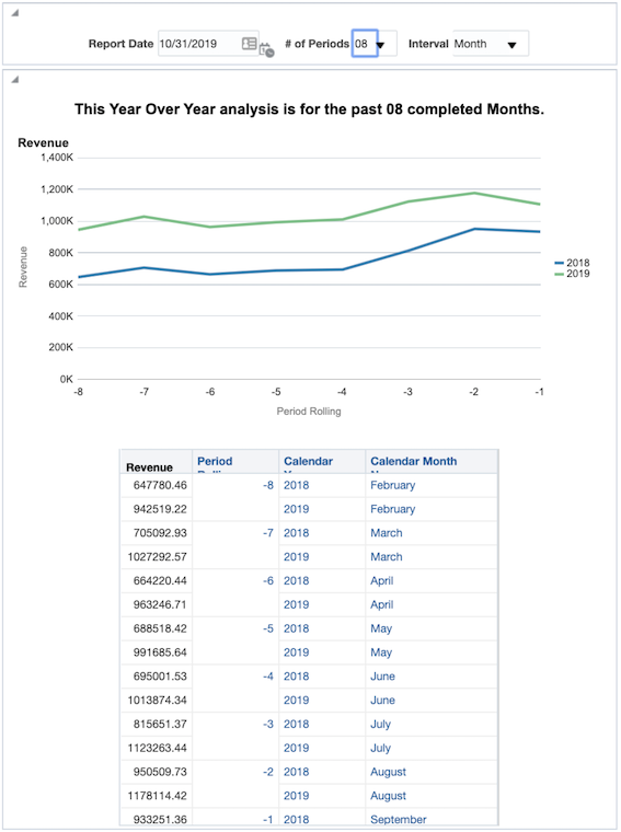
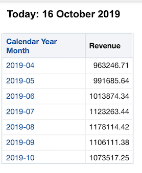
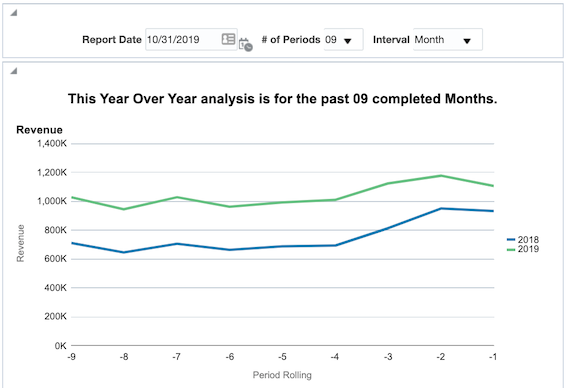
In this blog post I intend to show you how to combine the power of timestamp functions and presentation variables to create robust, repeatable reports. We will create a report that displays a year over year analysis for any rolling number of periods, by week or month, from any date in time, all determined by the user. This entire demo will only use values from a date and a revenue field.
TIMESTAMP Functions
TIMESTAMPADD() manipulates data of the data types DATE and DATETIME based on a calendar year.
Syntax: TIMESTAMPADD(interval, expr, timestamp)
Example: TIMESTAMPADD(SQL_TSI_MONTH, 12,Time."Order Date")
Description: Adds a specified number of intervals to a timestamp, and returns a single timestamp.
Timestamp Interval (TSI) Options: SQL_TSI_SECOND, SQL_TSI_MINUTE, SQL_TSI_HOUR, SQL_TSI_DAY, SQL_TSI_WEEK, SQL_TSI_MONTH, SQL_TSI_QUARTER, SQL_TSI_YEAR
Read more about other calendar functions.
Building Filters
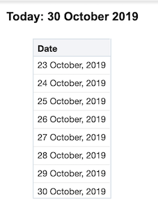
Starting to build our demo, the filter below returns all dates greater than or equal to 7 days ago including the current date.

In other words we have now a functional filter to select all the rows where Date >= a week ago.
As a good practice, always include a second filter giving an upper limit to the time filter. For example "Periods"."Day Date" < CURRENT_DATE would confirm that there won’t be any records that you don’t want in the mix and therefore no unnecessary strain on the system.
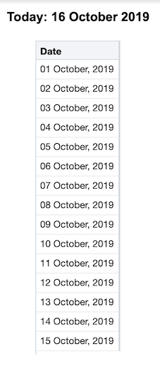
Let’s go one step further, instead of going 7 days back, we could try and include all the previous days in the current month or in other words dates >= the first day of the month. In this scenario, we can use the DAYOFMONTH() function to get the calendar day of any date. From here it will be easy to calculate the number of days in the month so far. Our new filter would look like this:
For example, if today is October 16th, DAYOFMONTH(CURRENT_DATE) would equal 16. Thus, we would subtract 16 days from CURRENT_DATE to go back to September 30th, and adding one will give us October 1st.
Presentation Variables
A presentation variable is a variable that can be created from the front end, the Analytics as part of one of the following types of dashboard prompts:
- Column prompt, Associated with a column and the values that it can take come from the column values. For information on working with column prompts, see Creating a Column Prompt.
- Variable prompt, Not associated with any column, and you define the values that it can take. For information on working with variable prompts, see Creating a Variable Prompt.
Each time a user selects a value in the column or variable prompt, the value of the presentation variable is set to the value that the user selects and will then be sent to any references of that filter throughout the dashboard page. This could be filters, formulas and even text boxes.
The first presentation variable we could introduce is to replace the CURRENT_DATE with a prompted value. Let’s call this presentation variable pv_Date,
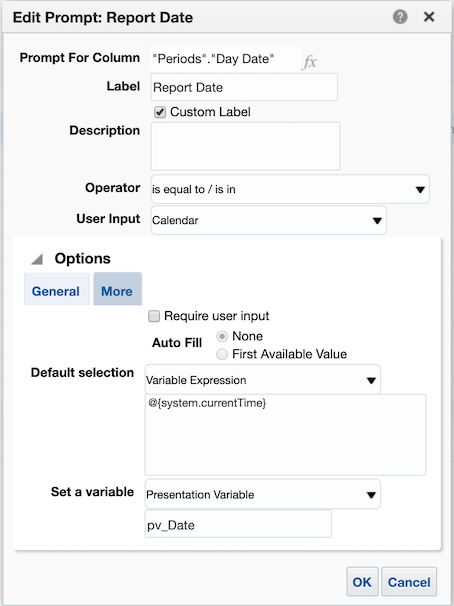
- Use the syntax
@{pv_Date}to call this variable in the reports. - For variables of type string, surround the name in single quotes:
‘@{pv_String]’ - It is good practice to assign a default value to the presentation variables so that you can work with your report before publishing it to a dashboard. For example the default value for the
pv_DateisCURRENT_DATEso the new syntax would be@{pv_Date}{CURRENT_DATE}
Demo Time!
Our updated filter after replacing the CURRENT_DATE looks like below. Will will refer to this filter later as Filter 1 (F1).

The filter is starting to take shape. Now let's say we are going to always be looking at a date range of six months before the selected date. All we would need to do is create a nested TIMESTAMP function. To do this, we will “wrap” our current TIMESTAMP with another that will subtract six months:

Now we have a filter to select dates that are greater than or equal to the first day of the month of any given date and all the six months prior to that.
To take this one step further, we can create another presentation variable called pv_n to allow the users to determine the amount of months to include in this analysis from a dashboard prompt.
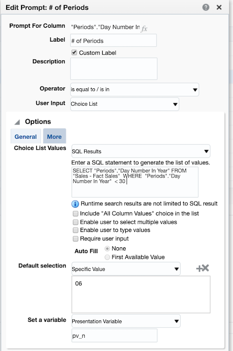
Here is the updated version of our filter using the number of periods presentation variable and a default value of 6, @{pv_n}{6}. We will refer to the following filter as Filter 2 (F2).

Our TIMESTAMPADD function is now fairly robust and will give us any date greater than or equal to the first day of the month from n months ago from any given date. Now we will see what we just created in action by creating date ranges to allow for a Year over Year analysis for any number of months. Consider the following filter set:
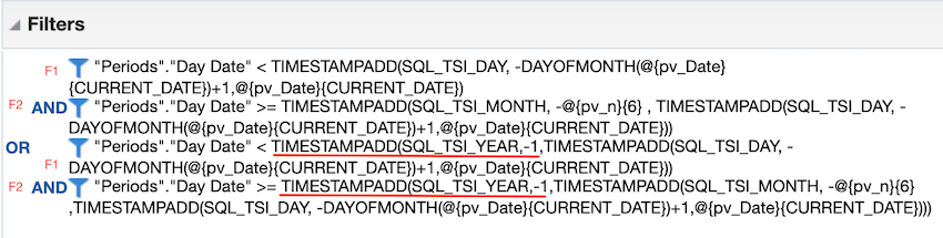
This may appear to be pretty intimidating at first but if we break it into parts we can start to understand its purpose. Notice we are using the exact same filters from before; Filter 1 and Filter 2. What we have done here is filtered on two time periods, separated by the OR statement.
- The first date range defines the period as being the most recent completed n months from any given prompted date value, using a presentation variable with a default of today. Dates in the current month have been removed from the set by Filter 1.
- The second time period, after the OR statement, is the exact same as the first only it has been wrapped in another TIMESTAMP function subtracting a year, giving you the exact same time frame for the year prior.
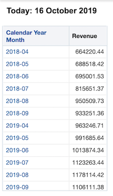
This allows us to create a report that can run a year over year analysis for a rolling n month time frame determined by the user.
A note on nested TIMESTAMPS: you will always want to create nested TIMESTAMPS with the smallest interval first. Then you will wrap intervals as necessary. In this case our smallest increment is day, wrapped by month, wrapped by year.
Let’s Go Crazy
A more advanced trick, If you use real time or near real time reporting: using CURRENT_DATE may be how you want to proceed. Otherwise, instead of using today as your default date value, use yesterday’s date since most data are only as current as yesterday. Using yesterday will be valuable especially when pulling reports on the first day of the month or year - you generally want the entire previous time period rather than the empty beginning of a new one. So, to implement, wherever you have @{pDate}{CURRENT_DATE} replace it with @{pDate}{TIMESTAMPADD(SQL_TSI_DAY,-1,CURRENT_DATE)}
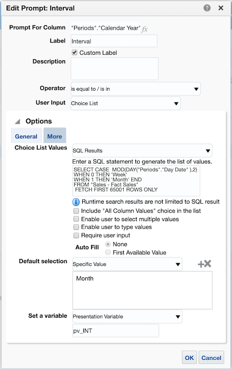
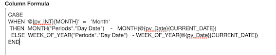
One more change on our filter to make it extra-flexible here is to use a new presentation variable to determine if you want to display year over year values, or by month, or by week. This can be done by inserting a variable into your SQL_TSI_MONTH and DAYOFMONTH statements; changing MONTH to SQL_TSI_@{pv_INT}{MONTH} and DAYOF@{pv_INT}{MONTH}, where pv_INT is the name of our variable.
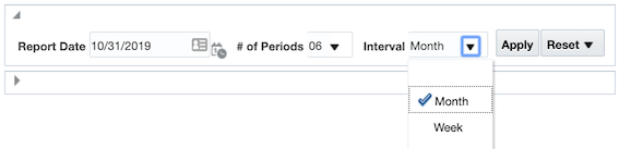
Start by creating a dummy variable in your prompt to allow users to select either MONTH or WEEK. You can try something like this: CASE MOD(DAY("Time"."Date"),2) WHEN 0 'WEEK' WHEN 1 THEN 'MONTH' END
The updated filter now look like this:
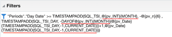
In order for our interaction between Month and Week to run smoothly we have to factor in one last consideration: if we are to take the date December 1st, 2019 and subtract one year we get December 1st, 2018. However, if we take the first day of this week, Sunday December 15, 2019 and subtract one year we get Saturday December 15, 2014. In our analysis this will cause an extra partial week to show up for prior years. To get around this we will add a case statement determining if '@{pv_INT}{MONTH}' = 'Week' THEN subtract 52 weeks from the first of the week ELSE subtract 1 year from the first of the month. With this, our final filter set will look like this:
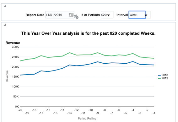
With the use of these filters and some creative dashboarding, you can construct a report that easily allows you to view a year over year analysis from any date in time for any number of periods either by month or by week.
Filtered by Week intervals;
The formula below will give you the value of period rolling to use in the analysis;
In this post, we created a cloud version of the amazing demo previously described by Brian Hall. As demonstrated, Timestamp functions and their power have been within the interesting topics of the visualisation and reporting for as long as we at Rittman Mead remember and can still be used in the realm of the Oracle Cloud Services in a very similar way as the past.
Feel free to get in touch, let us know your reviews and comments.